Benjamin Constant Palette 7

Palette Analysis
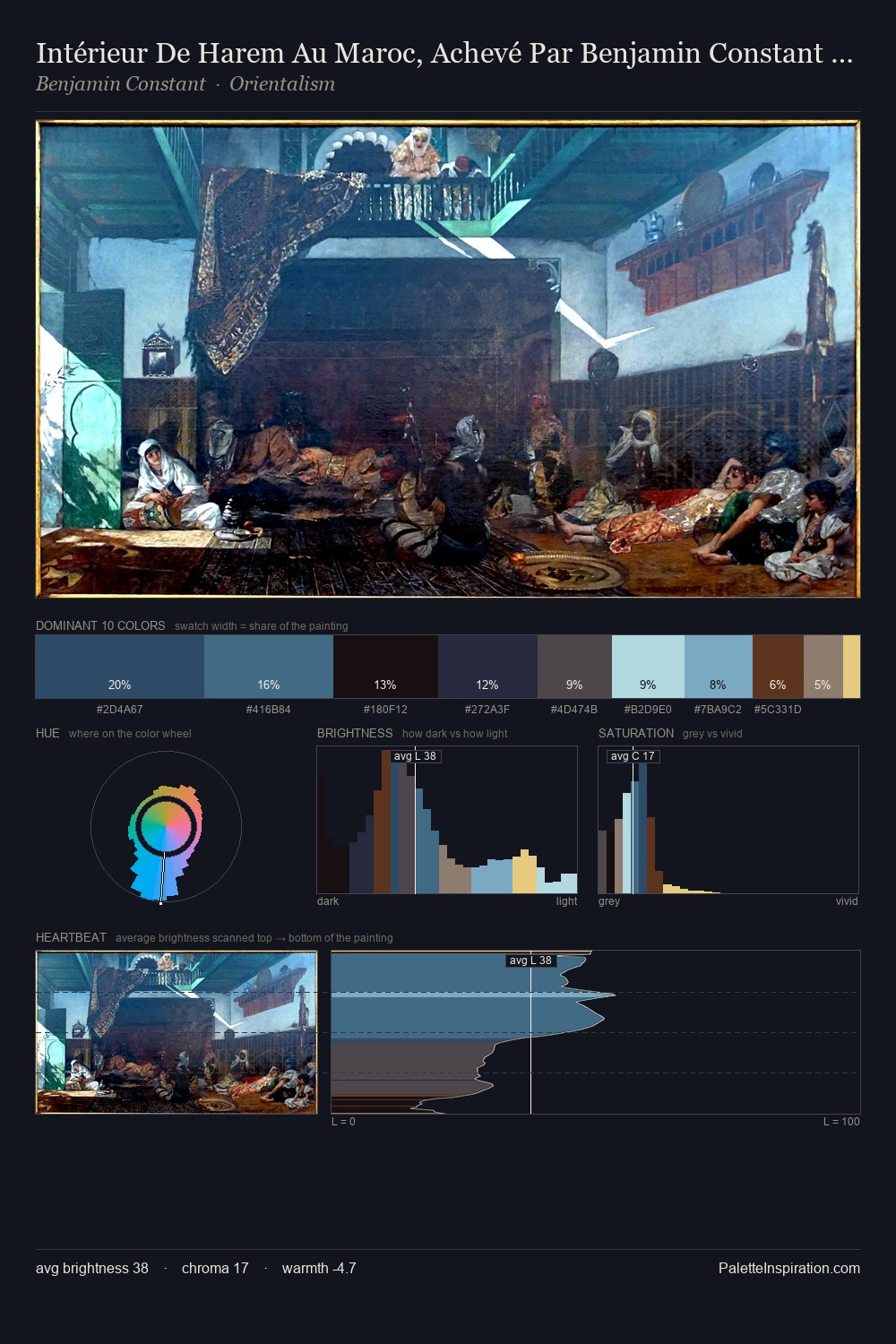
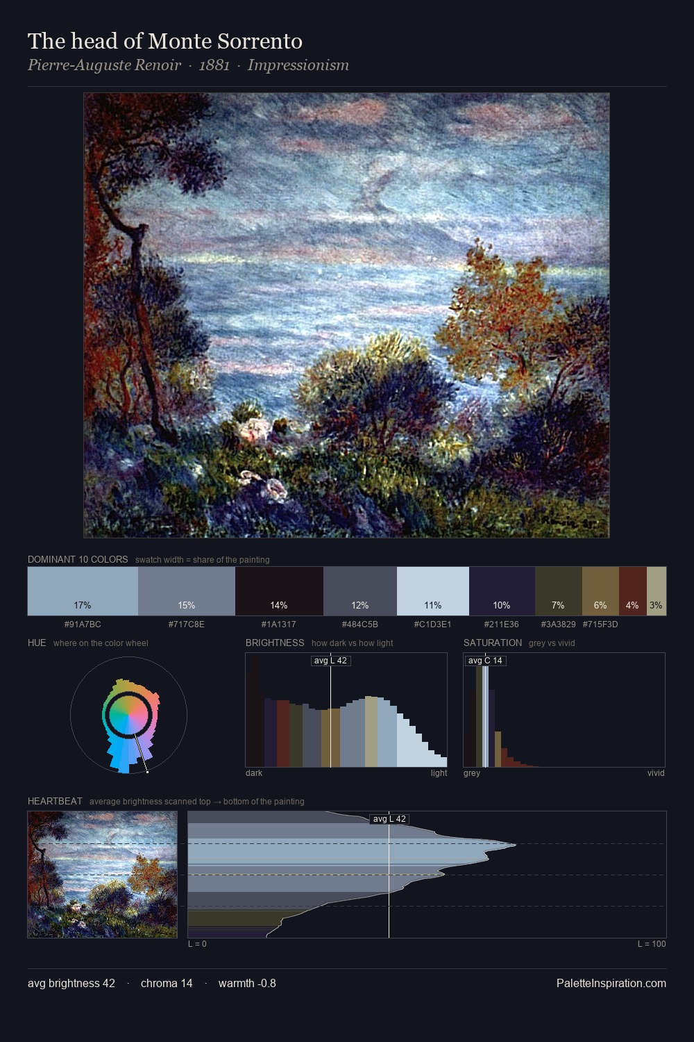
Benjamin Constant occupies the comfortable middle of the value scale, avoiding both extremes to hold the eye in a sustained middle grey. Cool tones set the register here - the blues and greens easily outweigh any warm accents. Chroma is kept low across all colours, producing the soft, enveloping quality that characterises tonal painting. The saturated accent, #6D4431, registers at 5.7% - sparse enough to feel like a deliberate surprise. 65 units of value range underpin the palette's structural clarity: the eye always knows where light falls. High luminosity and cool temperature suggest the plein-air condition: unfiltered daylight and open sky. Benjamin Constant's palette 7 carries its own internal logic while remaining in conversation with the artist's broader colour intelligence.
Example use cases
- legal services
- corporate identity
- industrial design
- professional services
- fintech
I Love This!
Copy, export, or download for your project