Bengt Nordenberg Palette 3

Palette Analysis
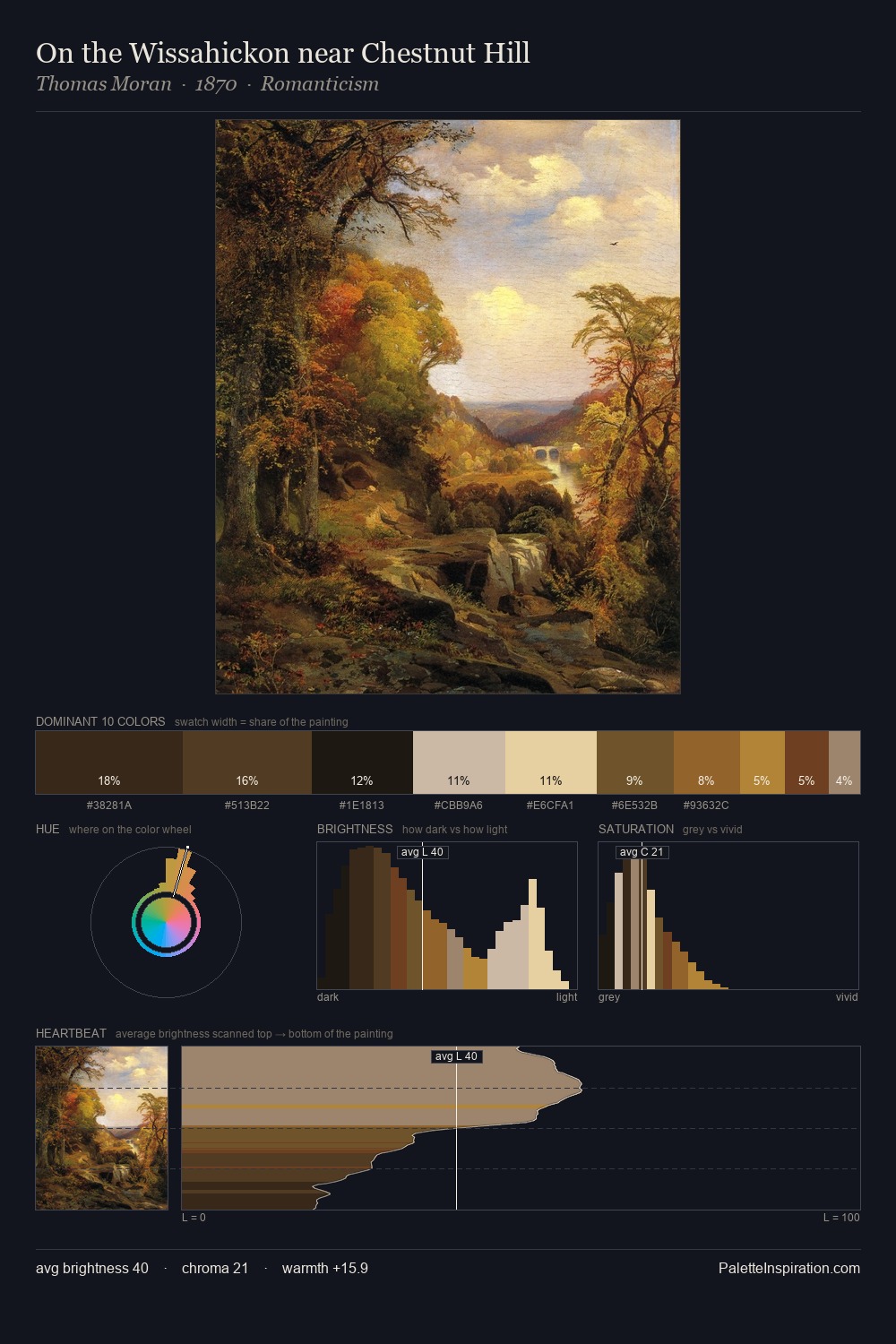
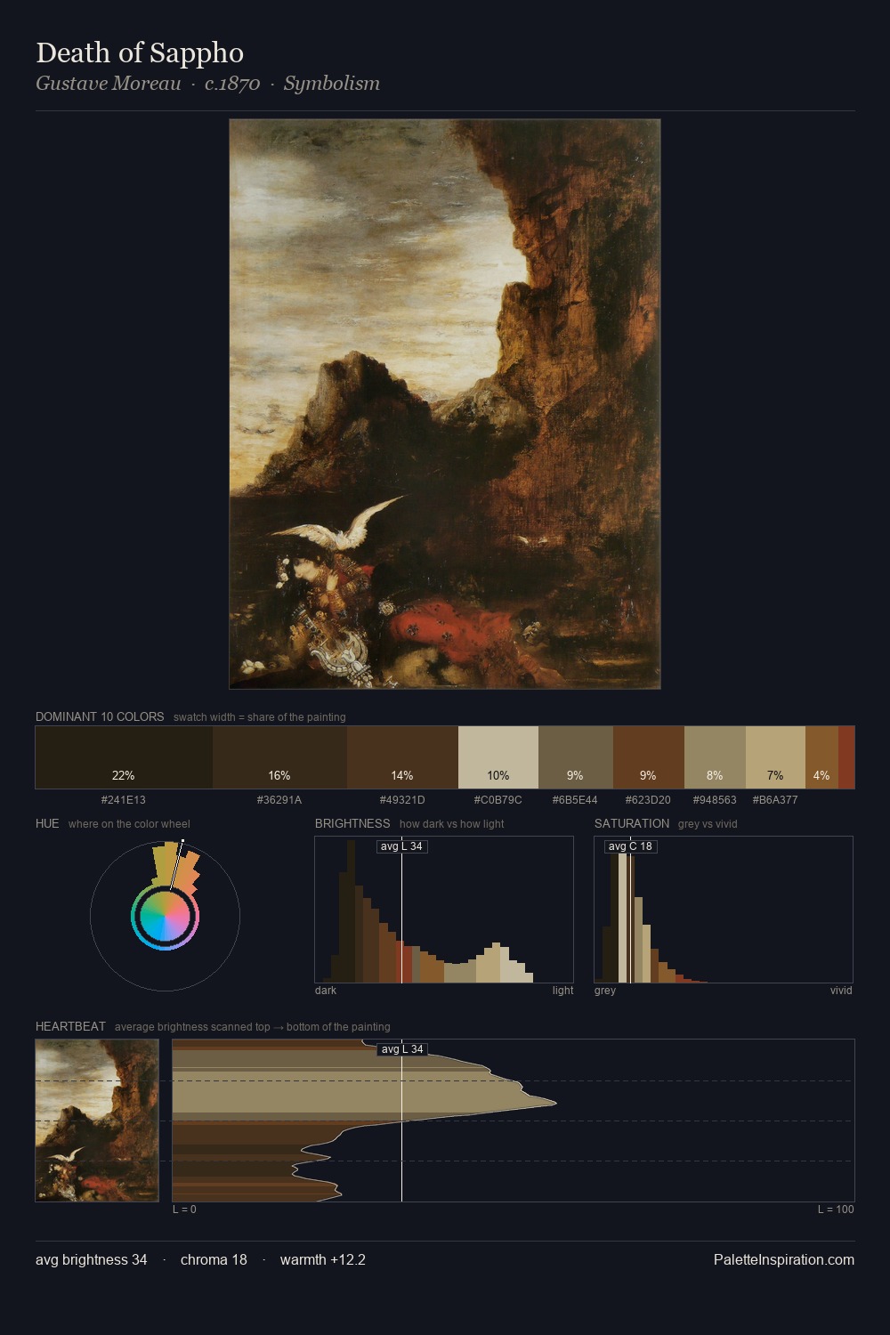
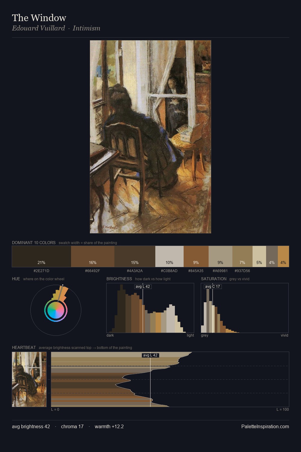
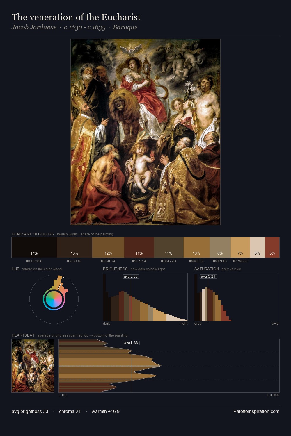
Mid-key values give Bengt Nordenberg its characteristic quietness - nothing blazes, nothing disappears. Cool tones set the register here - the blues and greens easily outweigh any warm accents. Chroma is kept low across all colours, producing the soft, enveloping quality that characterises tonal painting. A single dominant - #2C261C at 26.0% - sets the character of the whole composition. #9C6A3B functions as the palette's exclamation mark: highest chroma, lowest percentage (3.0%). 61 units of value range underpin the palette's structural clarity: the eye always knows where light falls. The mid-to-high key, cool bias, and moderate chroma point to outdoor observation - sky and diffused daylight as the dominant light source. Palette 3 sits within the larger chromatic argument that Bengt Nordenberg's complete body of work advances.
Example use cases
- theater design
- jewelry brands
- tobacco-adjacent retail
- event branding
- film & entertainment
I Love This!
Copy, export, or download for your project