Beatrix Potter Palette 3

Palette Analysis
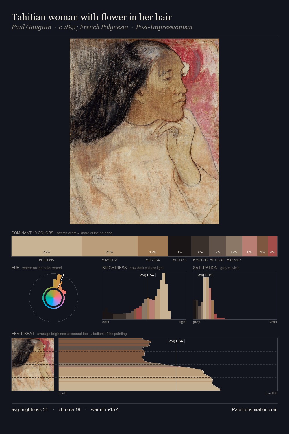
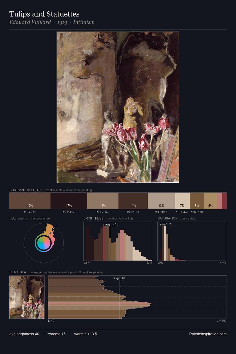
Beatrix Potter is strongly light-biased - shadow is suggested rather than declared. Beatrix Potter tilts toward cool - blues and silver-greys carry the structural weight. Saturation is deliberately withheld - the beauty here lies in the near-monochromatic gradations rather than colour difference. Beatrix Potter gives 62.9% of the composition to a single #D3BE9F - a decisive chromatic anchor. #B85D61 functions as the palette's exclamation mark: highest chroma, lowest percentage (3.2%). The palette spans 50 value units: a measured range that delivers coherence over drama. The mid-to-high key, cool bias, and moderate chroma point to outdoor observation - sky and diffused daylight as the dominant light source. This is palette 3 of Beatrix Potter's sequence - a single chapter in a chromatic story told across many works.
Example use cases
- interior design
- furniture brands
- cookbook publishing
- wine & spirits
- food packaging
I Love This!
Copy, export, or download for your project