Beatrice Emma Parsons Palette 1

Palette Analysis
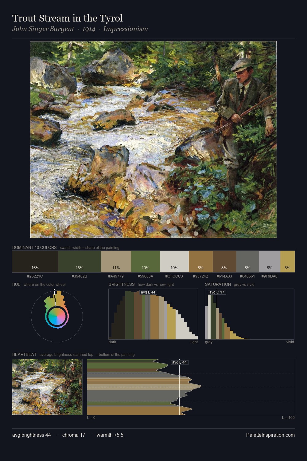
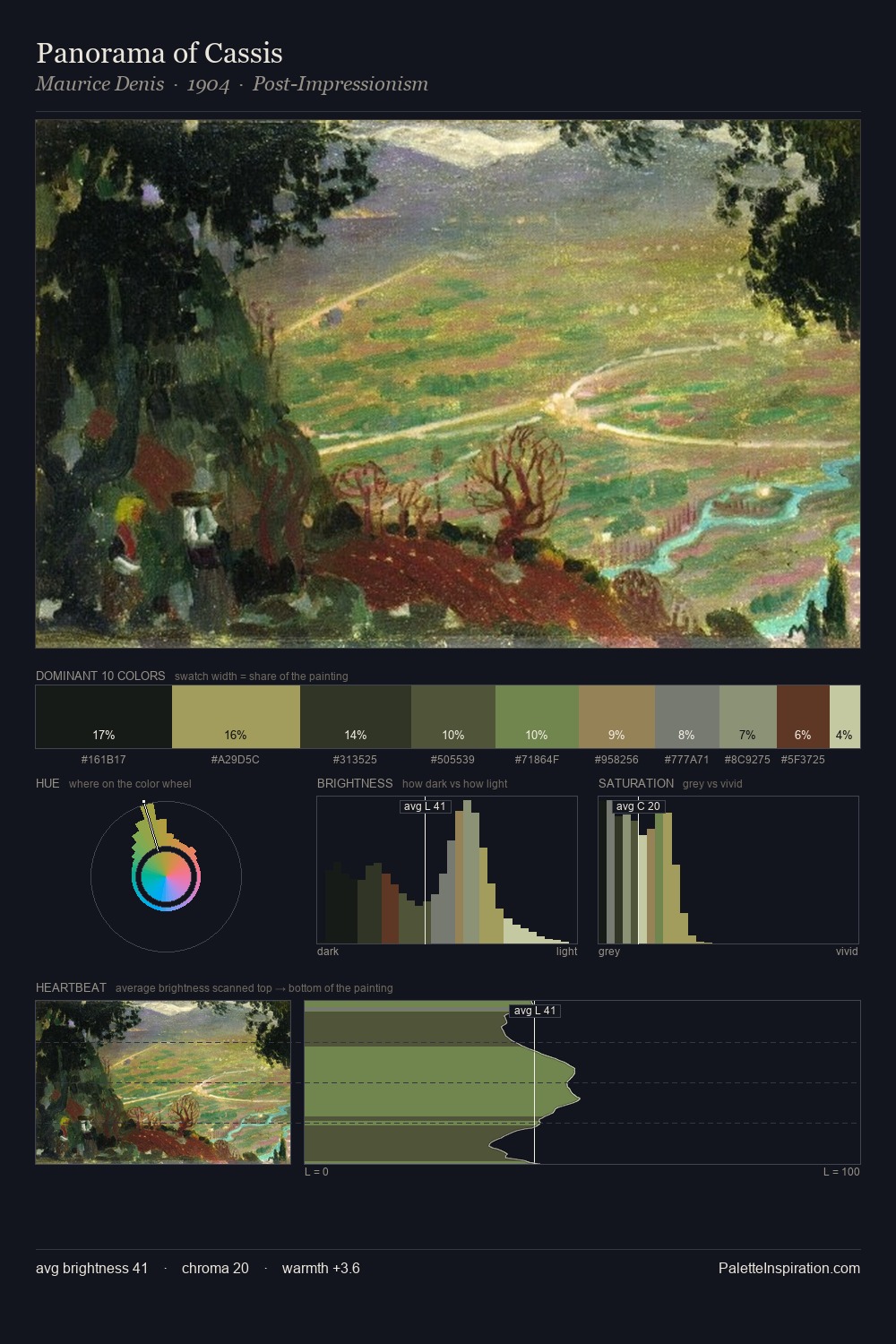
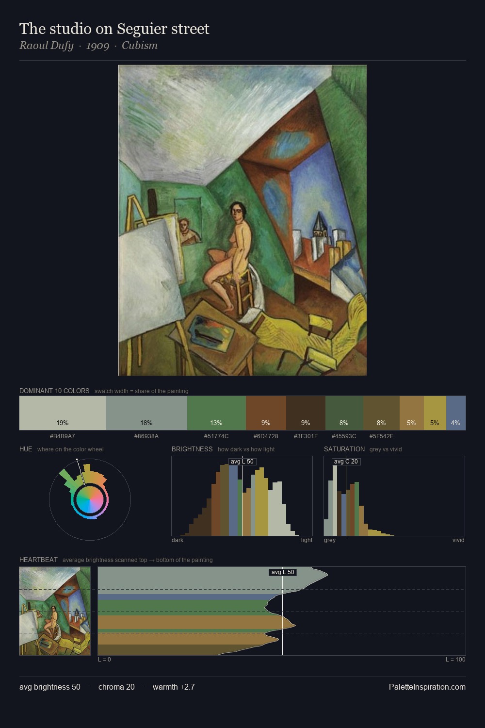
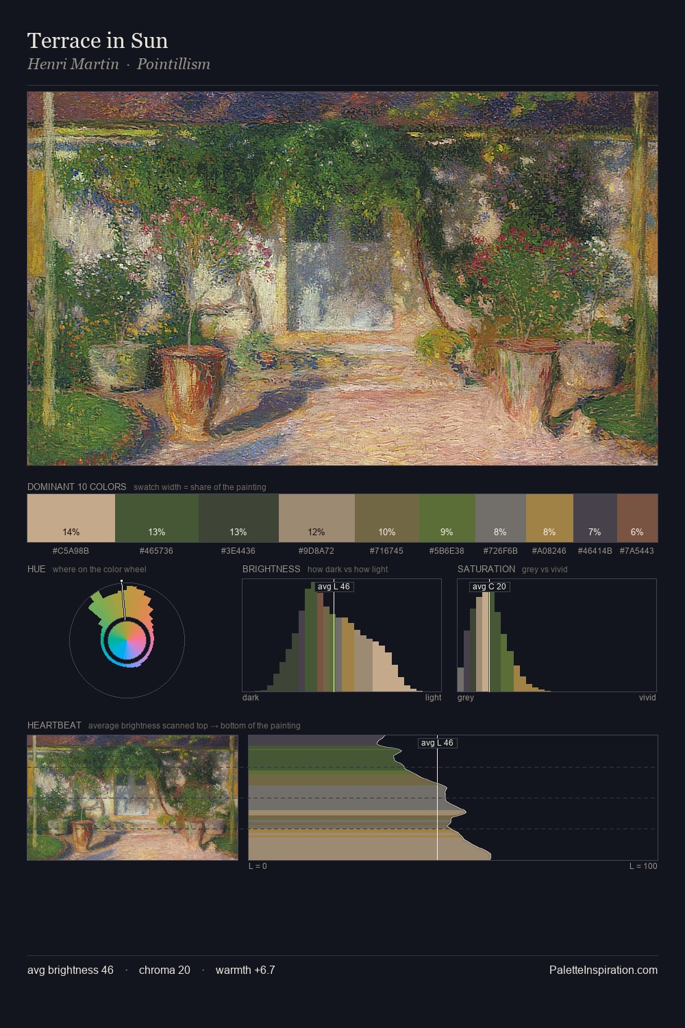
Mid-key values give Beatrice Emma Parsons its characteristic quietness - nothing blazes, nothing disappears. Blues and teal-greys govern the palette, lending it an aquatic or atmospheric quality. The absence of saturated colour is itself an expressive choice: this is a palette of restraint and atmosphere. #9B7F4D functions as the palette's exclamation mark: highest chroma, lowest percentage (5.8%). At 47 units across the value scale, the palette keeps contrast readable without letting it dominate. The mid-to-high key, cool bias, and moderate chroma point to outdoor observation - sky and diffused daylight as the dominant light source. Palette 1 sits within the larger chromatic argument that Beatrice Emma Parsons's complete body of work advances.
Example use cases
- theater design
- jewelry brands
- tobacco-adjacent retail
- event branding
- film & entertainment
I Love This!
Copy, export, or download for your project