Bartolomeo Veneto Palette 5

Palette Analysis
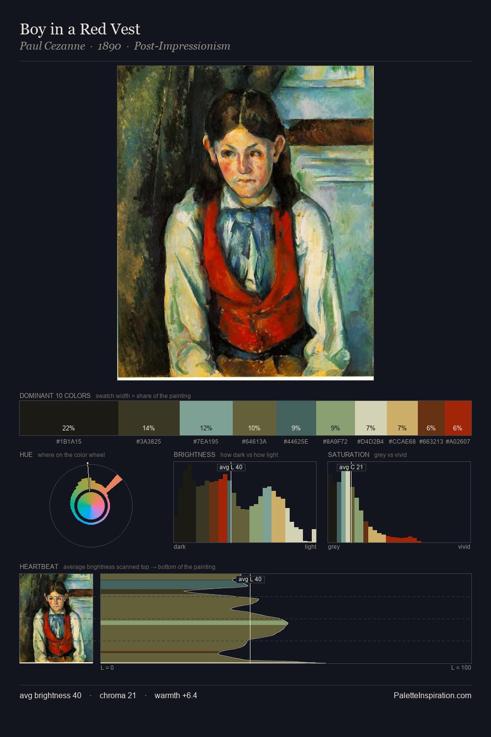
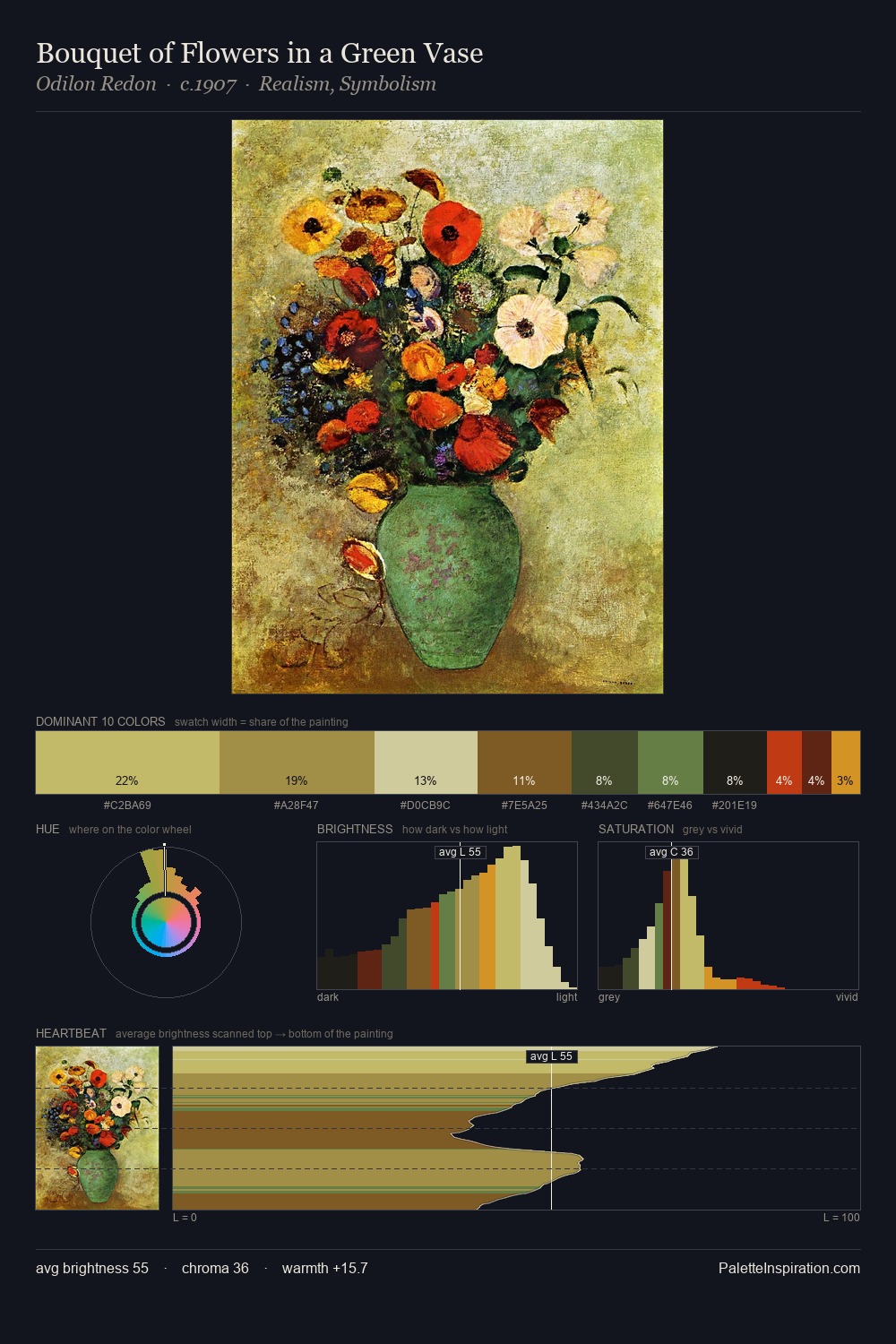
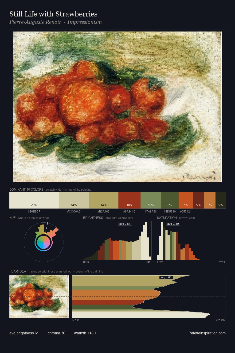
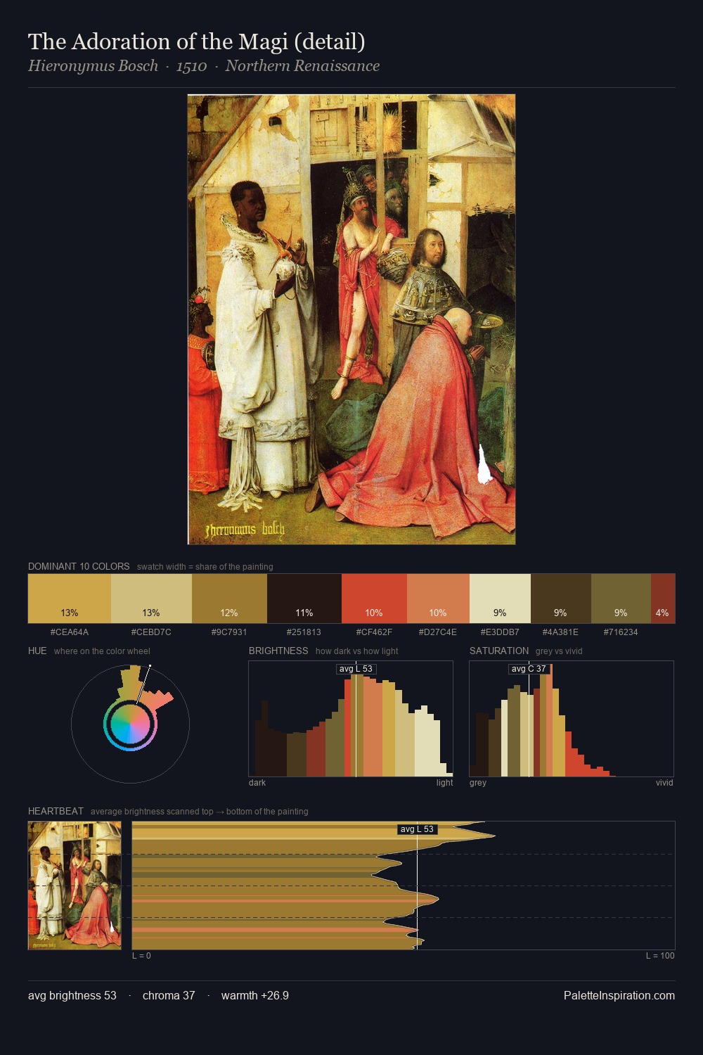
Bartolomeo Veneto distributes its values across the middle register, creating harmony without high contrast. Cool tones set the register here - the blues and greens easily outweigh any warm accents. Chroma is moderate: colours carry enough saturation to be read as colour, but the palette stops well short of garish intensity. At 26.1%, #11110B functions less as a colour accent and more as a complete atmospheric environment. The saturated accent, #903014, registers at 4.7% - sparse enough to feel like a deliberate surprise. 77 units of value range underpin the palette's structural clarity: the eye always knows where light falls. The palette has the character of outdoor light: cool, mid-bright, with colour rendered faithfully rather than expressively. This is palette 5 of Bartolomeo Veneto's sequence - a single chapter in a chromatic story told across many works.
Example use cases
- theater design
- jewelry brands
- tobacco-adjacent retail
- event branding
- film & entertainment
I Love This!
Copy, export, or download for your project