Bartolomeo Pinelli Palette 1
Luminous Ivory
Luminous Self-illuminated feeling - high-key values with an inner glow quality.
Ivory Warm creamy white - the color of natural ivory, warmer than pure white.

Palette Analysis
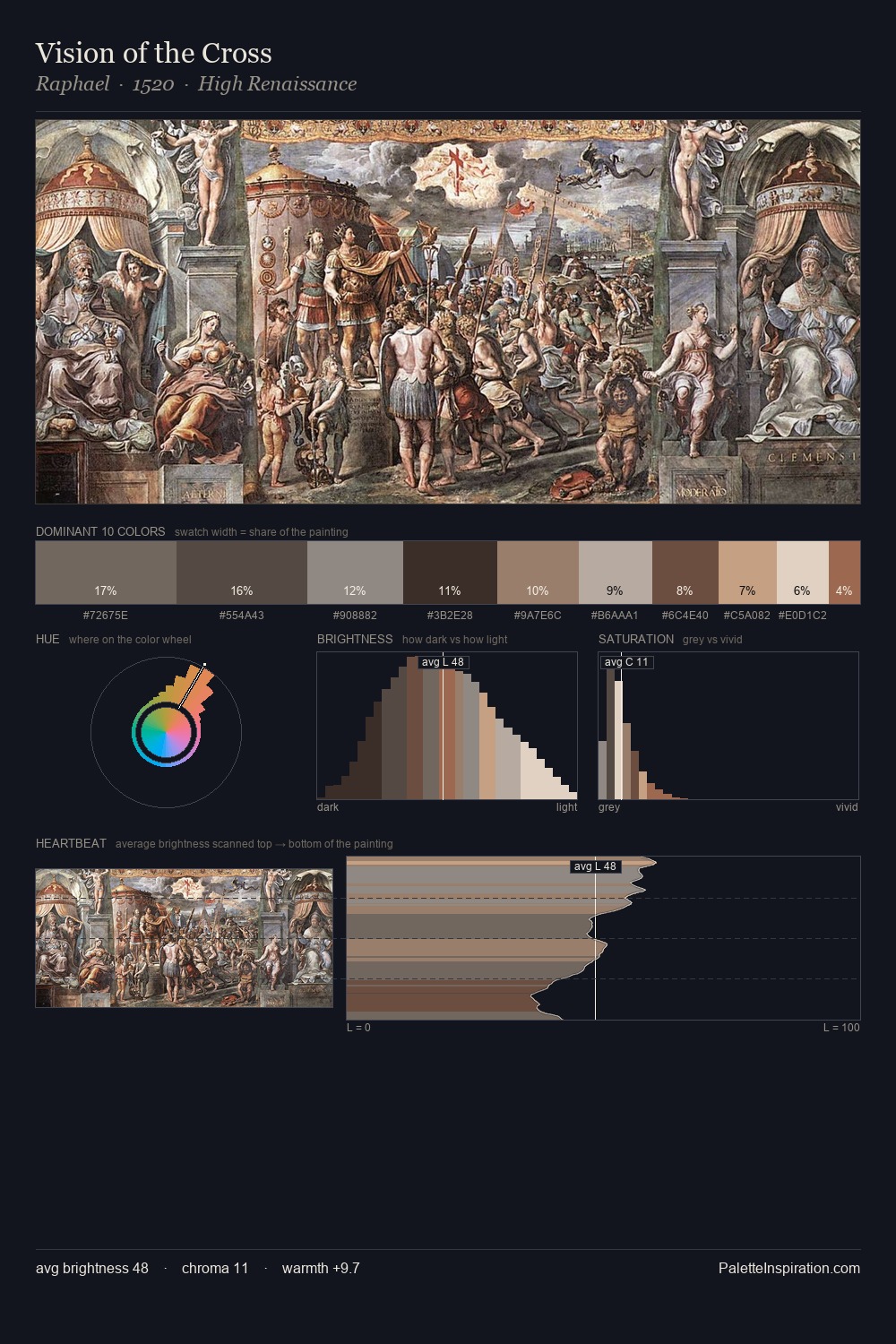
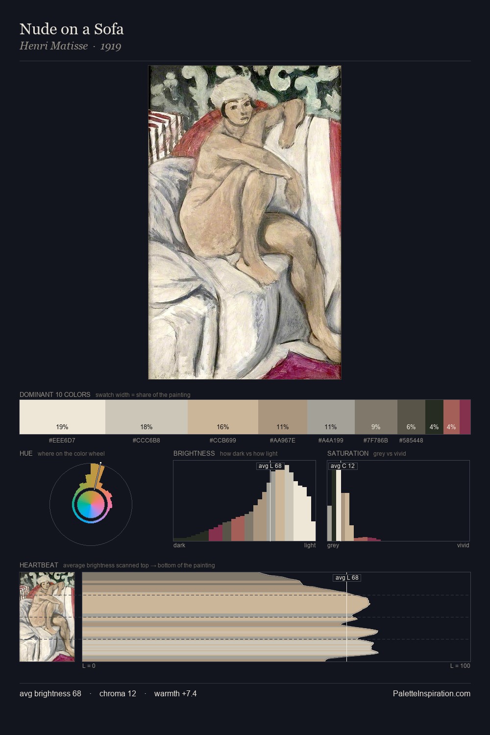
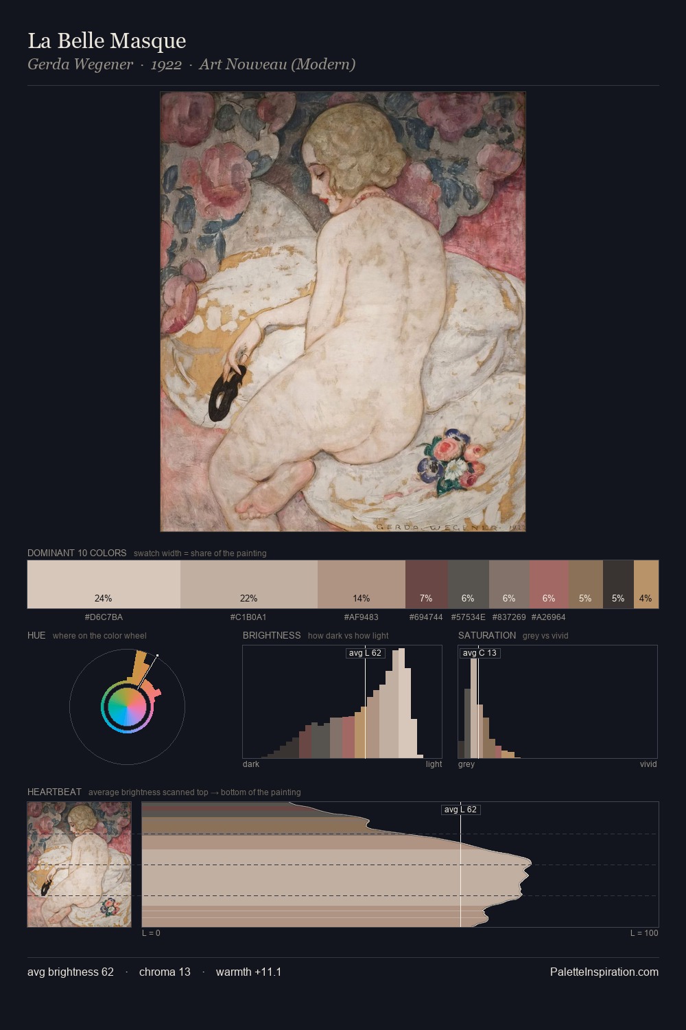
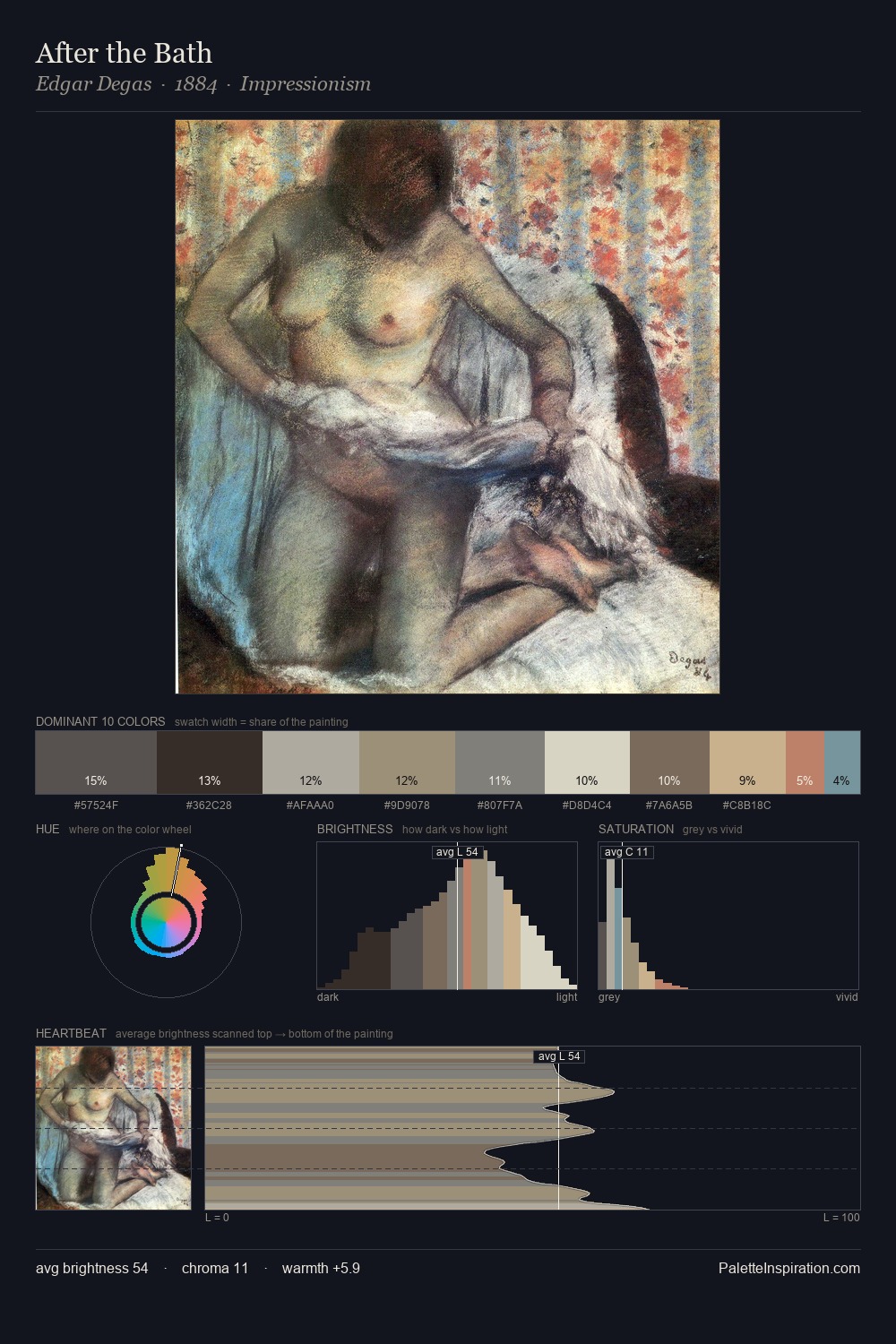
Bartolomeo Pinelli is strongly light-biased - shadow is suggested rather than declared. The dominant temperature is warm, with earth tones and fire-hues setting the emotional key. Chroma hovers near zero; colour declares itself through subtle shifts in hue rather than outright saturation. #DEC7B8 functions as the palette's exclamation mark: highest chroma, lowest percentage (12.6%). At 45 units across the value scale, the palette keeps contrast readable without letting it dominate. This is palette 1 of Bartolomeo Pinelli's sequence - a single chapter in a chromatic story told across many works.
Example use cases
- florist branding
- event design
- real estate
- jewelry retail
- hospitality branding
I Love This!
Use This Palette
Copy, export, or download for your project
Copy, export, or download for your project
Copy:
Download:
Share: