Bartholomeus van Hove Master Palette

Palette Analysis
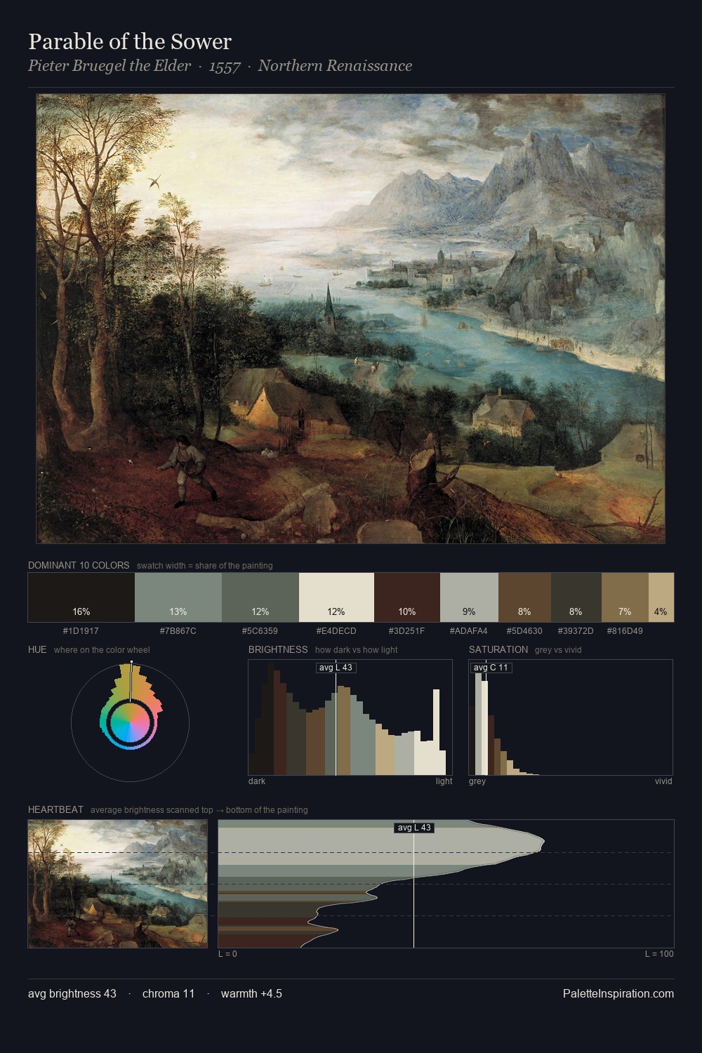
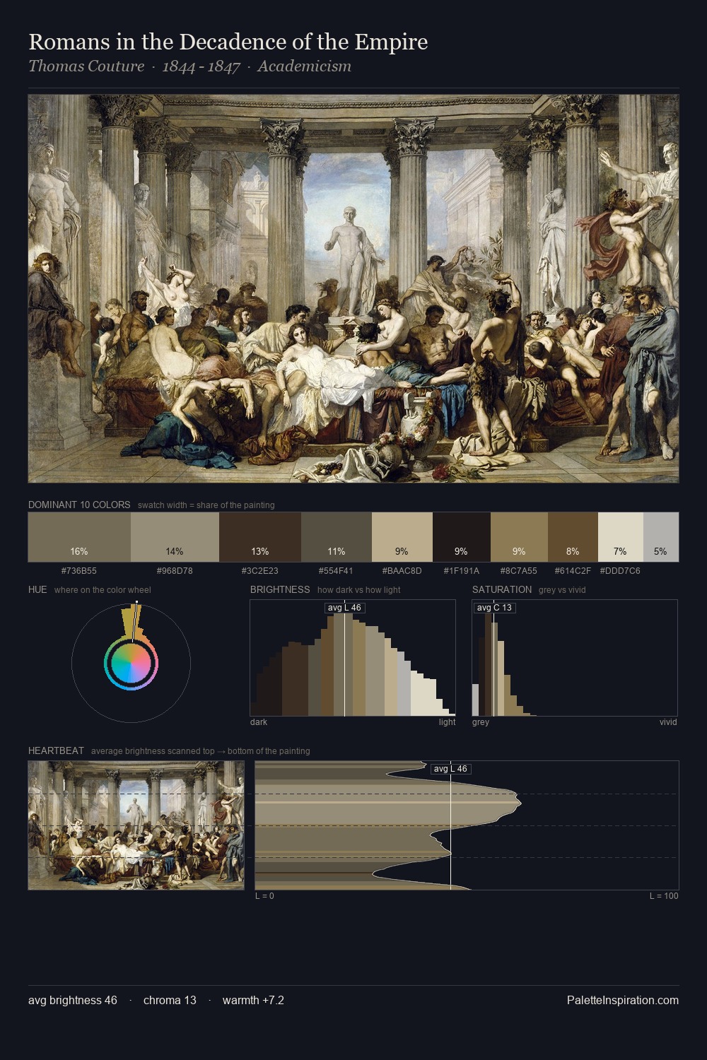
Bartholomeus van Hove distributes its values across the middle register, creating harmony without high contrast. The dominant temperature is warm, with earth tones and fire-hues setting the emotional key. Chroma is kept low across all colours, producing the soft, enveloping quality that characterises tonal painting. A single dominant - #B0ADAF at 25.0% - sets the character of the whole composition. The most saturated colour, #3B2C1F, covers 5.0% of the surface: too much to call an accent, too strong to ignore. 55 units of value range underpin the palette's structural clarity: the eye always knows where light falls. The palette is recognisably Bartholomeus van Hove's own: particular in its temperature, chroma, and the economy of its brightest note.
Example use cases
- exhibition design
- foundation branding
- estate management
- art education
- museums & galleries
I Love This!
Copy, export, or download for your project