Bartholomeus van der Helst Master Palette

Palette Analysis
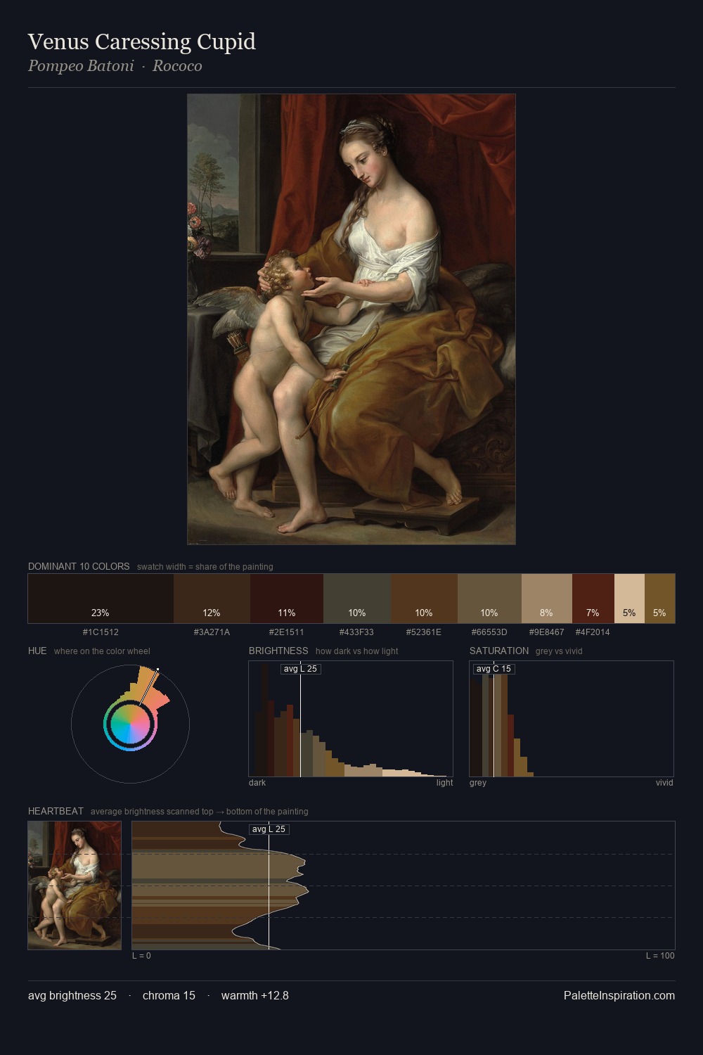
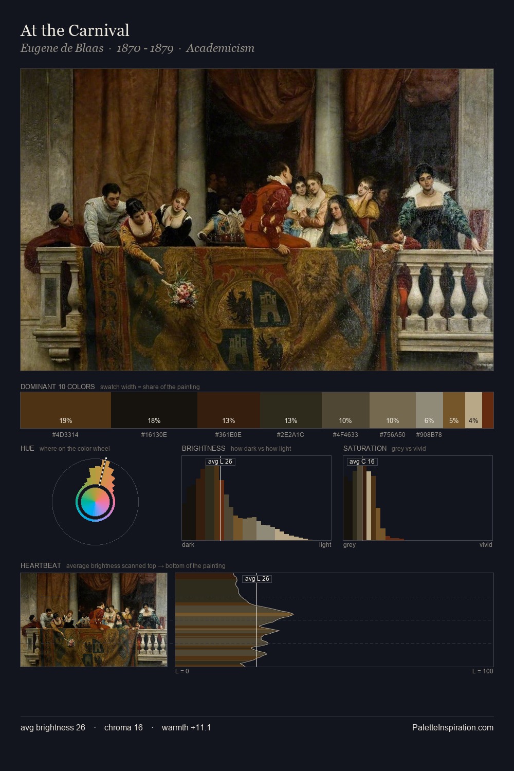
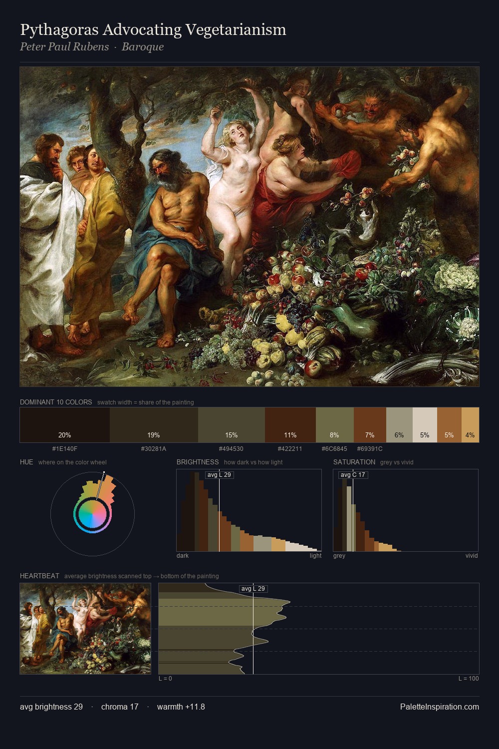
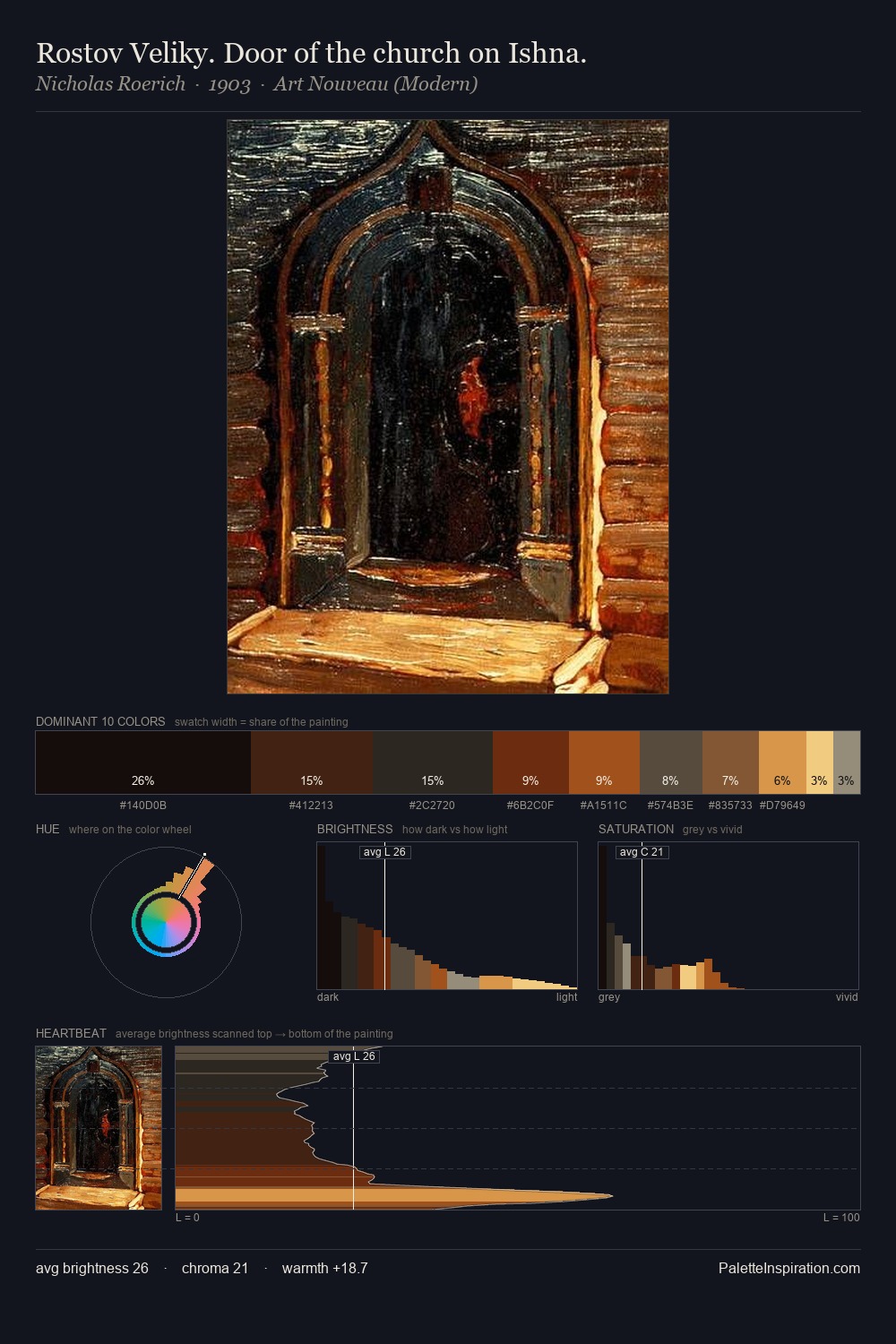
Bartholomeus van der Helst is built on dark foundations, with values clustered toward shadow. Warm and cool tones are held in careful balance - neither family dominates, creating tension and resolution simultaneously. All colours lean toward grey, building depth through value rather than colour punch. The dominant colour, #0A0D06, takes 25.1% of the total area, establishing the overall mood before any other hue is introduced. The highest-chroma note - #845F37 - appears at just 5.8%, deployed as a precision accent against the quieter ground. 49 units of value spread create a palette that is varied but unified - contrast in the service of harmony. This tonal restraint is characteristic of the Bartholomeus van der Helst approach: colour serves light, not the reverse. These proportions encode Bartholomeus van der Helst's instinctive sense of how much of each quality the eye can hold.
Example use cases
- theater design
- jewelry brands
- tobacco-adjacent retail
- event branding
- film & entertainment
I Love This!
Copy, export, or download for your project