Bartholomeus Spranger Palette 2

Palette Analysis
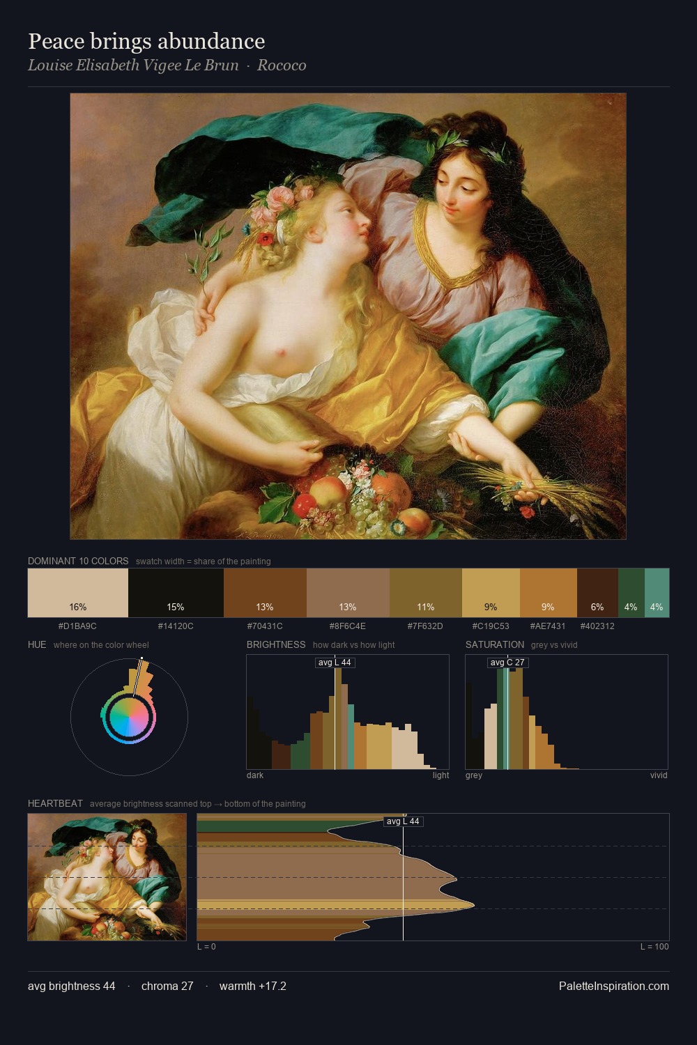
Mid-key values give Bartholomeus Spranger its characteristic quietness - nothing blazes, nothing disappears. Blues and teal-greys govern the palette, lending it an aquatic or atmospheric quality. Chroma is kept low across all colours, producing the soft, enveloping quality that characterises tonal painting. #161613 claims 29.1% of the surface, functioning as the work's tonal foundation. The saturated accent, #29501B, registers at 1.2% - sparse enough to feel like a deliberate surprise. At 62 units of value range, the palette has the tonal breadth to sustain complex spatial readings. High luminosity and cool temperature suggest the plein-air condition: unfiltered daylight and open sky. Palette 2 sits within the larger chromatic argument that Bartholomeus Spranger's complete body of work advances.
Example use cases
- music labels
- luxury hospitality
- editorial photography
- leather goods
- premium streaming
I Love This!
Copy, export, or download for your project
Related Palettes

Johann Ludwig Ernst Morgenstern Master Palette
Penumbral Terracotta

Johann Ludwig Ernst Morgenstern Palette 1
Penumbral Terracotta

Jacob Jordaens Palette 3
Shadowed Terracotta

Hermann Wislicenus Palette 4
Penumbral Caramel

Bartholomeus Spranger Palette 1
Shadowed Parchment

Bartholomeus Spranger Palette 3
Shadowed Parchment