Bartholomeus Spranger Palette 1
Shadowed Parchment
Shadowed Low-key - values weighted toward shadow, the palette of dim interiors and overcast skies.
Parchment Aged warm neutral - the color of old manuscript parchment, tan and slightly yellowed.

Palette Analysis
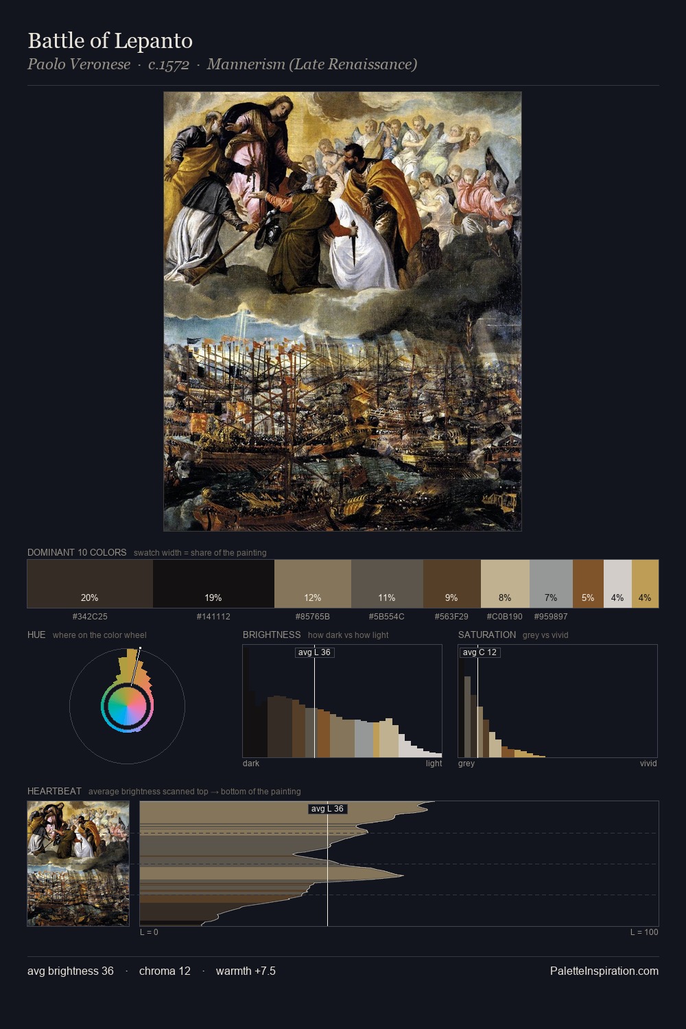
The value structure of Bartholomeus Spranger is mid-key: quiet, controlled, and cohesive. The dominant temperature is warm, with earth tones and fire-hues setting the emotional key. All colours lean toward grey, building depth through value rather than colour punch. Only 10.3% is devoted to #7C5E41, yet that small allocation delivers the palette's entire chromatic tension. The palette spans 54 value units: a measured range that delivers coherence over drama. Palette 1 sits within the larger chromatic argument that Bartholomeus Spranger's complete body of work advances.
Example use cases
- theater design
- jewelry brands
- tobacco-adjacent retail
- event branding
- film & entertainment
I Love This!
Use This Palette
Copy, export, or download for your project
Copy, export, or download for your project
Copy:
Download:
Share: