Barend Cornelis Koekkoek Master Palette
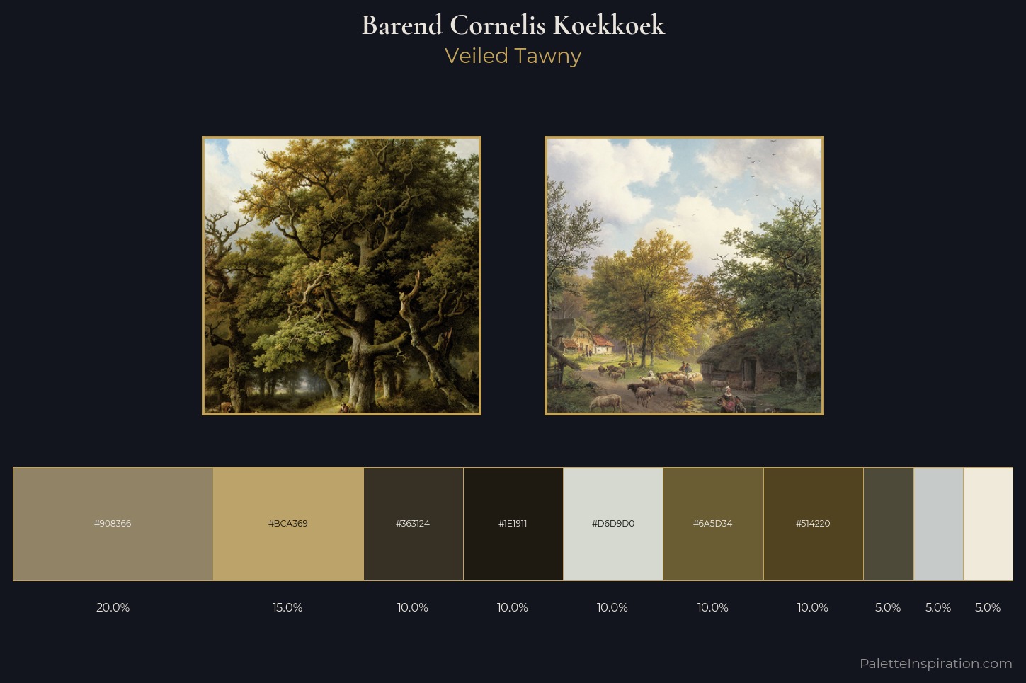
Palette Analysis
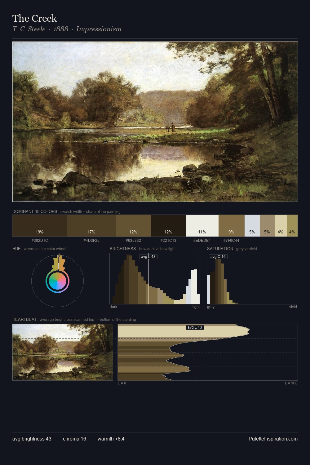
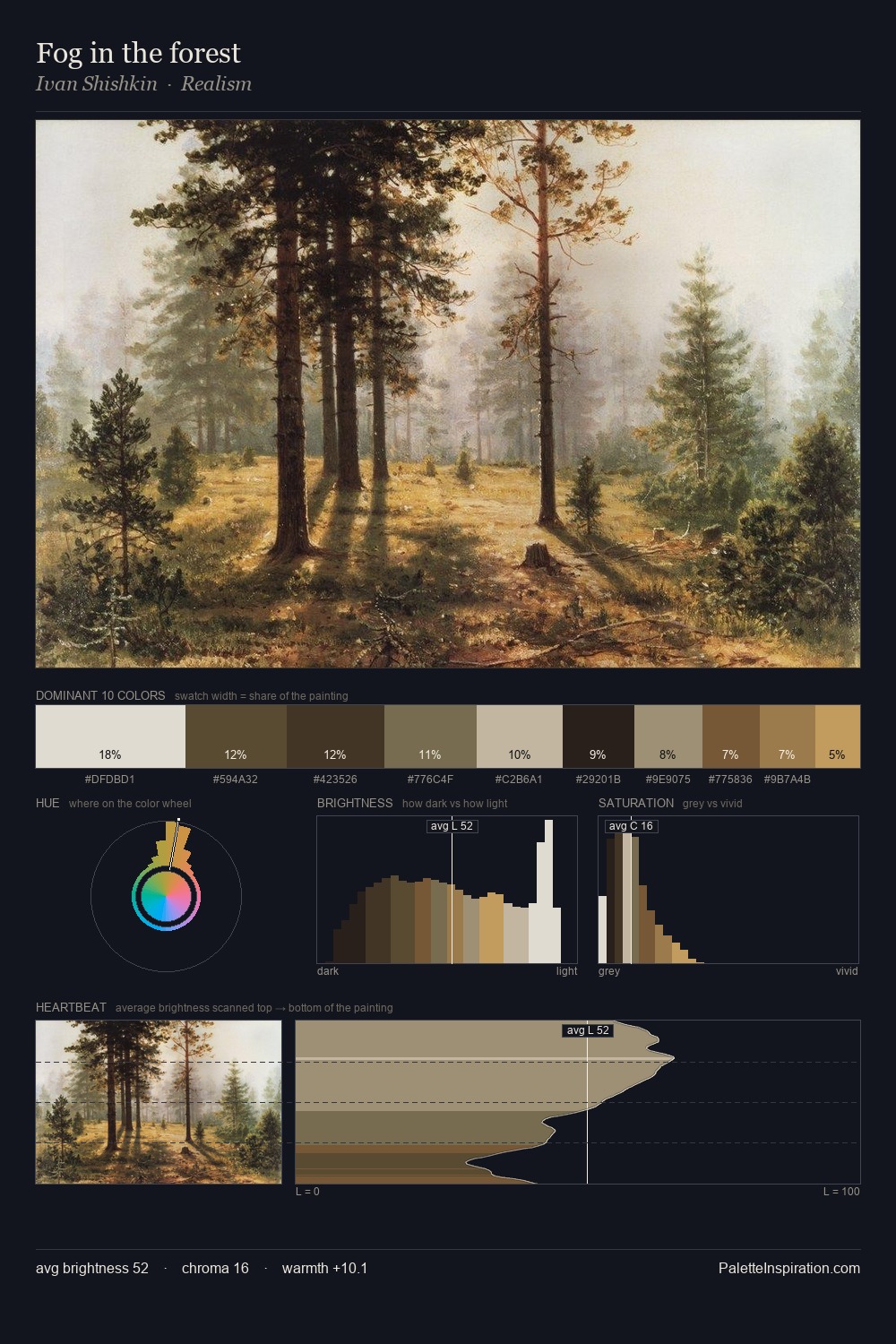
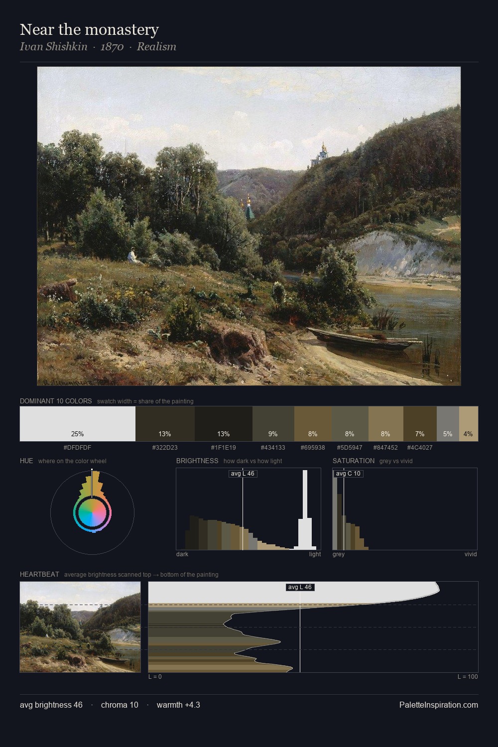
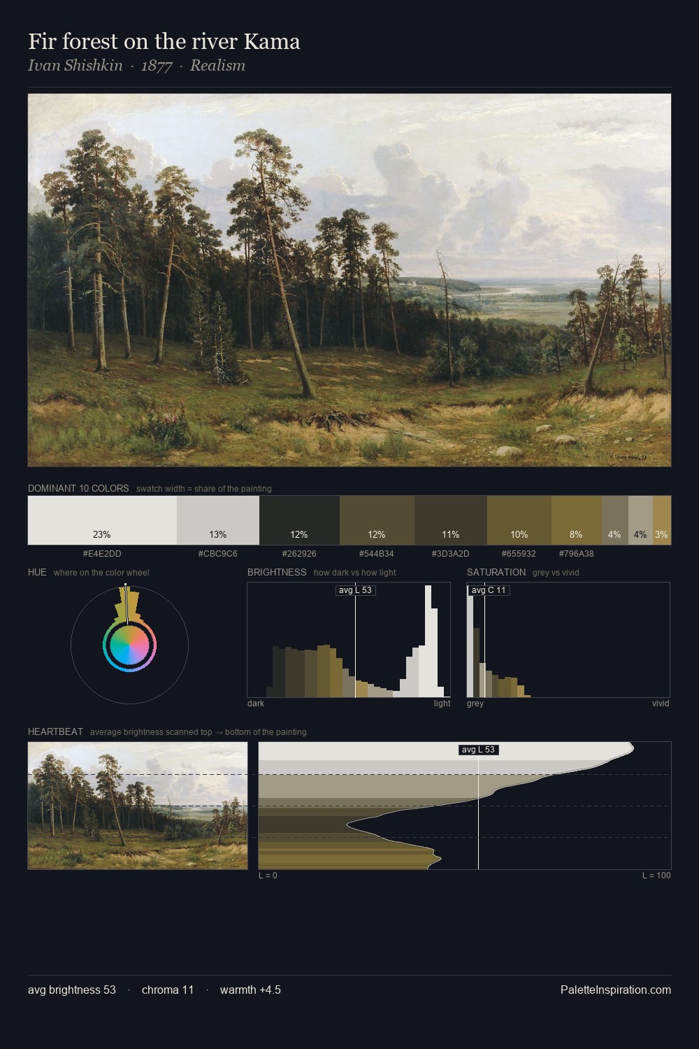
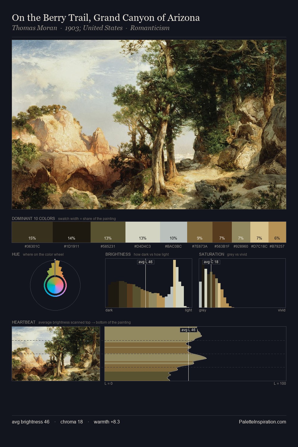
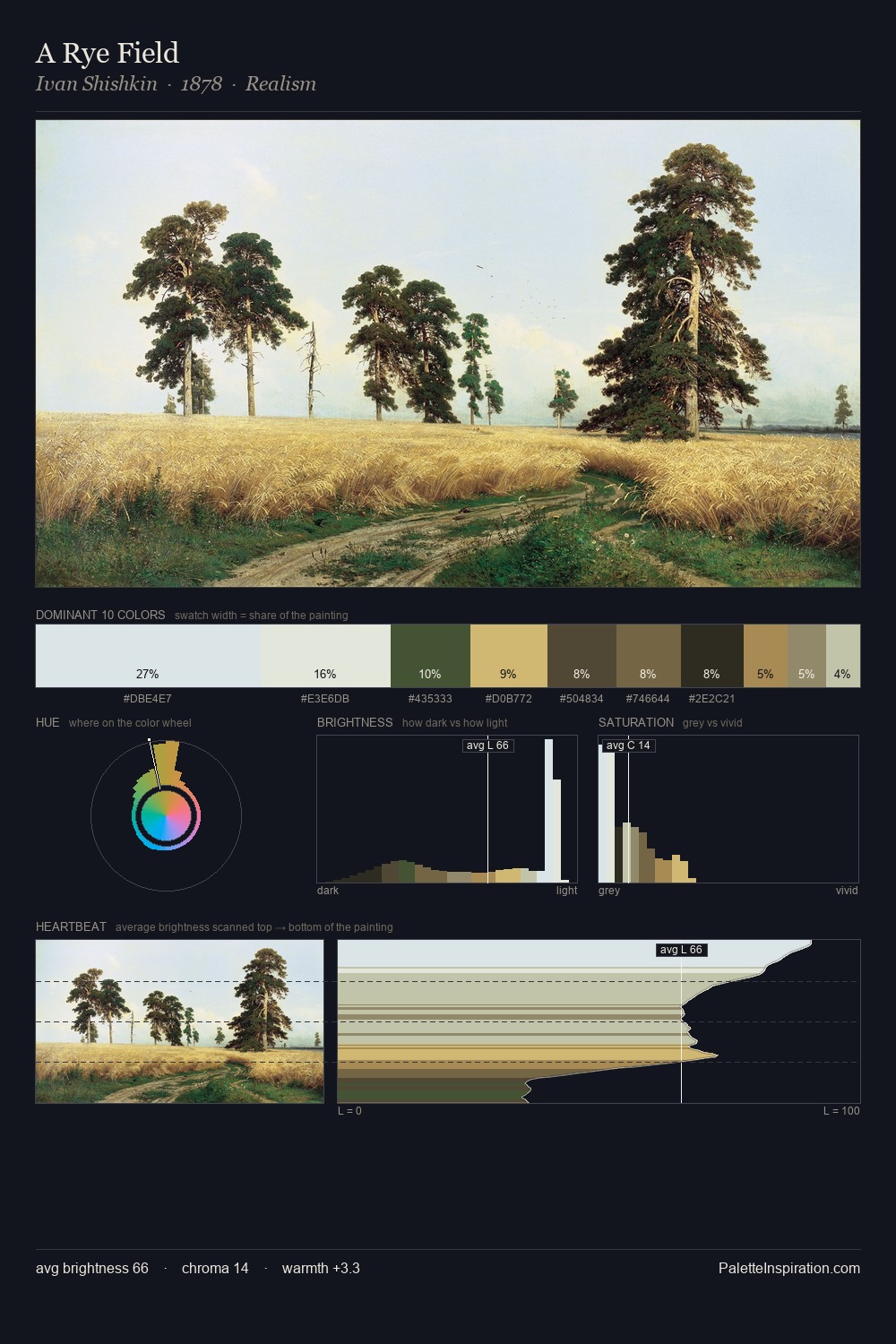
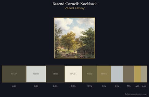
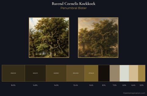
Barend Cornelis Koekkoek occupies the comfortable middle of the value scale, avoiding both extremes to hold the eye in a sustained middle grey. Blues and teal-greys govern the palette, lending it an aquatic or atmospheric quality. Saturation is deliberately withheld - the beauty here lies in the near-monochromatic gradations rather than colour difference. The chromatic peak belongs to #6A5D34, and at 10.0% it dominates, not decorates. At 72 units of value range, the palette has the tonal breadth to sustain complex spatial readings. The palette has the character of outdoor light: cool, mid-bright, with colour rendered faithfully rather than expressively. The palette is recognisably Barend Cornelis Koekkoek's own: particular in its temperature, chroma, and the economy of its brightest note.
Example use cases
- craft & artisan brands
- specialty coffee
- home goods
- lifestyle retail
- ceramics & pottery
I Love This!
Copy, export, or download for your project