Barbara Longhi Master Palette

Palette Analysis
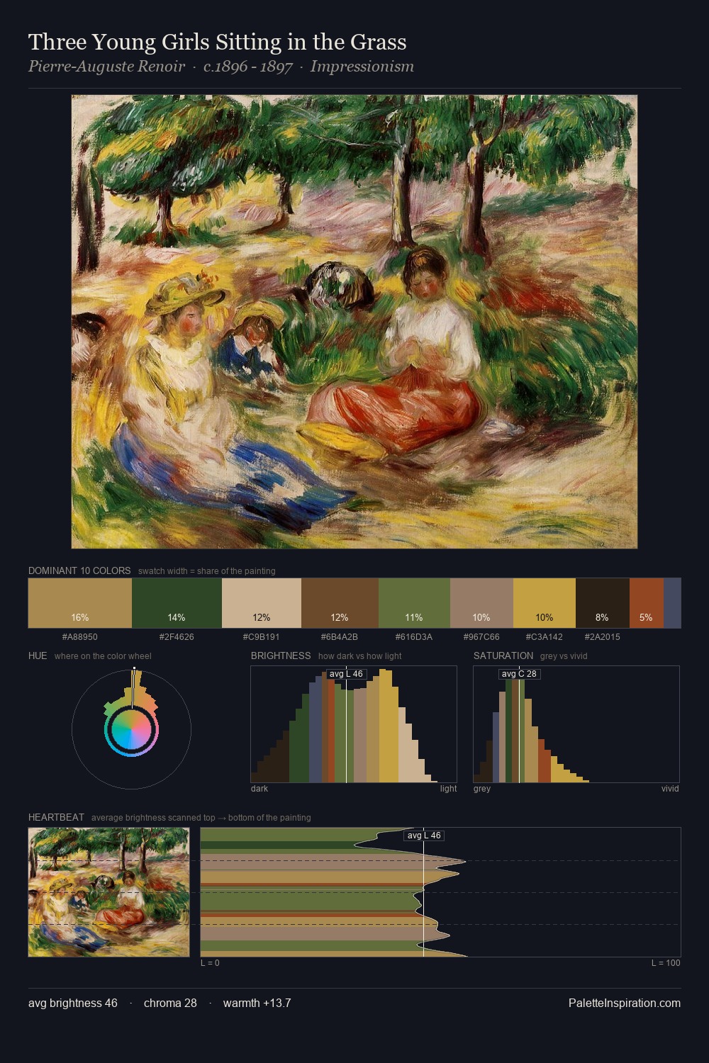
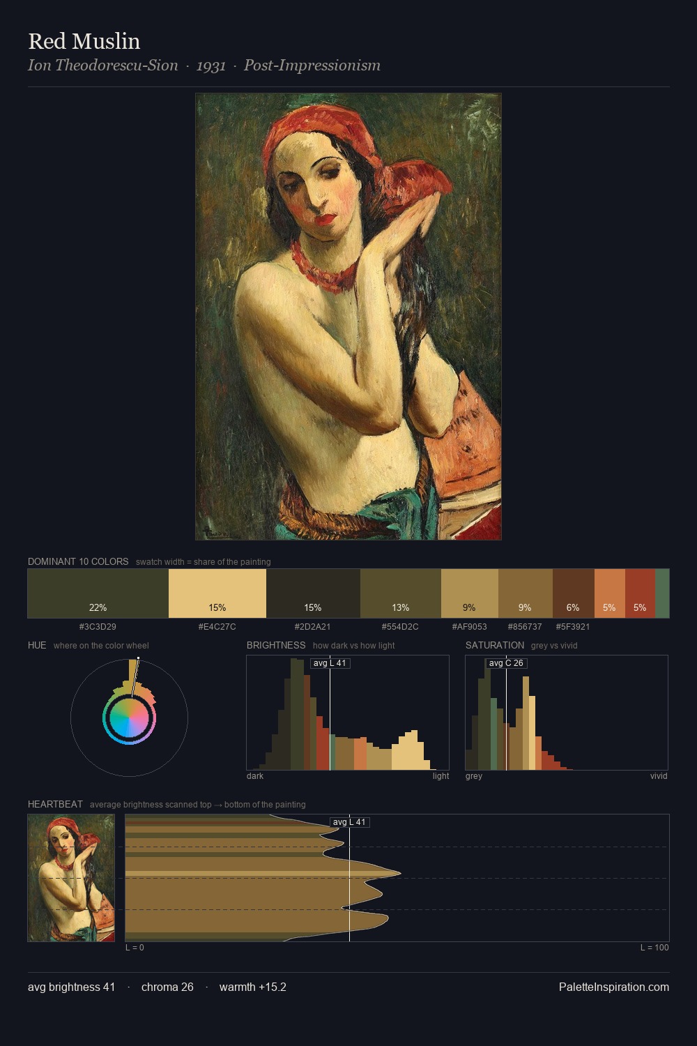
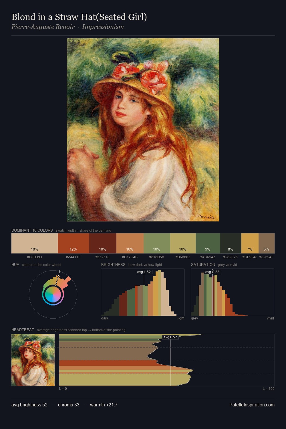
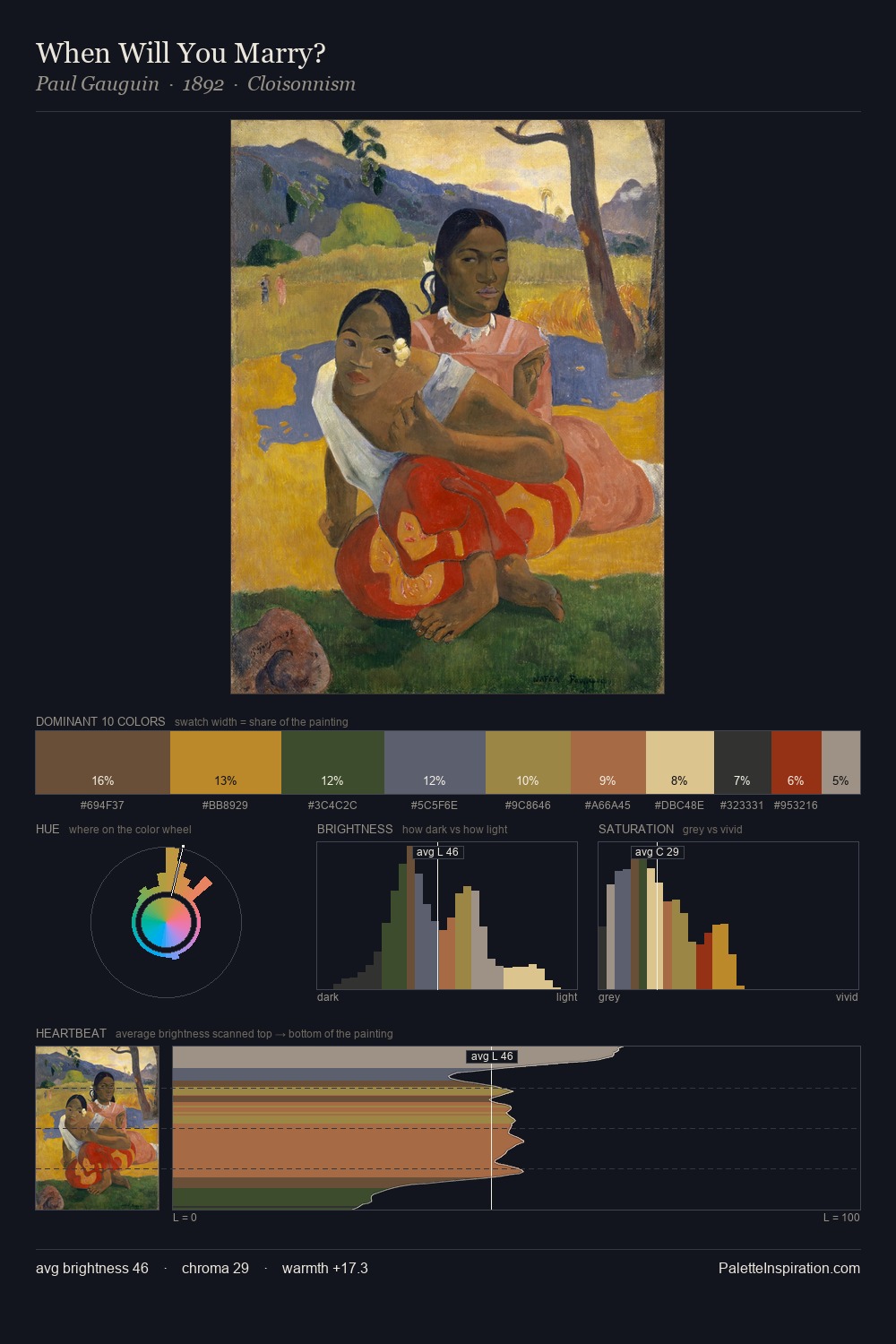
Barbara Longhi occupies the comfortable middle of the value scale, avoiding both extremes to hold the eye in a sustained middle grey. The palette achieves thermal balance - reds and blues, ochres and greens, each holding the other in check. Chroma is held at a comfortable level - distinct colours, but no single hue is allowed to overwhelm. #D6BD88 at 25.0% of the palette: an overwhelming presence that pulls all other colours into its gravitational field. The highest-chroma note - #C17740 - appears at just 5.0%, deployed as a precision accent against the quieter ground. From deepest dark to palest light, the palette traverses 56 units of the value scale - a span that creates natural depth. The palette reads as an Impressionist one - light-biased, chromatically direct, and built on temperature contrast rather than value opposition. The palette is a signature: Barbara Longhi's particular sense of value, warmth, and colour weight made legible.
Example use cases
- food packaging
- leather accessories
- travel & outdoor
- natural cosmetics
- interior design
I Love This!
Copy, export, or download for your project