Balthasar Wigand Palette 4
Gleaming Ivory
Gleaming Bright and polished - high-key, often warm, suggesting reflective or luminous surfaces.
Ivory Warm creamy white - the color of natural ivory, warmer than pure white.

Palette Analysis
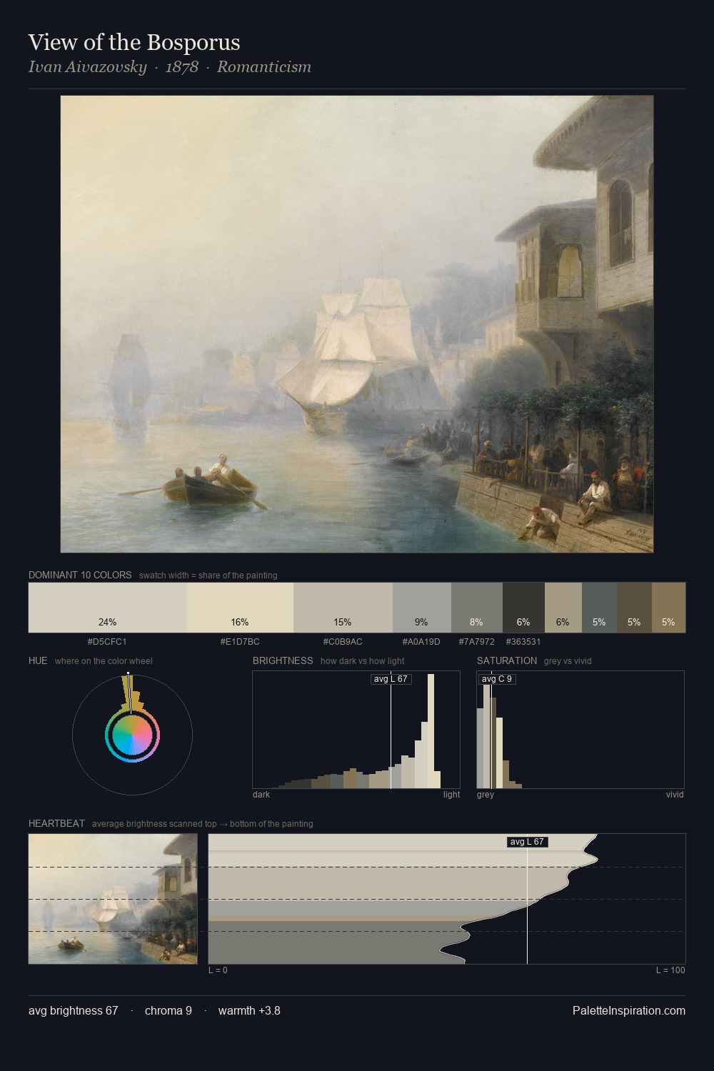
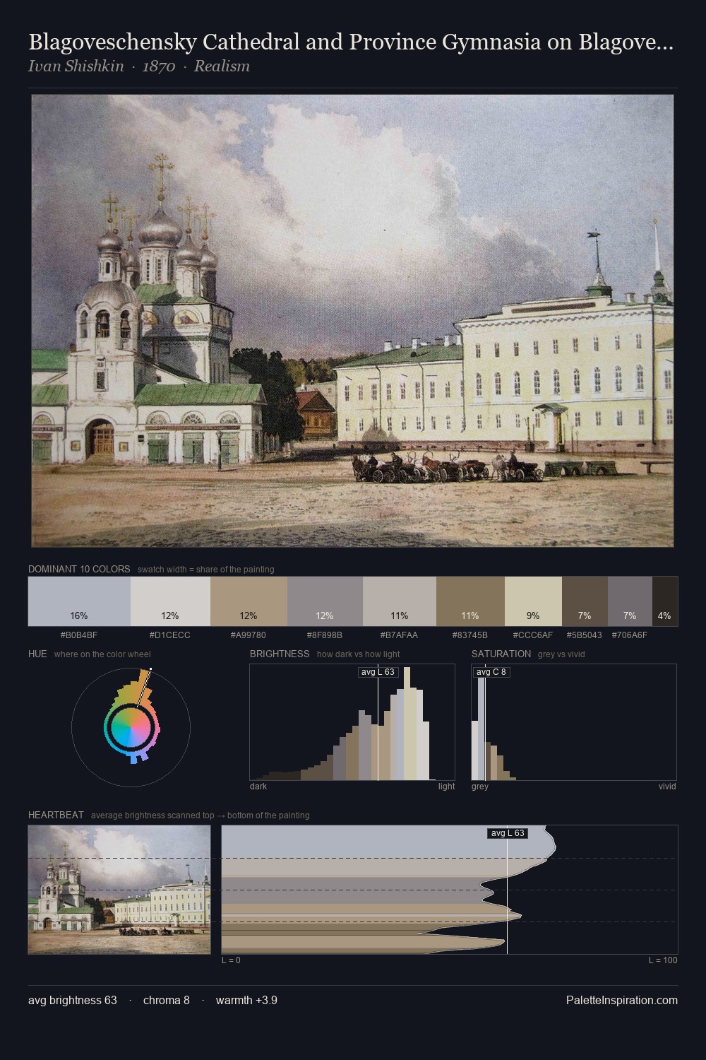
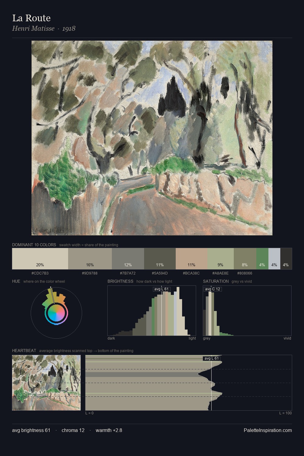
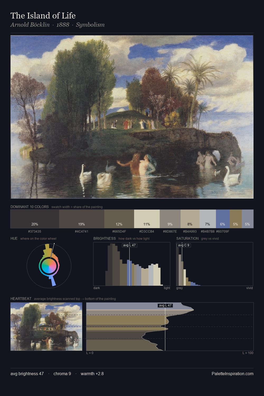
Balthasar Wigand is high-key - luminous, open, and weighted toward light. Temperature is balanced: the palette pits warm earth against cool sky without declaring a winner. The absence of saturated colour is itself an expressive choice: this is a palette of restraint and atmosphere. #B6A893 delivers the chromatic peak at only 12.2% - a small shot of colour with outsized visual impact. Spanning 53 units on the value axis, the palette achieves the balance between tonal flatness and fragmentation. In the context of Balthasar Wigand's full range of palettes, group 4 represents one movement in an ongoing chromatic dialogue.
Example use cases
- florist branding
- event design
- real estate
- jewelry retail
- hospitality branding
I Love This!
Use This Palette
Copy, export, or download for your project
Copy, export, or download for your project
Copy:
Download:
Share: