Arthur Verona Palette 3
Veiled Tawny
Veiled Partially obscured light - mid-dark with a hazy, scrim-filtered quality.
Tawny Warm orange-brown - a traditional term for the color of tanned leather or lion fur.

Palette Analysis
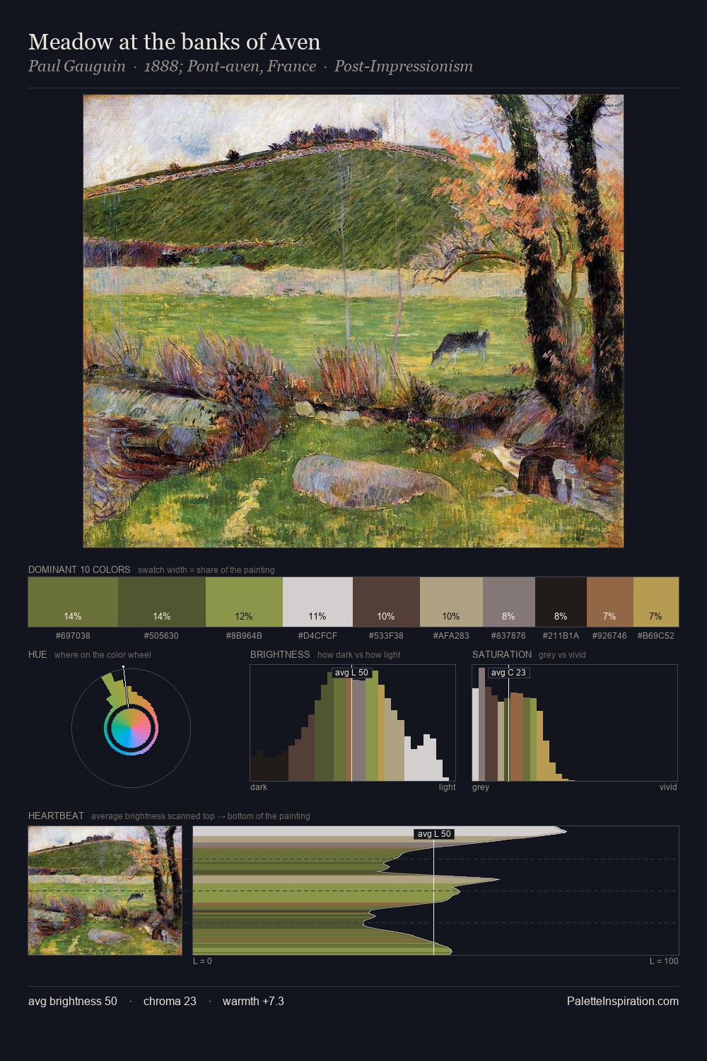
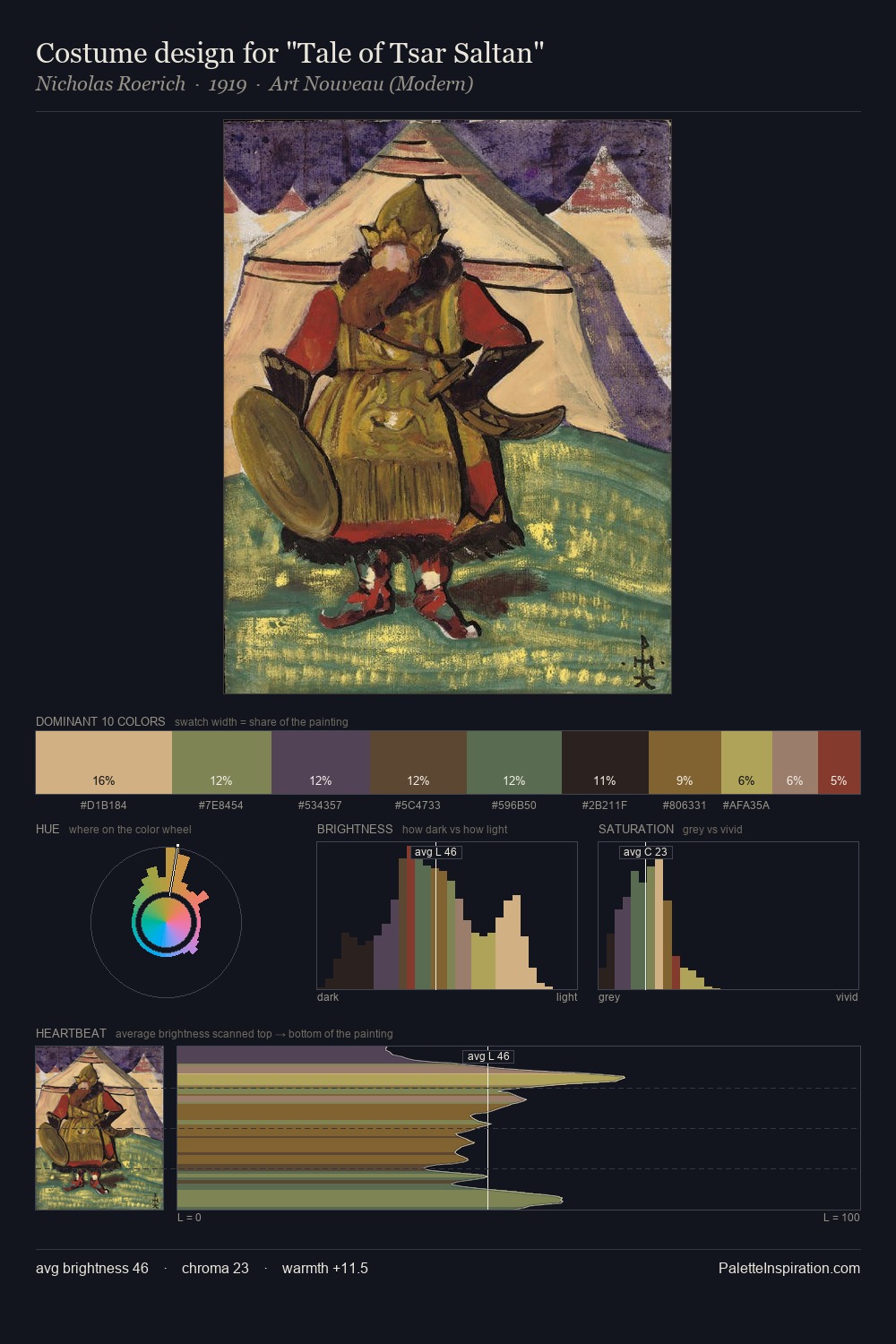
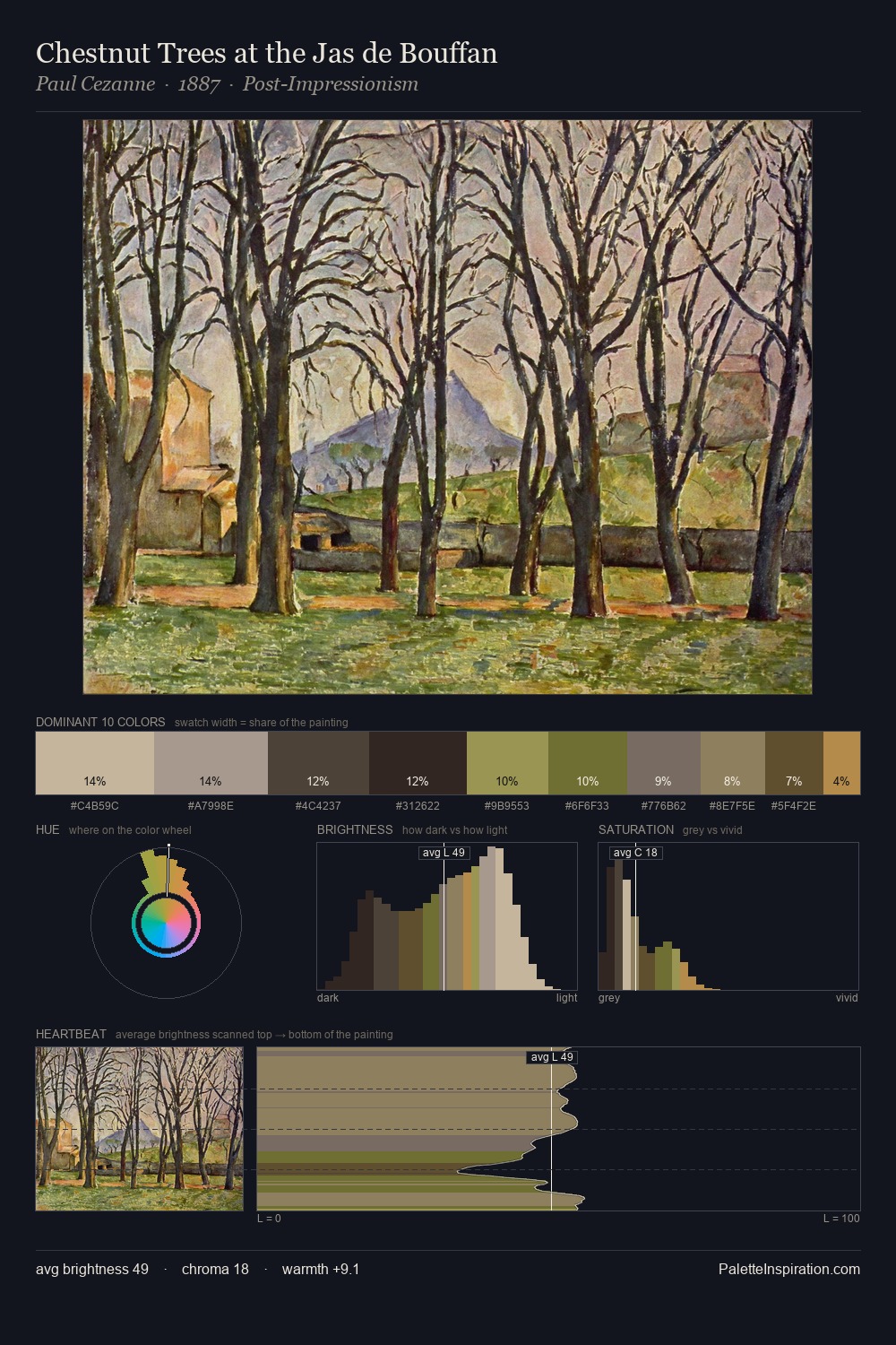
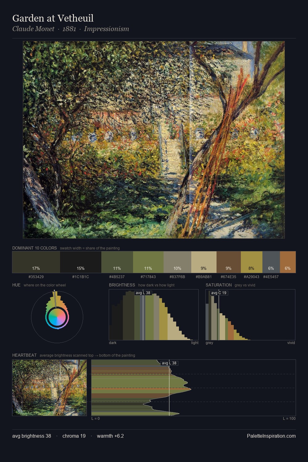
Values in Arthur Verona rest in the mid-range - neither dramatically lit nor steeped in shadow. Arthur Verona balances warm and cool with remarkable evenness, giving the composition its characteristic vibrancy. Chroma hovers near zero; colour declares itself through subtle shifts in hue rather than outright saturation. The highest-chroma note - #627441 - appears at just 7.5%, deployed as a precision accent against the quieter ground. 50 units of value spread create a palette that is varied but unified - contrast in the service of harmony. This is palette 3 of Arthur Verona's sequence - a single chapter in a chromatic story told across many works.
Example use cases
- exhibition design
- foundation branding
- estate management
- art education
- museums & galleries
I Love This!
Use This Palette
Copy, export, or download for your project
Copy, export, or download for your project
Copy:
Download:
Share: