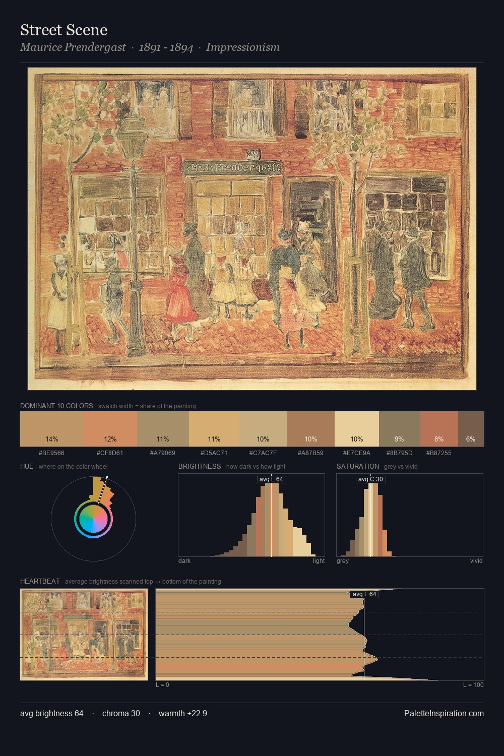
Arthur Rackham Palette 5

Palette Analysis
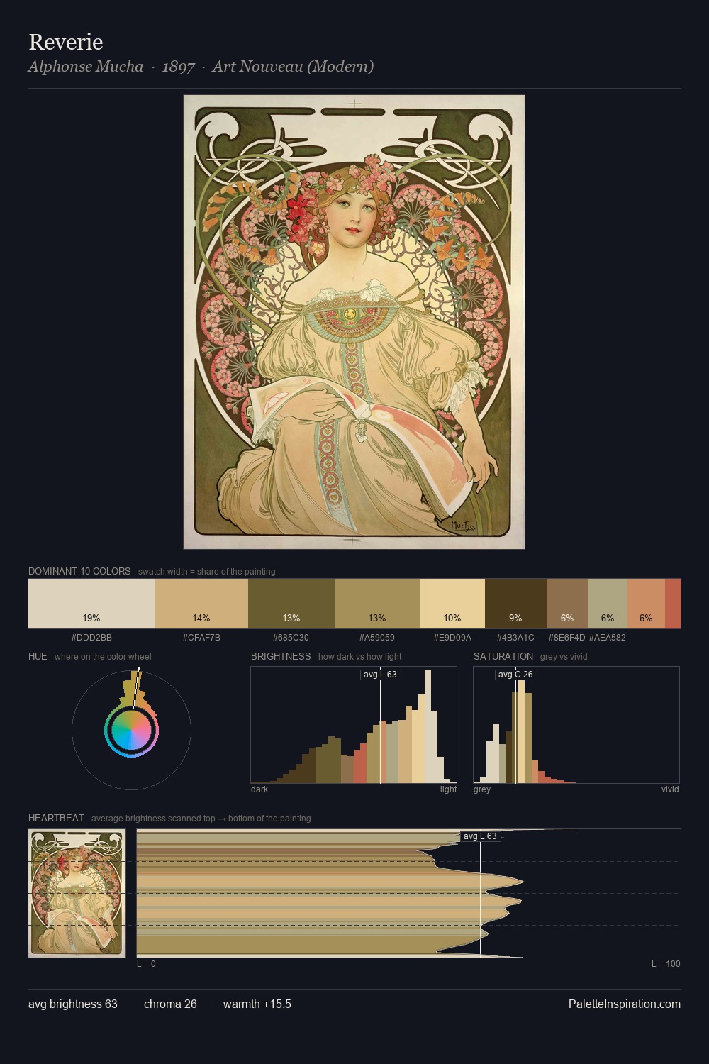
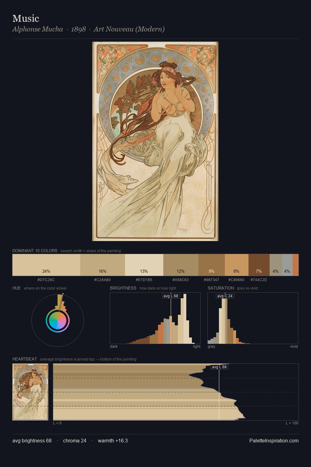
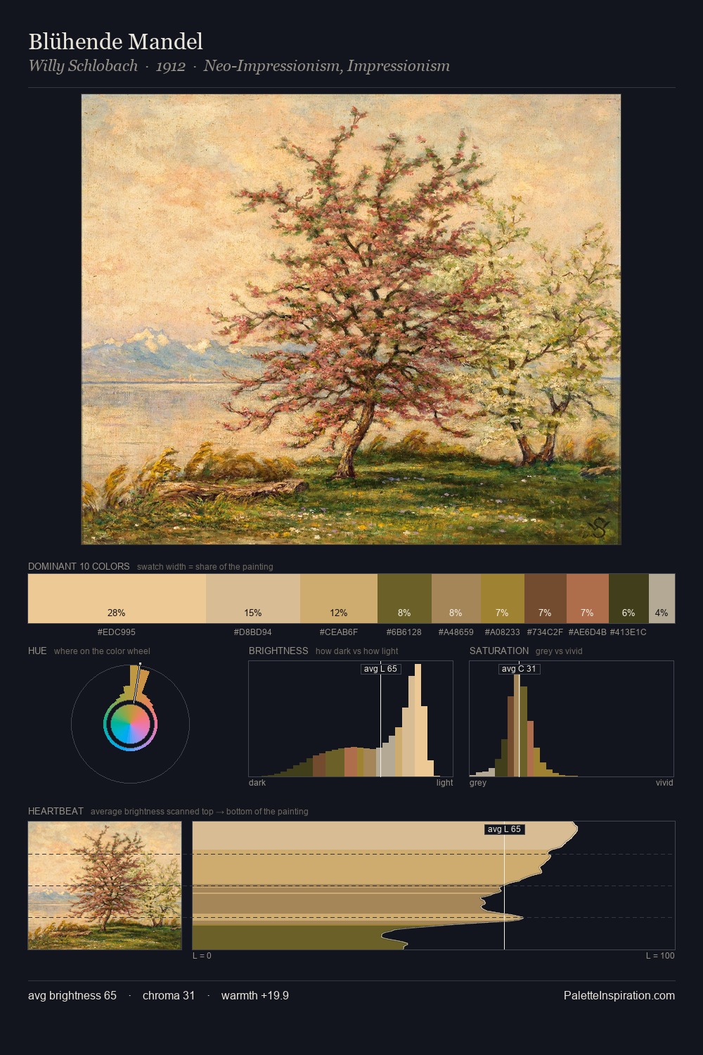
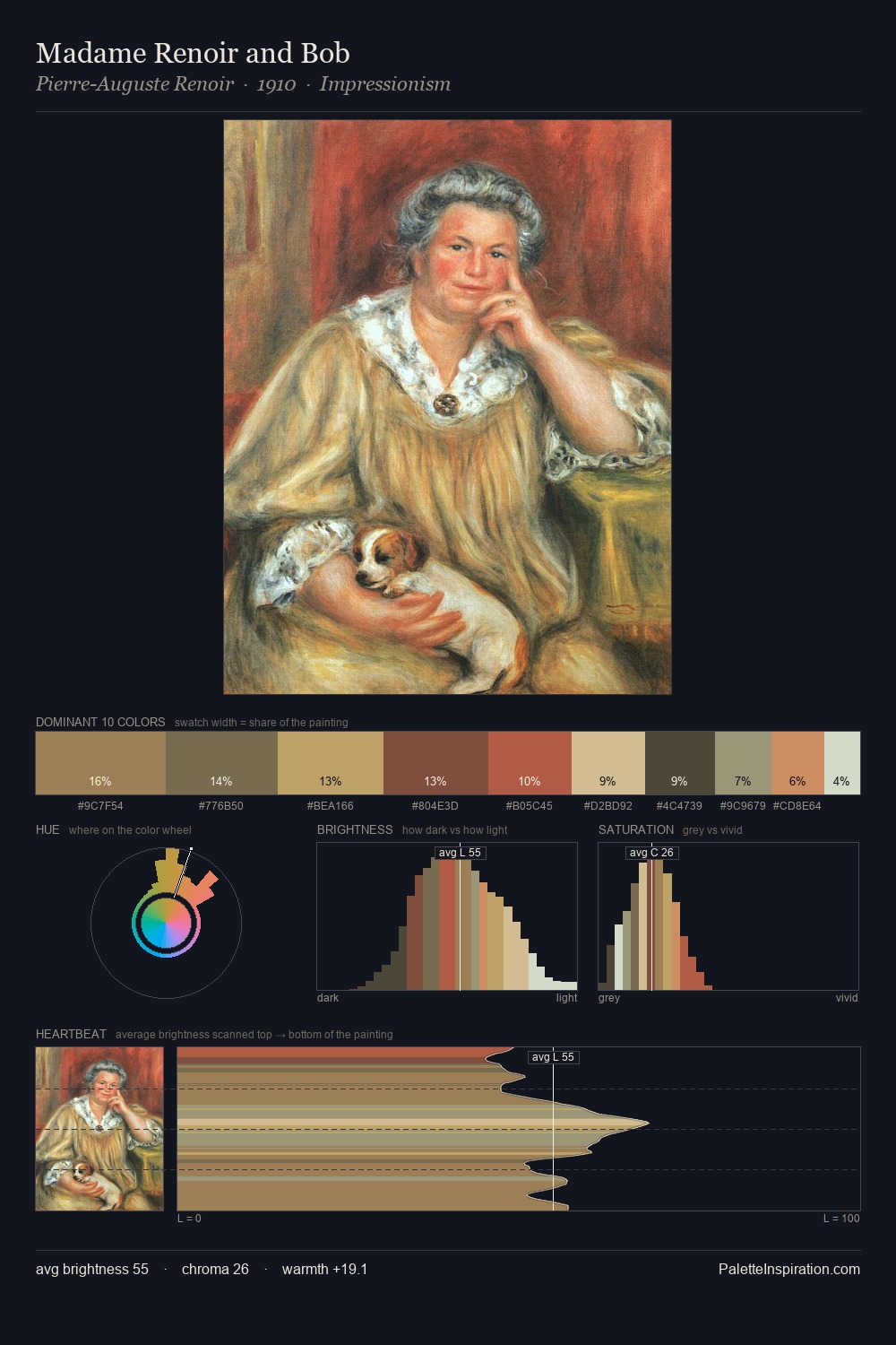
Arthur Rackham is strongly light-biased - shadow is suggested rather than declared. Arthur Rackham balances warm and cool with remarkable evenness, giving the composition its characteristic vibrancy. Chroma is moderate: colours carry enough saturation to be read as colour, but the palette stops well short of garish intensity. Only 9.4% is devoted to #D1A76D, yet that small allocation delivers the palette's entire chromatic tension. At 36 units across the value scale, the palette keeps contrast readable without letting it dominate. Together these qualities point to the open-air Impressionist method: recording light rather than local colour. This is palette 5 of Arthur Rackham's sequence - a single chapter in a chromatic story told across many works.
Example use cases
- ceramics & pottery
- boutique hospitality
- menswear
- heritage food brands
- craft & artisan brands
I Love This!
Copy, export, or download for your project