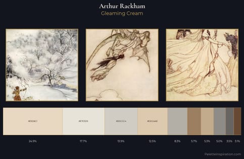
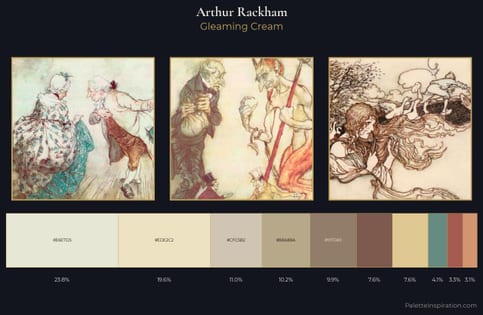
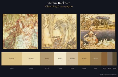
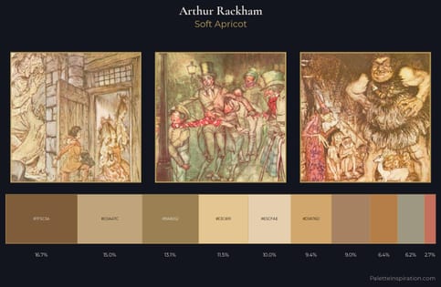
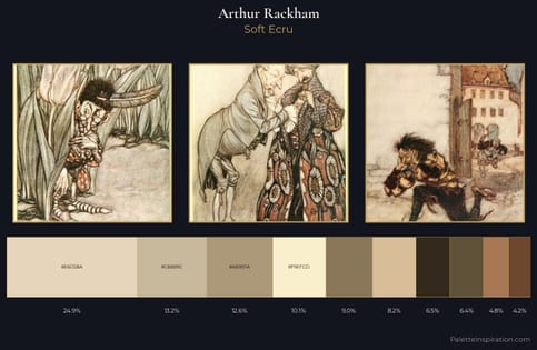
Arthur Rackham Palette 3
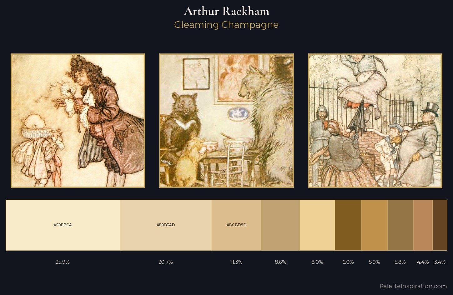
Palette Analysis
Arthur Rackham is high in key: pale, luminous, and filled with optical air. Arthur Rackham tilts toward cool - blues and silver-greys carry the structural weight. Colours are neither washed out nor blazing; they occupy the productive middle ground of the chroma scale. At 26.0%, #F8EBCA functions less as a colour accent and more as a complete atmospheric environment. The saturated accent, #815C20, registers at 5.9% - sparse enough to feel like a deliberate surprise. The value range of 52 units sits in the comfortable middle: enough depth, enough light, neither extreme. The mid-to-high key, cool bias, and moderate chroma point to outdoor observation - sky and diffused daylight as the dominant light source. In the context of Arthur Rackham's full range of palettes, group 3 represents one movement in an ongoing chromatic dialogue.
Example use cases
- design agencies
- product brands
- e-commerce
- editorial sites
- publishing
I Love This!
Copy, export, or download for your project