Arthur Beecher Carles Palette 3

Palette Analysis
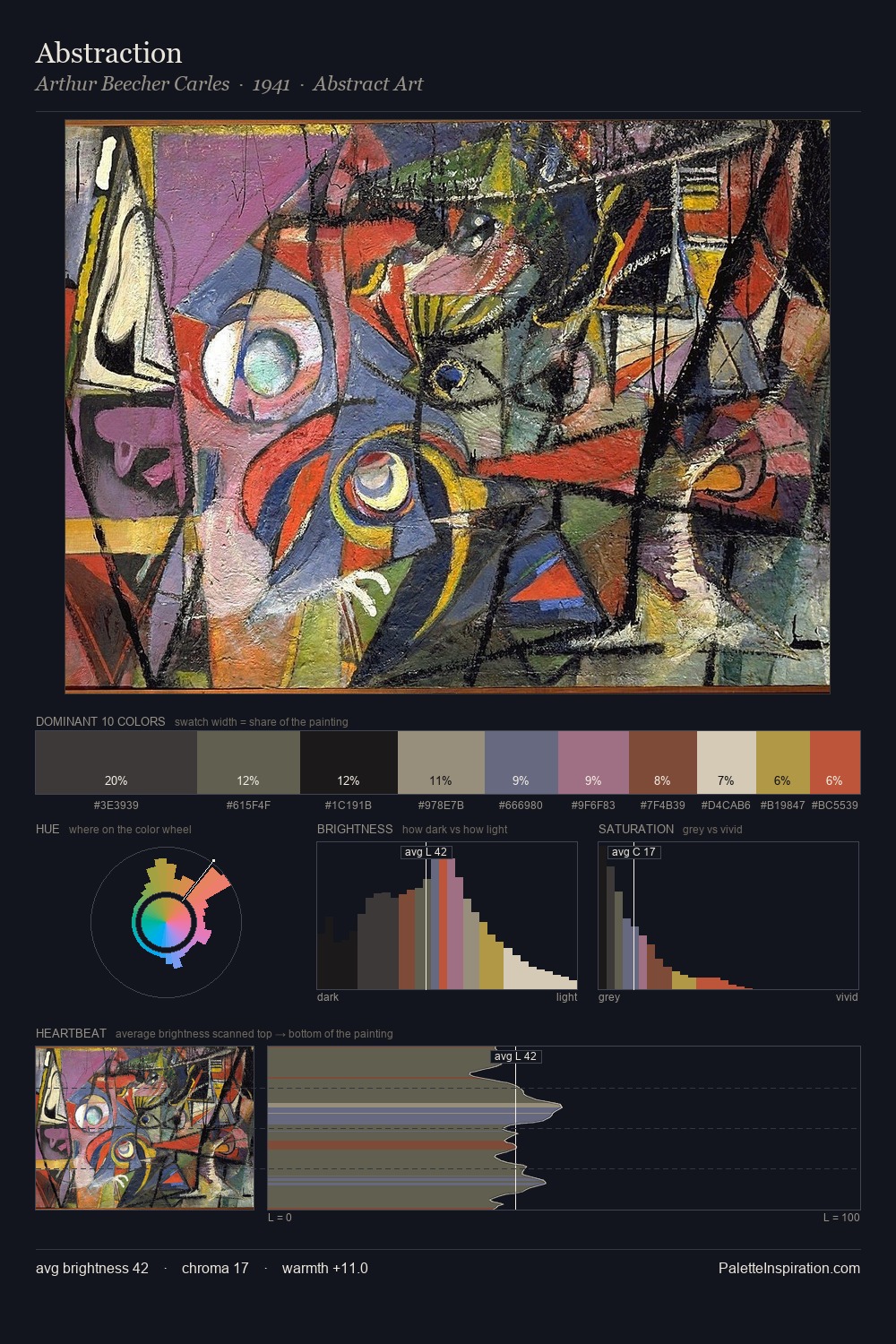
Arthur Beecher Carles distributes its values across the middle register, creating harmony without high contrast. Arthur Beecher Carles builds on cool foundations: the palette favours the blue-cyan-green arc. Chroma hovers near zero; colour declares itself through subtle shifts in hue rather than outright saturation. At 5.9%, #B77C66 carries the palette's sharpest chromatic charge: an accent that earns its place precisely because it is withheld. 52 units of value spread create a palette that is varied but unified - contrast in the service of harmony. The mid-to-high key, cool bias, and moderate chroma point to outdoor observation - sky and diffused daylight as the dominant light source. Palette 3 sits within the larger chromatic argument that Arthur Beecher Carles's complete body of work advances.
Example use cases
- exhibition design
- foundation branding
- estate management
- art education
- museums & galleries
I Love This!
Copy, export, or download for your project