Art Nouveau Palette 16
Muted Apricot
Muted Deliberately desaturated - chroma pulled toward gray, the restraint of tonal painting.
Apricot Soft warm orange - peach-adjacent, the color of ripe stone fruit.

Palette Analysis
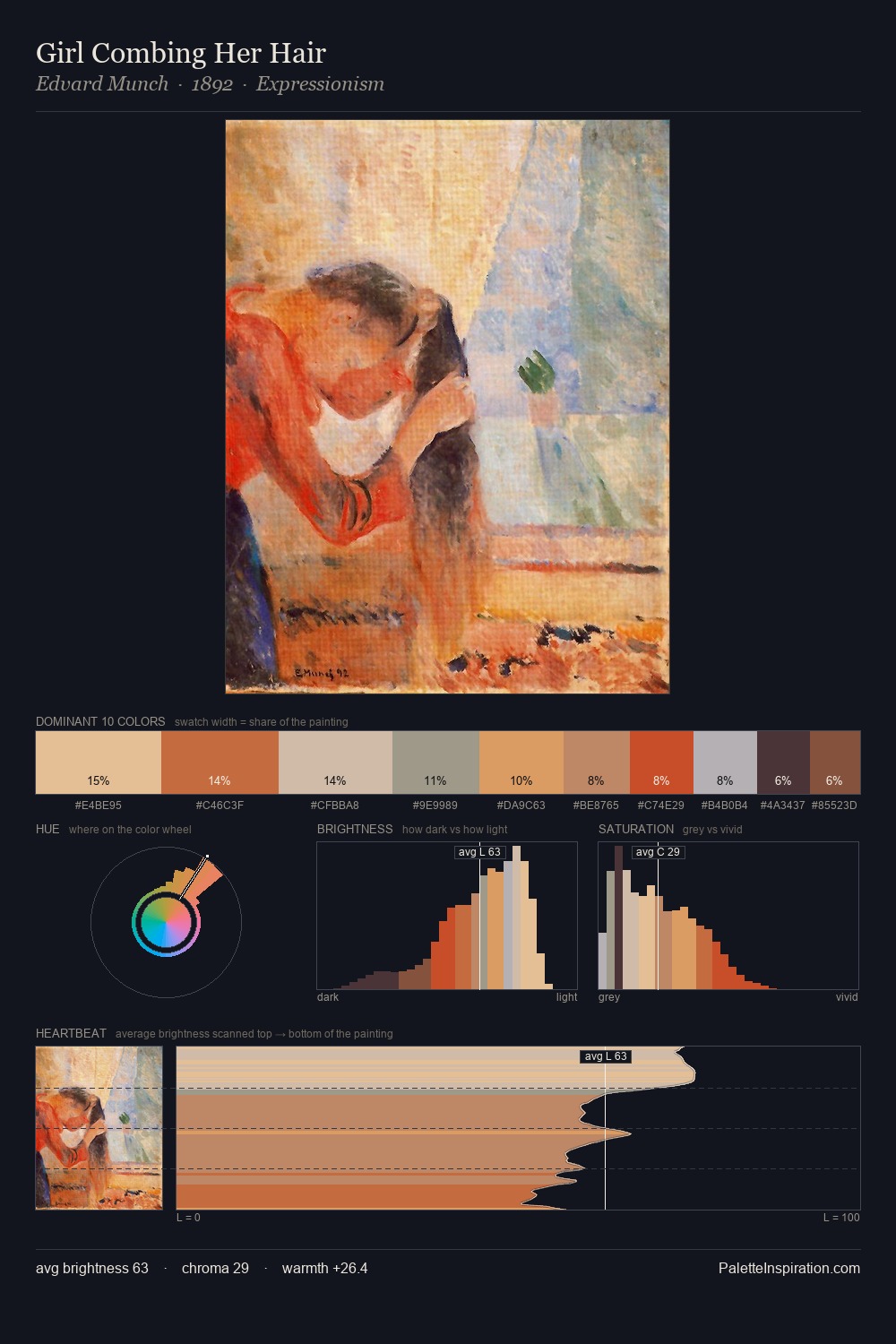
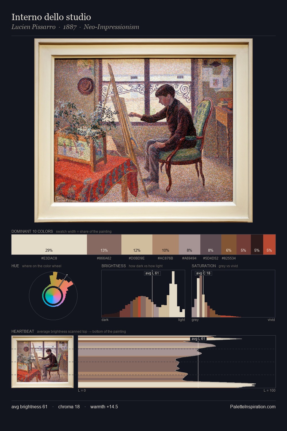
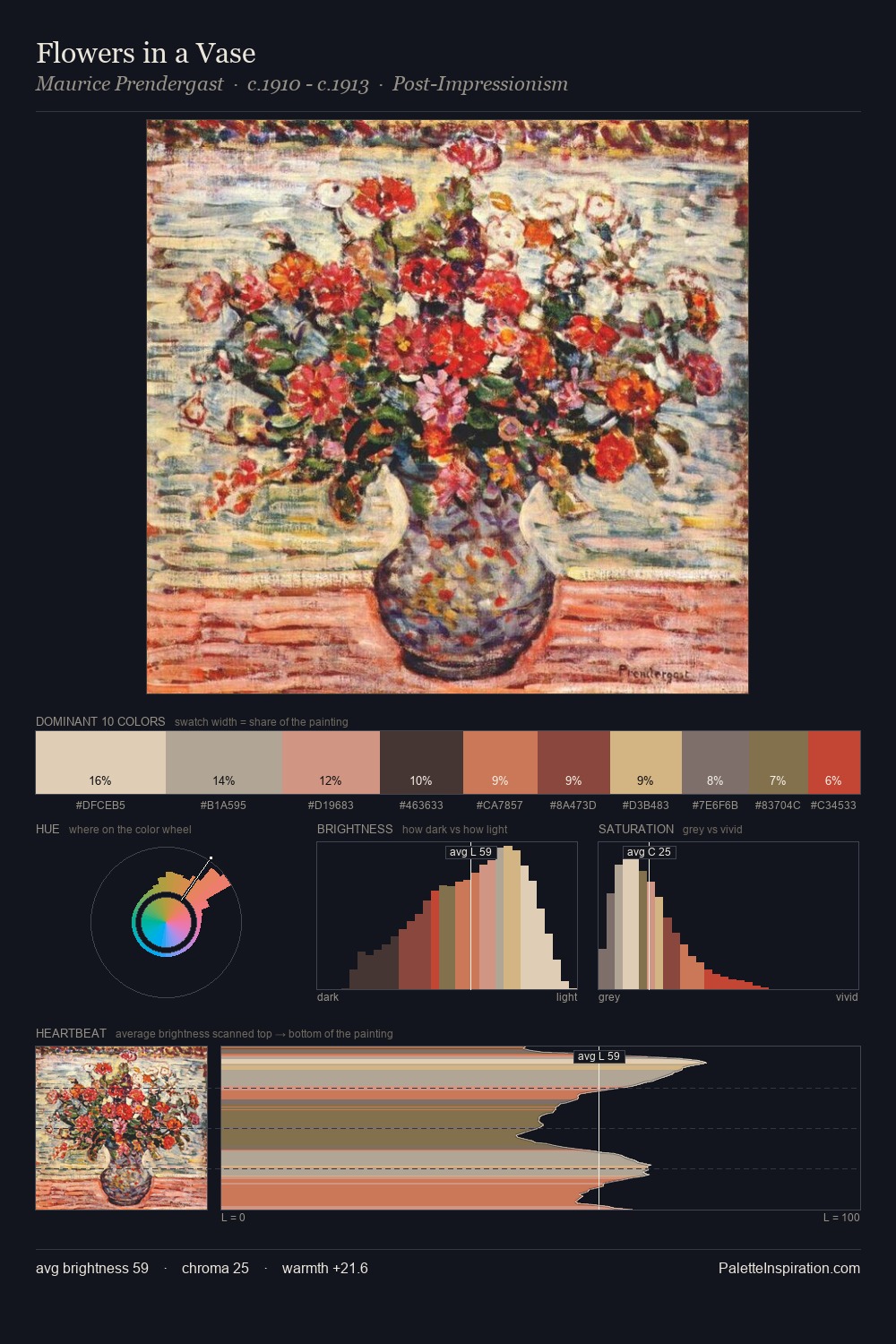
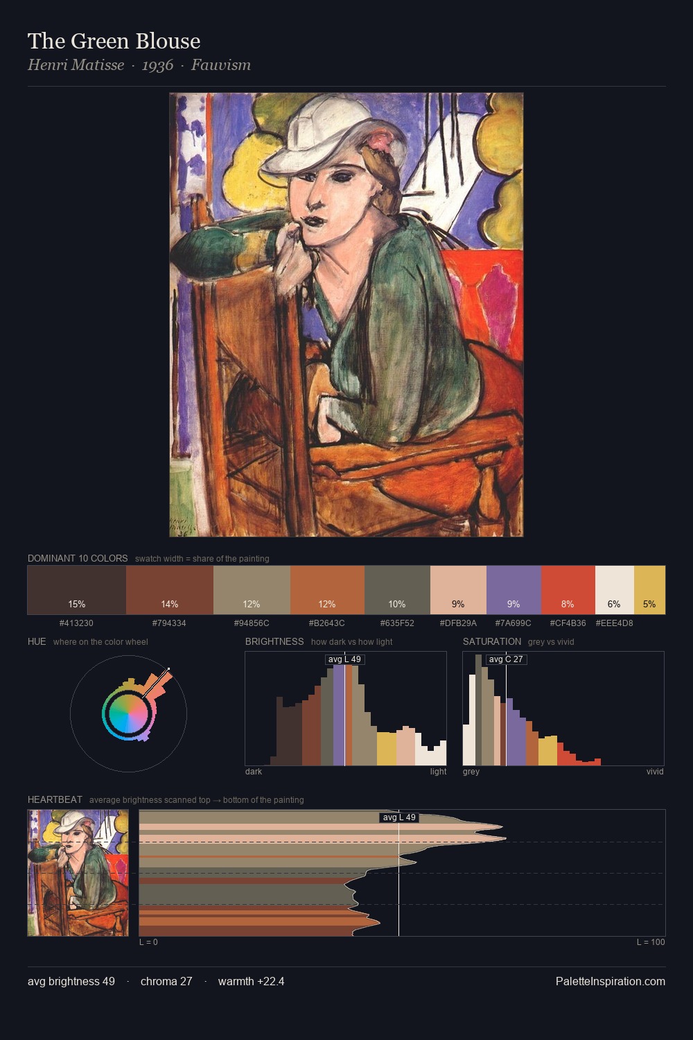
Values in Art Nouveau rest in the mid-range - neither dramatically lit nor steeped in shadow. The palette orchestrates warmth above all else - reds, ambers, and siennas take the lead. Chroma is moderate: colours carry enough saturation to be read as colour, but the palette stops well short of garish intensity. At 7.2%, #D2AF9E carries the palette's sharpest chromatic charge: an accent that earns its place precisely because it is withheld. 49 units of value spread create a palette that is varied but unified - contrast in the service of harmony.
Example use cases
- publishing
- corporate identity
- consumer apps
- hospitality
- design agencies
I Love This!
Use This Palette
Copy, export, or download for your project
Copy, export, or download for your project
Copy:
Download:
Share: