Art Deco Master Palette

Palette Analysis
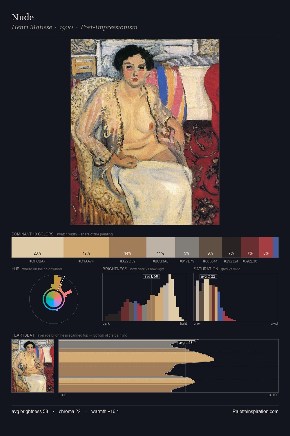
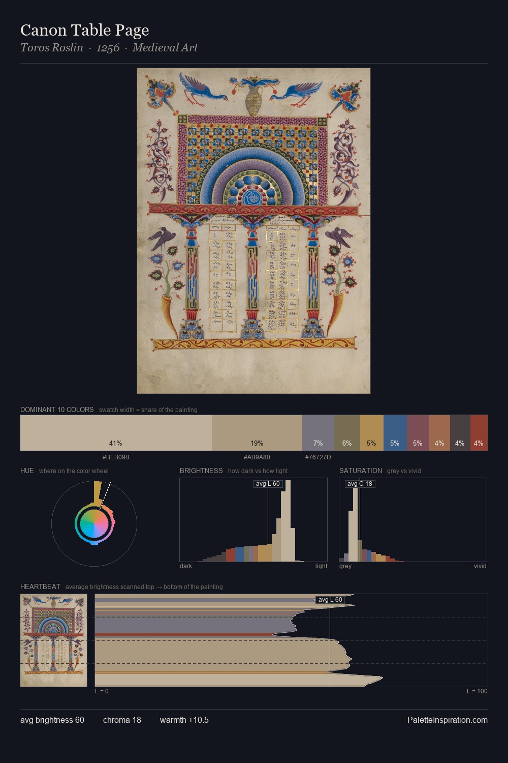
What unites the Art Deco movement is as much chromatic as stylistic; this palette traces that unspoken agreement. Values in Art Deco rest in the mid-range - neither dramatically lit nor steeped in shadow. Blues and teal-greys govern the palette, lending it an aquatic or atmospheric quality. All colours lean toward grey, building depth through value rather than colour punch. #8C1110 delivers the chromatic peak at only 2.1% - a small shot of colour with outsized visual impact. Value range is moderate at 52 units - enough contrast for legibility, not so much as to fragment the tonal unity. High luminosity and cool temperature suggest the plein-air condition: unfiltered daylight and open sky. Any work aspiring to the Art Deco sensibility would find reliable footing in these values.
Example use cases
- ceramics & pottery
- boutique hospitality
- menswear
- heritage food brands
- craft & artisan brands
I Love This!
Copy, export, or download for your project