Art Deco Palette 6
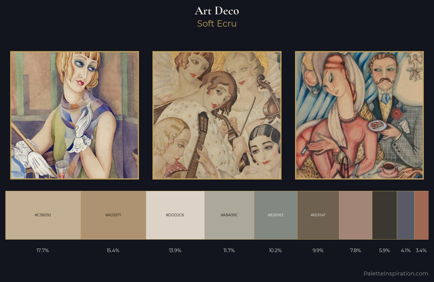
Soft Ecru
Soft Low-contrast, gentle chroma - mid-key values and low saturation, approachable and calm.
Ecru Unbleached linen - warm mid-neutral, slightly grayed, raw and natural.
Palette Analysis
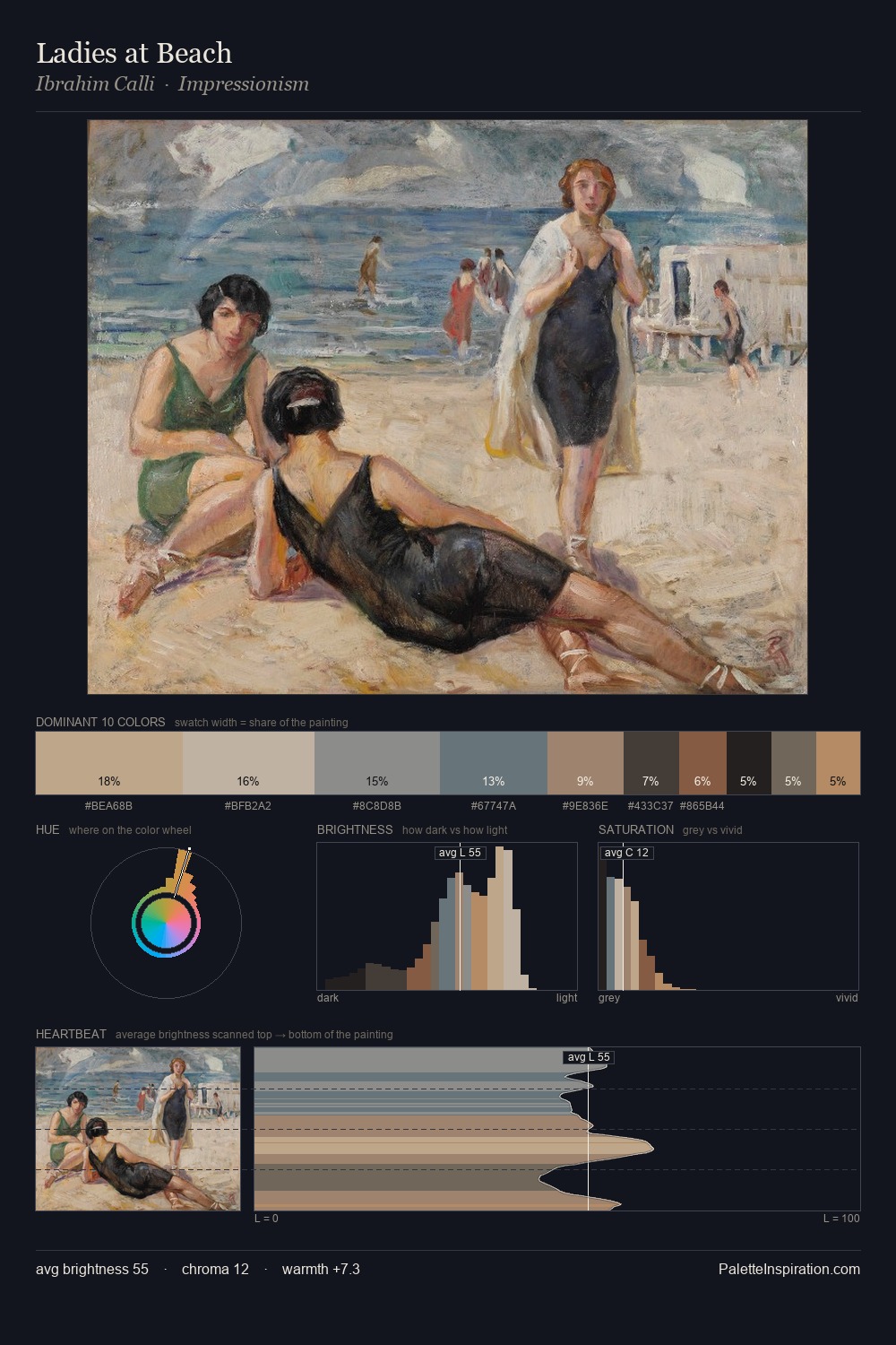
Art Deco is strongly light-biased - shadow is suggested rather than declared. Blues and teal-greys govern the palette, lending it an aquatic or atmospheric quality. Saturation is deliberately withheld - the beauty here lies in the near-monochromatic gradations rather than colour difference. The saturated accent, #A06752, registers at 3.4% - sparse enough to feel like a deliberate surprise. Spanning 53 units on the value axis, the palette achieves the balance between tonal flatness and fragmentation. High luminosity and cool temperature suggest the plein-air condition: unfiltered daylight and open sky.
Example use cases
- archival print
- university identity
- rare books
- cultural institutions
- nonprofit identity
I Love This!
Use This Palette
Copy, export, or download for your project
Copy, export, or download for your project
Copy:
Download:
Share: