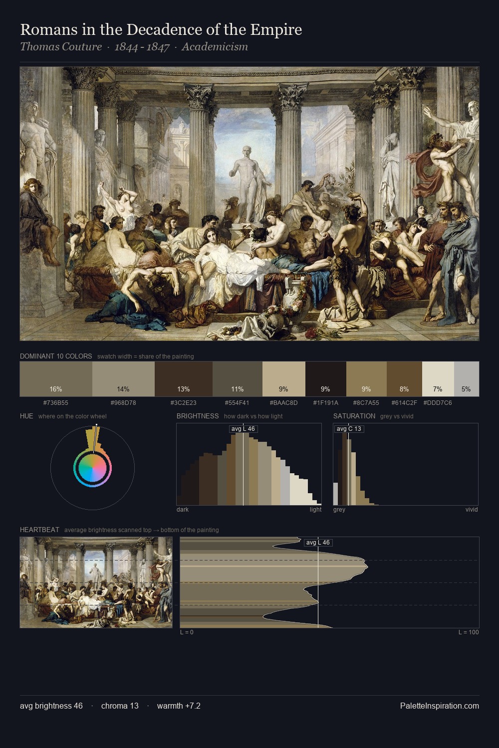
Art Deco Palette 5
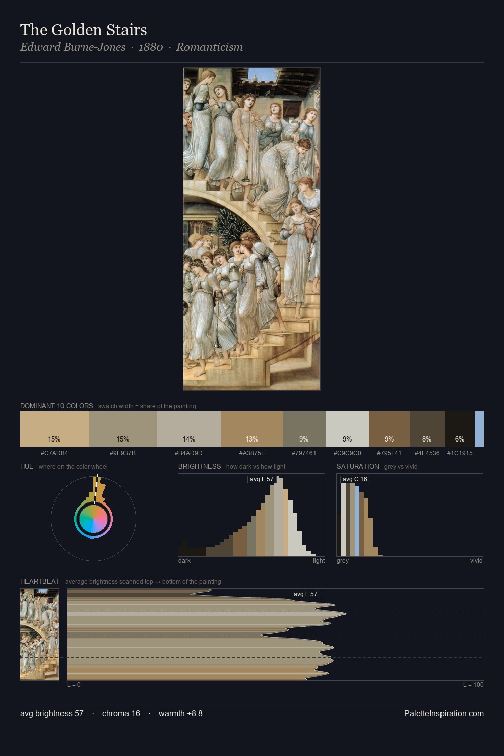
Soft Ivory
Soft Low-contrast, gentle chroma - mid-key values and low saturation, approachable and calm.
Ivory Warm creamy white - the color of natural ivory, warmer than pure white.

Palette Analysis
Art Deco is high in key: pale, luminous, and filled with optical air. Cool tones set the register here - the blues and greens easily outweigh any warm accents. Saturation is deliberately withheld - the beauty here lies in the near-monochromatic gradations rather than colour difference. #957956 delivers the chromatic peak at only 6.5% - a small shot of colour with outsized visual impact. At 64 units of value range, the palette has the tonal breadth to sustain complex spatial readings. The mid-to-high key, cool bias, and moderate chroma point to outdoor observation - sky and diffused daylight as the dominant light source.
Example use cases
- exhibition design
- foundation branding
- estate management
- art education
- museums & galleries
I Love This!
Use This Palette
Copy, export, or download for your project
Copy, export, or download for your project
Copy:
Download:
Share: