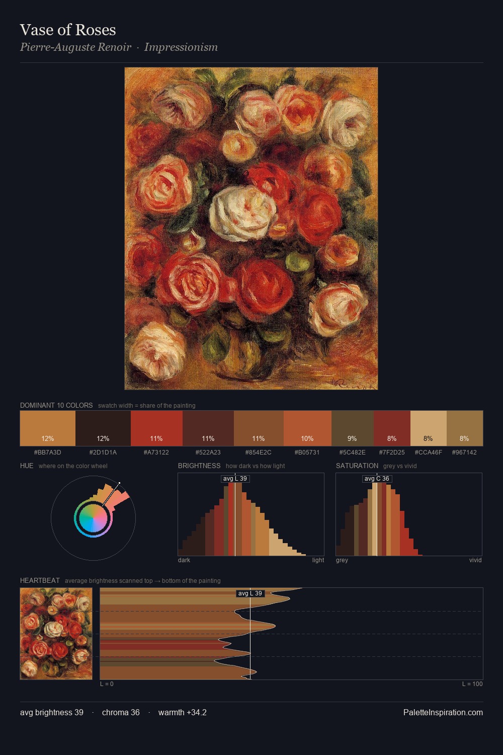
Art Deco Palette 10
Shadowed Rust
Shadowed Low-key - values weighted toward shadow, the palette of dim interiors and overcast skies.
Rust Oxidized red-brown - the color of iron corrosion, warm and earthy-red.

Palette Analysis
Art Deco distributes its values across the middle register, creating harmony without high contrast. Warm hues command this palette; it favours the reds, oranges, and yellows of firelight and earth. Mid-saturation across the board: the palette has colour character without chromatic excess. The most saturated colour, #A8110C, covers 50.4% of the surface: too much to call an accent, too strong to ignore. 52 units of value spread create a palette that is varied but unified - contrast in the service of harmony.
Example use cases
- theater design
- jewelry brands
- tobacco-adjacent retail
- event branding
- film & entertainment
I Love This!
Use This Palette
Copy, export, or download for your project
Copy, export, or download for your project
Copy:
Download:
Share: