Arshak Fetvadjian Master Palette

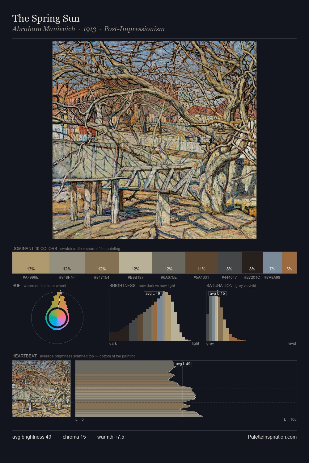
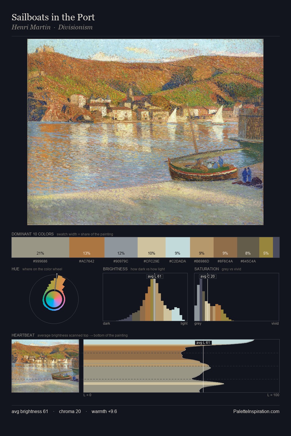
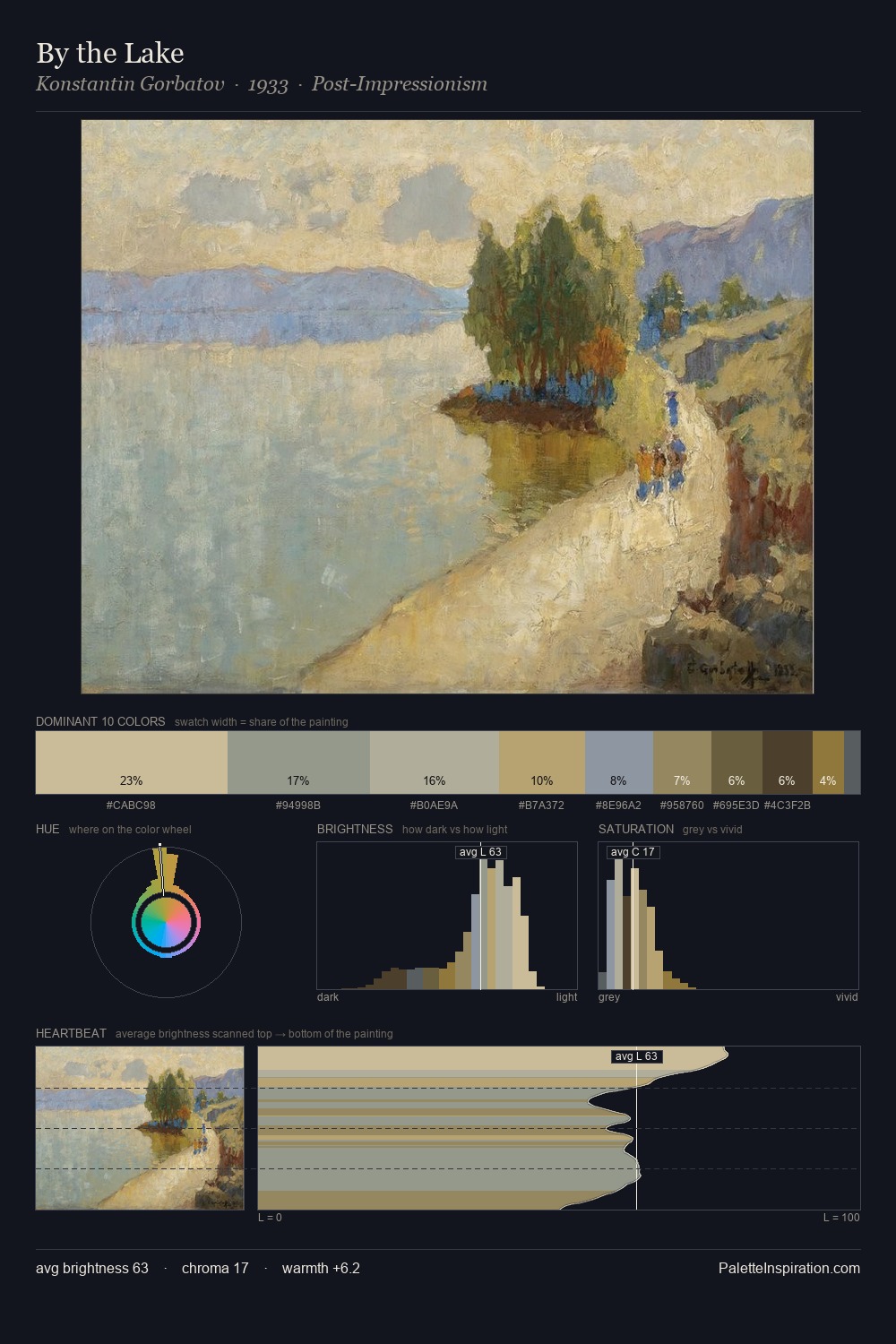
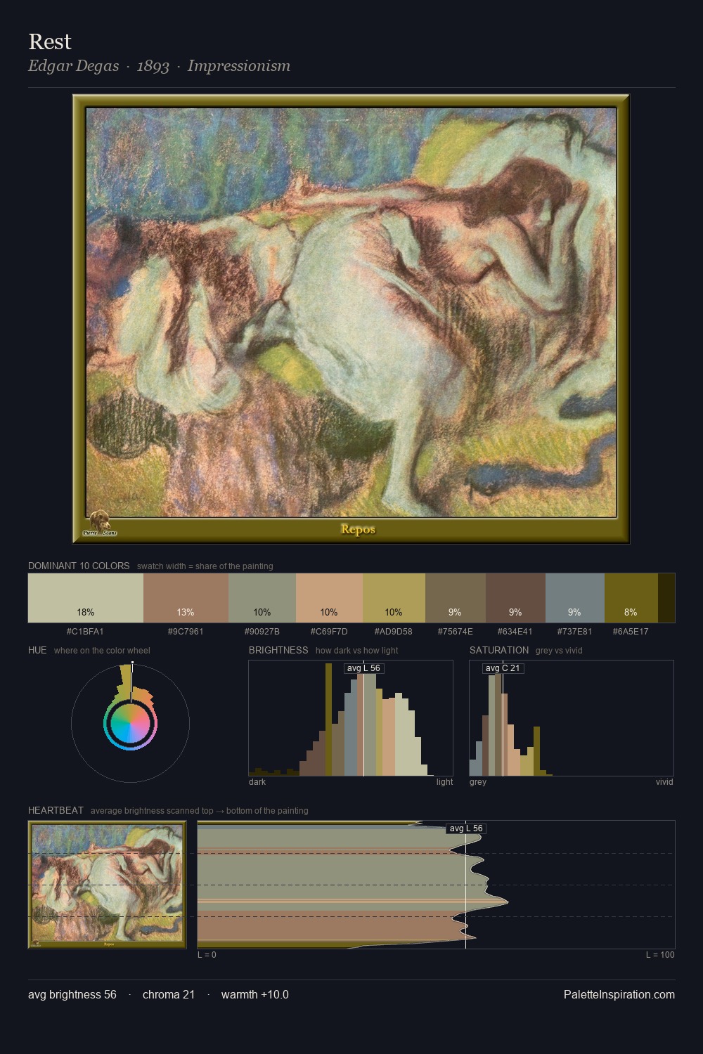
Palette Analysis
Light floods Arshak Fetvadjian; the palette keeps values pale and airy across its range. Cool hues prevail: blues, greens, and greys anchor the palette's emotional temperature. Saturation is deliberately withheld - the beauty here lies in the near-monochromatic gradations rather than colour difference. The most saturated colour, #886B4B, covers 3.5% of the surface: too much to call an accent, too strong to ignore. Spanning 37 units on the value axis, the palette achieves the balance between tonal flatness and fragmentation. The palette has the character of outdoor light: cool, mid-bright, with colour rendered faithfully rather than expressively. Taken together, these qualities constitute Arshak Fetvadjian's chromatic voice - distinctive enough to be read across an entire body of work.
Example use cases
- ceramics & pottery
- boutique hospitality
- menswear
- heritage food brands
- craft & artisan brands
I Love This!
Copy, export, or download for your project