Archibald Thorburn Palette 7
Penumbral Caramel
Penumbral Partial shadow - the transitional zone between light and full dark, soft-edged.
Caramel Warm mid-brown - the color of cooked sugar, smooth and amber-toned.

Palette Analysis
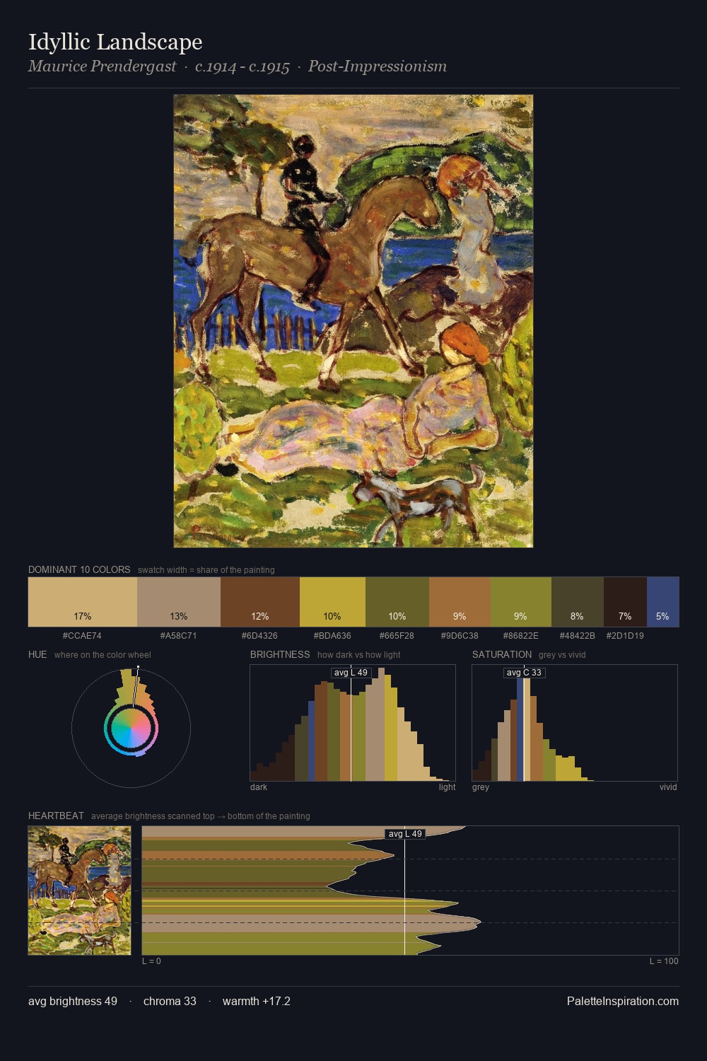
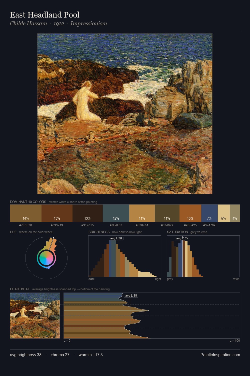
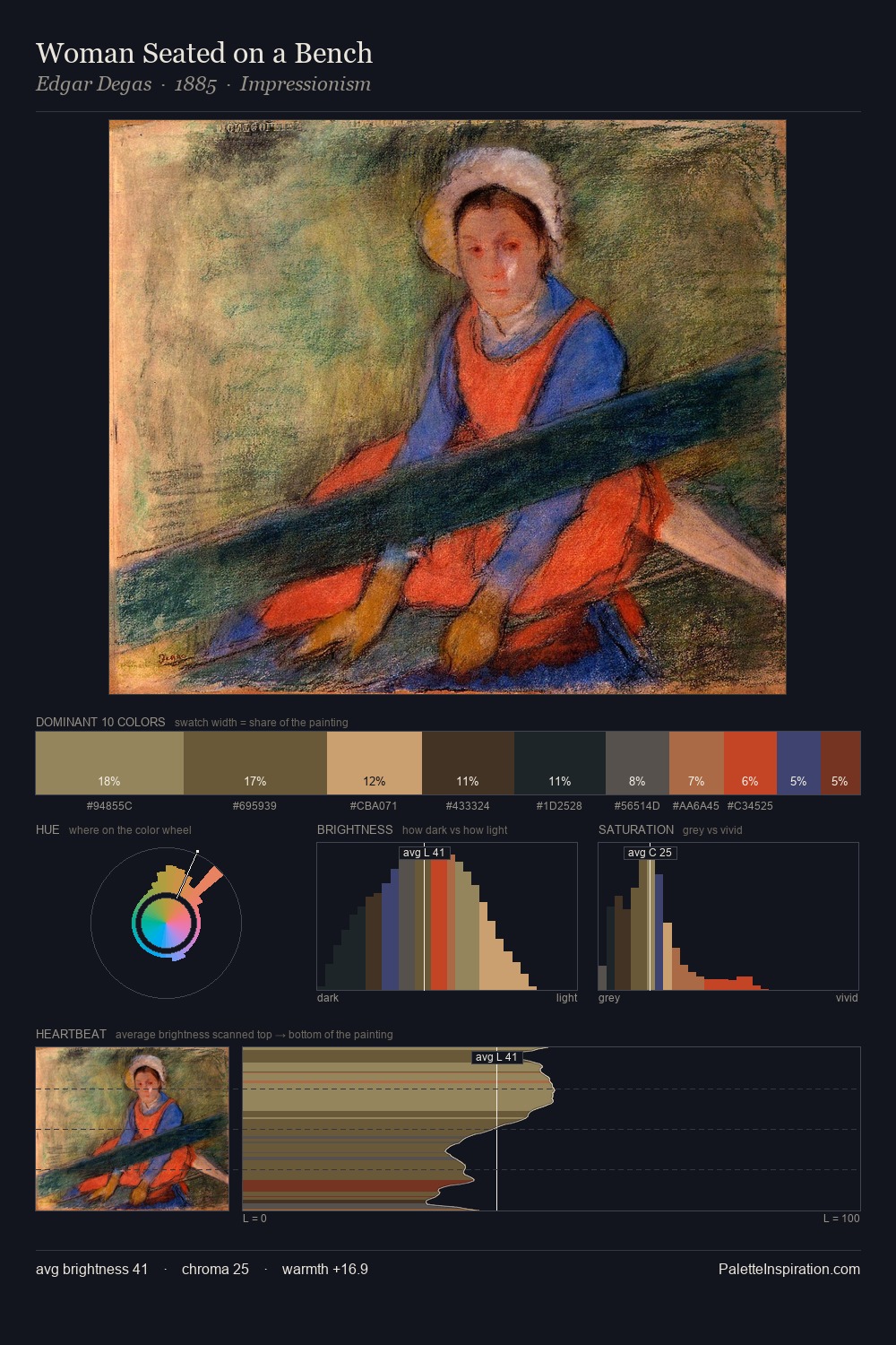
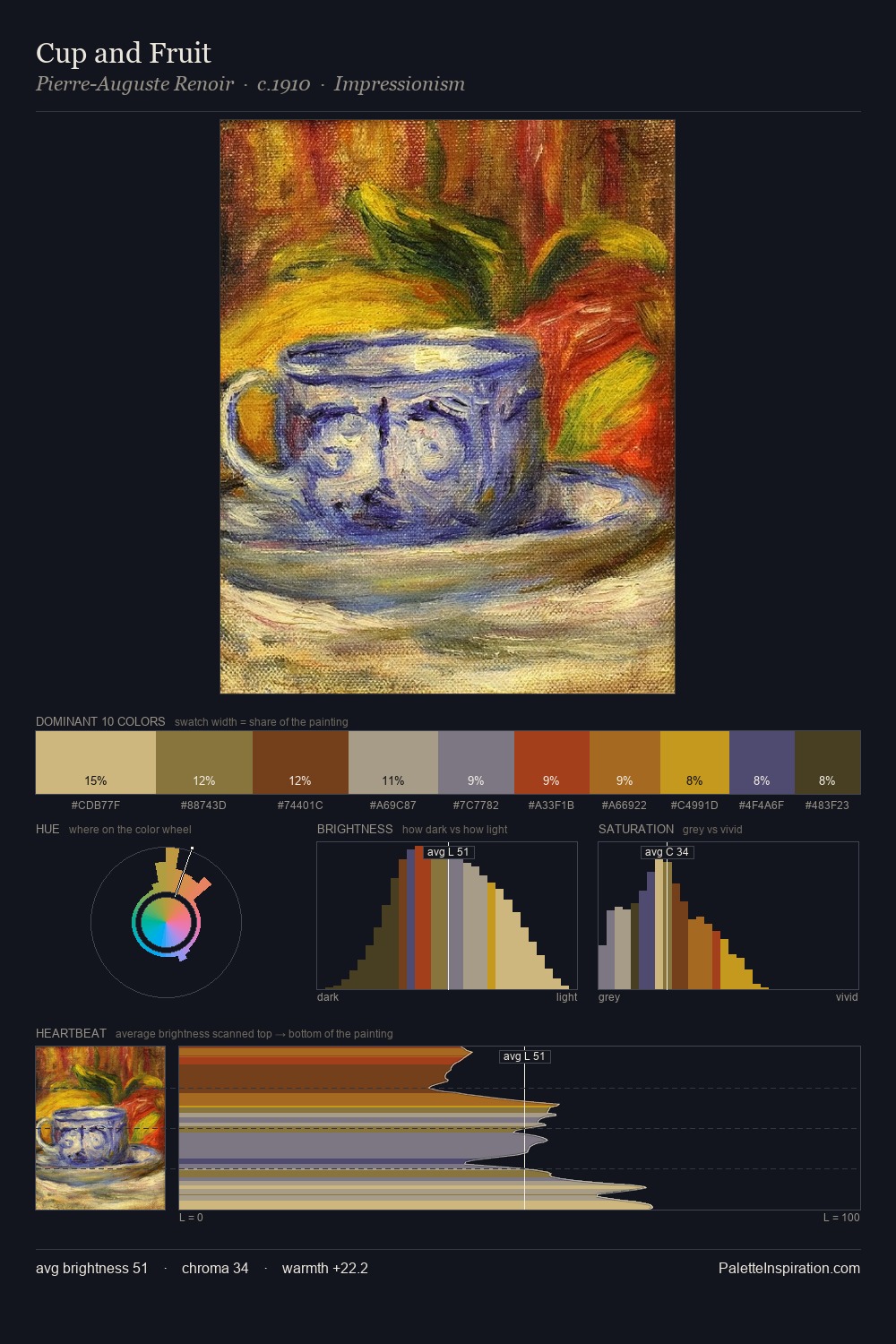
Archibald Thorburn distributes its values across the middle register, creating harmony without high contrast. Neither warm nor cool has the upper hand here; the equilibrium between the two generates the palette's visual energy. All colours lean toward grey, building depth through value rather than colour punch. The most saturated colour, #C7AA79, is reserved to 7.8% of the surface, where it acts as a focal punctuation. Value range is moderate at 44 units - enough contrast for legibility, not so much as to fragment the tonal unity. In the context of Archibald Thorburn's full range of palettes, group 7 represents one movement in an ongoing chromatic dialogue.
Example use cases
- theater design
- jewelry brands
- tobacco-adjacent retail
- event branding
- film & entertainment
I Love This!
Use This Palette
Copy, export, or download for your project
Copy, export, or download for your project
Copy:
Download:
Share: