Apollinary Goravsky Palette 2

Palette Analysis
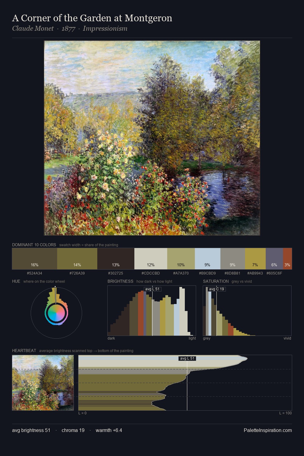
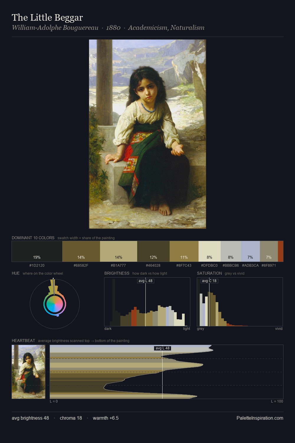
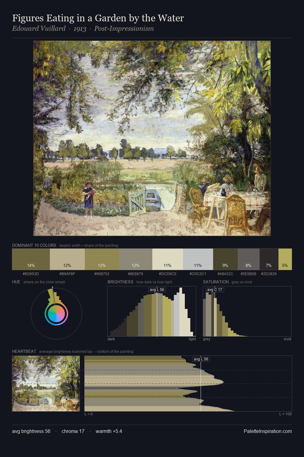
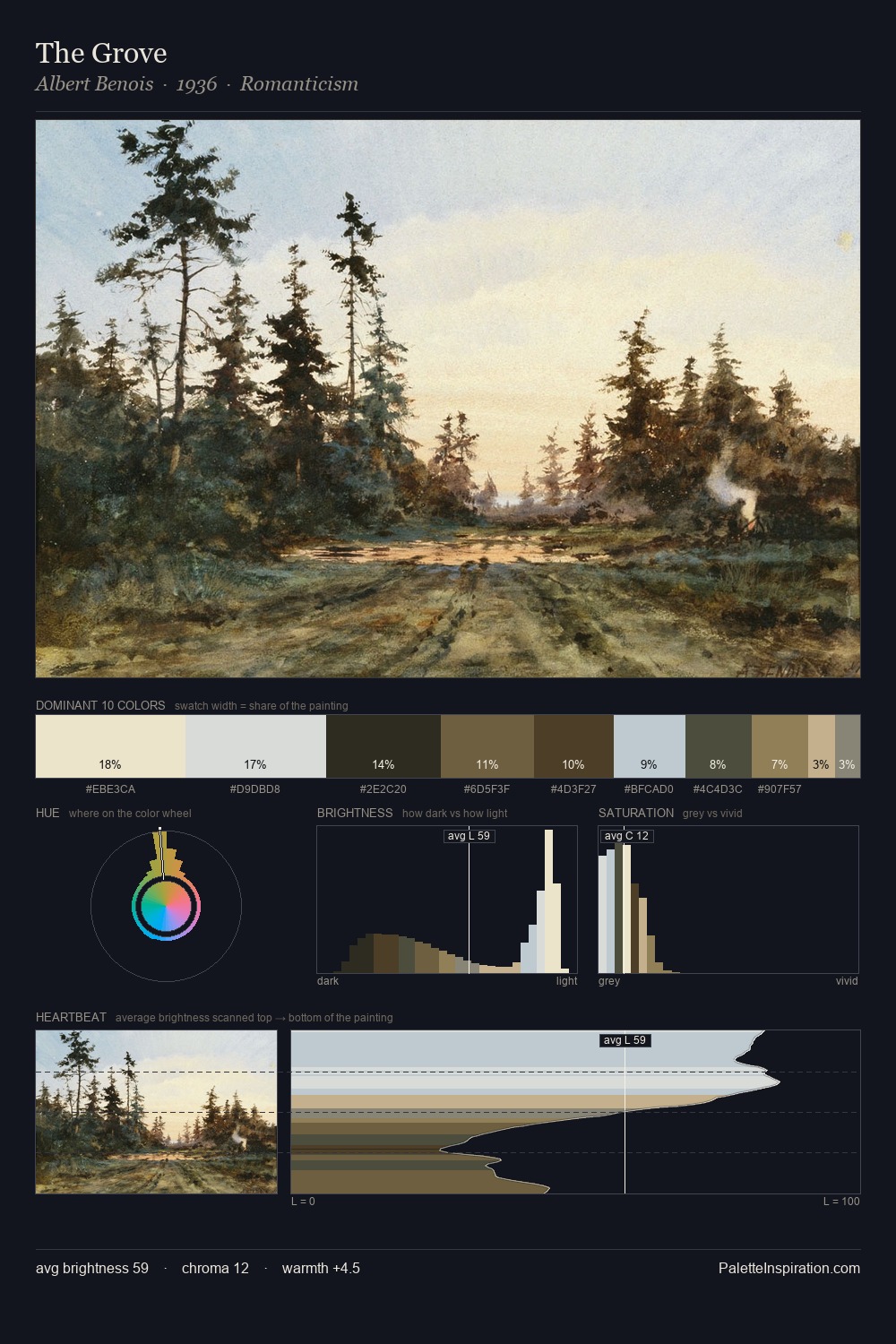
Apollinary Goravsky is high-key - luminous, open, and weighted toward light. Blues and teal-greys govern the palette, lending it an aquatic or atmospheric quality. Saturation is deliberately withheld - the beauty here lies in the near-monochromatic gradations rather than colour difference. The saturated accent, #BDAC7F, registers at 5.9% - sparse enough to feel like a deliberate surprise. The value range spans 57 units across the palette, providing the full gamut from deep shadow to near-white and ensuring clear tonal hierarchy. The mid-to-high key, cool bias, and moderate chroma point to outdoor observation - sky and diffused daylight as the dominant light source. Apollinary Goravsky's palette 2 carries its own internal logic while remaining in conversation with the artist's broader colour intelligence.
Example use cases
- exhibition design
- foundation branding
- estate management
- art education
- museums & galleries
I Love This!
Copy, export, or download for your project