Antonio Verrio Palette 4

Palette Analysis
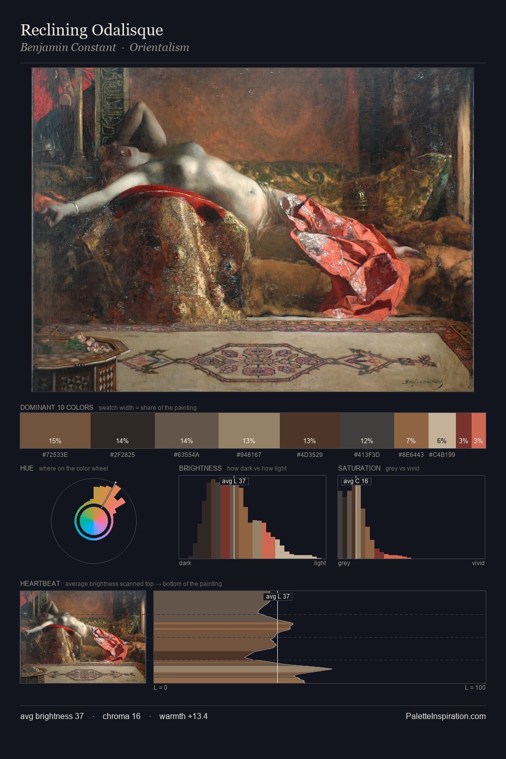
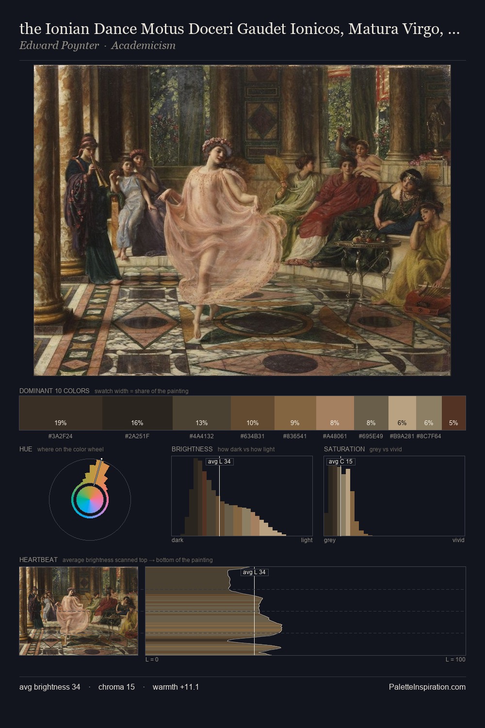
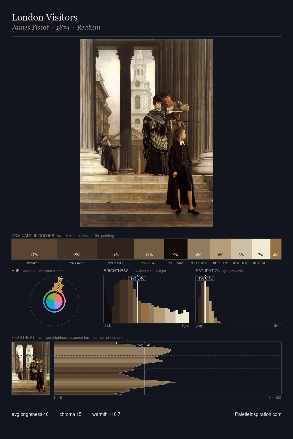
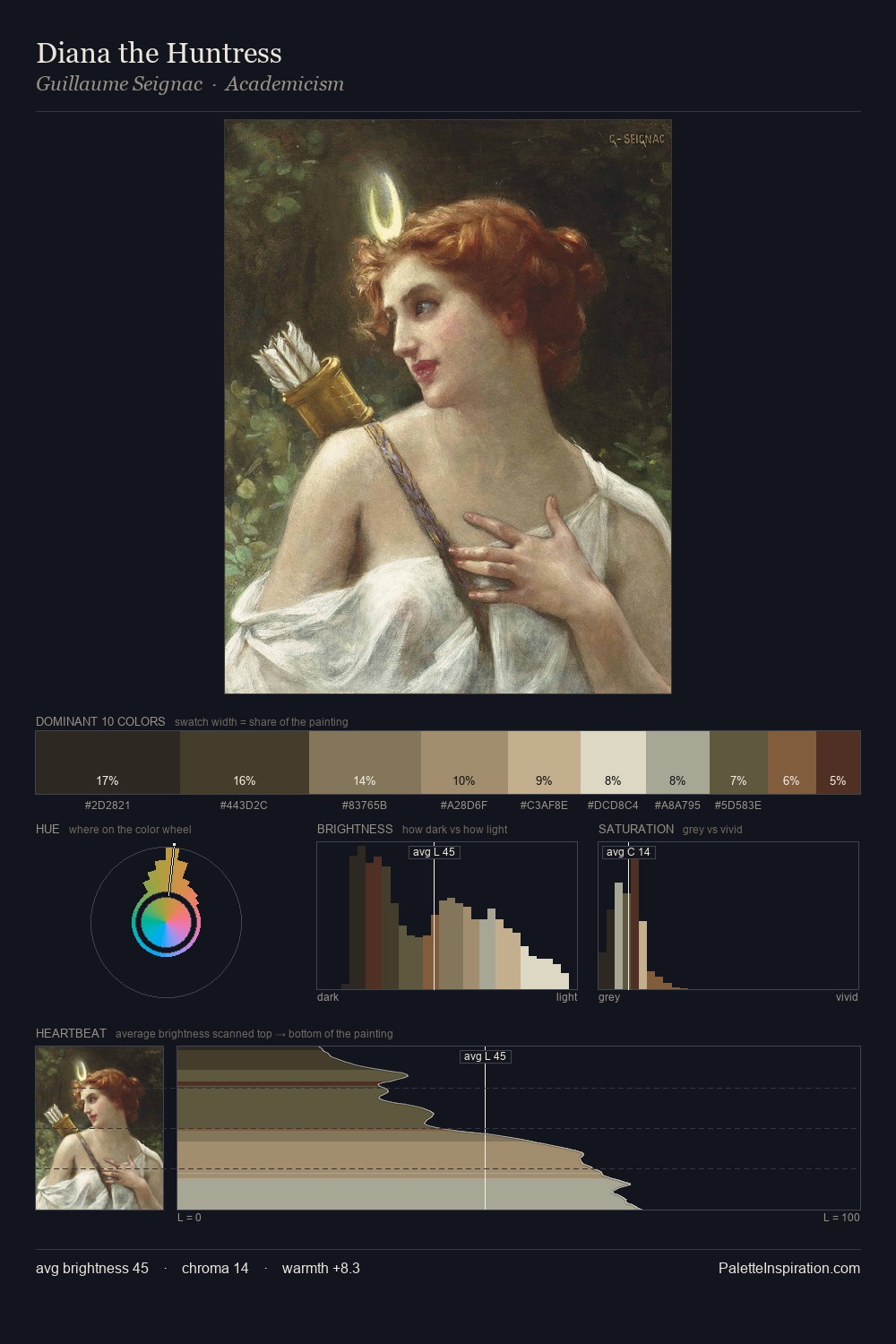
The value structure of Antonio Verrio is mid-key: quiet, controlled, and cohesive. Antonio Verrio builds on cool foundations: the palette favours the blue-cyan-green arc. The absence of saturated colour is itself an expressive choice: this is a palette of restraint and atmosphere. The highest-chroma note - #CCB595 - appears at just 1.9%, deployed as a precision accent against the quieter ground. 51 units of value spread create a palette that is varied but unified - contrast in the service of harmony. The palette has the character of outdoor light: cool, mid-bright, with colour rendered faithfully rather than expressively. Antonio Verrio's palette 4 carries its own internal logic while remaining in conversation with the artist's broader colour intelligence.
Example use cases
- theater design
- jewelry brands
- tobacco-adjacent retail
- event branding
- film & entertainment
I Love This!
Copy, export, or download for your project