Antonio Joli Palette 2
Palette Analysis
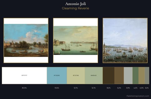
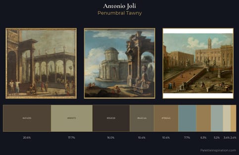
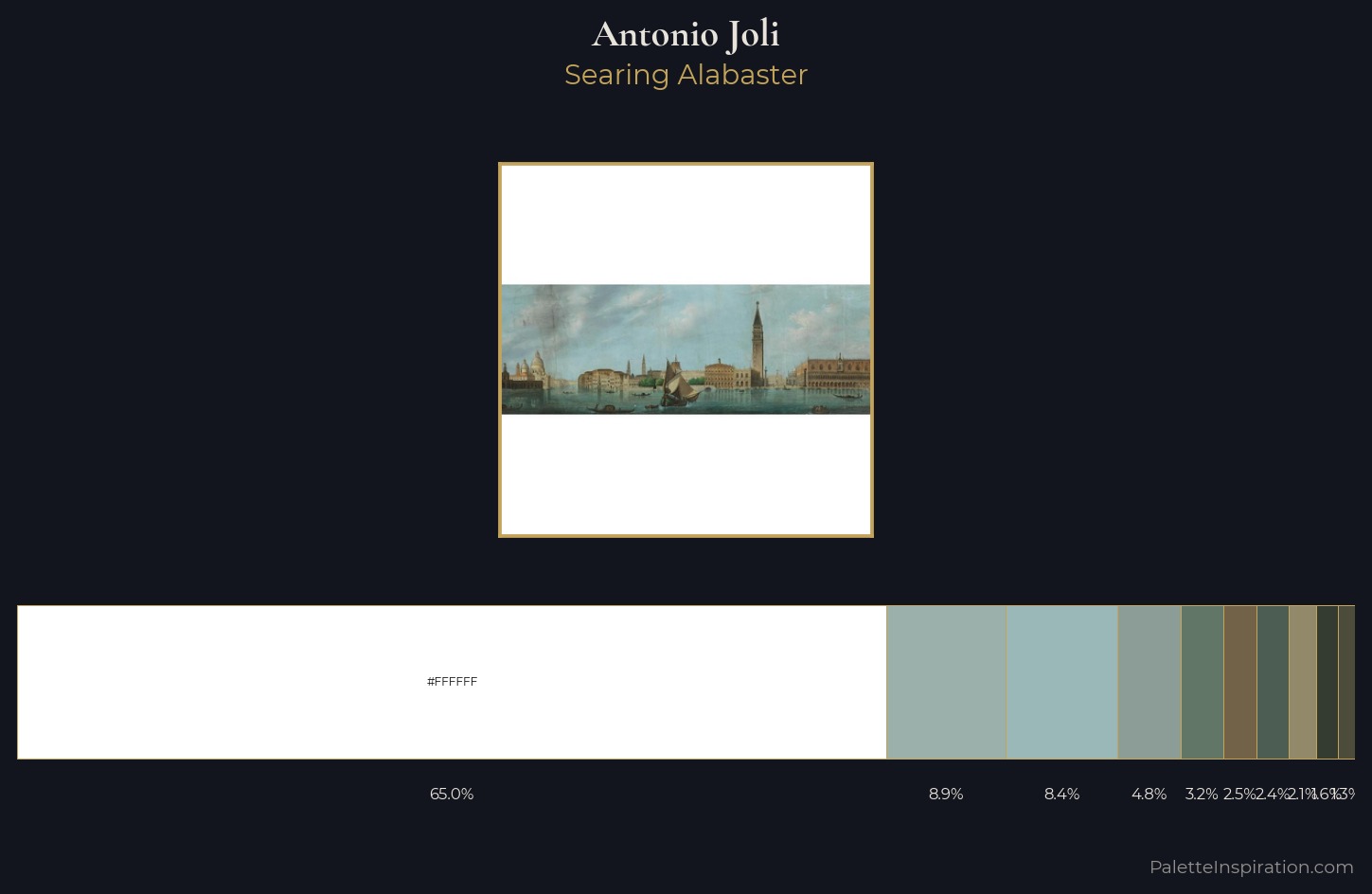
The high-key values of Antonio Joli give it an effulgent, almost bleached quality. Blues and teal-greys govern the palette, lending it an aquatic or atmospheric quality. All colours lean toward grey, building depth through value rather than colour punch. #FFFFFF claims 65.0% of the surface, functioning as the work's tonal foundation. At 2.5%, #726348 carries the palette's sharpest chromatic charge: an accent that earns its place precisely because it is withheld. A value spread of 66 units gives the palette both depth and air - shadows are genuinely dark, lights genuinely light. The mid-to-high key, cool bias, and moderate chroma point to outdoor observation - sky and diffused daylight as the dominant light source. Palette 2 sits within the larger chromatic argument that Antonio Joli's complete body of work advances.
Example use cases
- museum collateral
- fashion lookbooks
- minimalist e-commerce
- interior design
- publishing
I Love This!
Copy, export, or download for your project