Antonio Jacobsen Palette 8

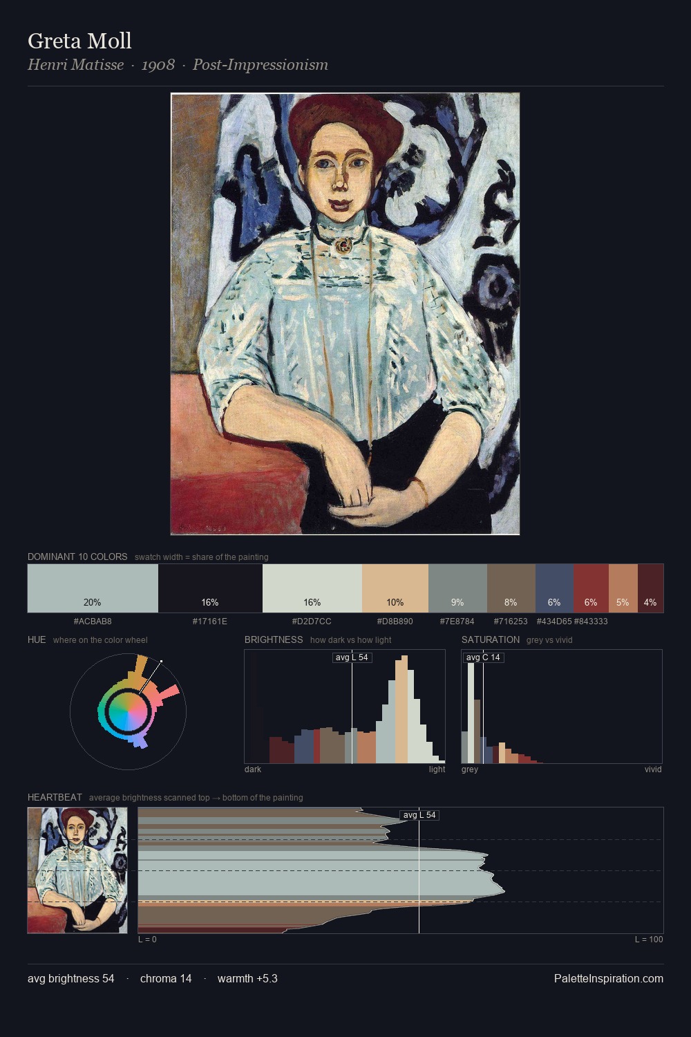
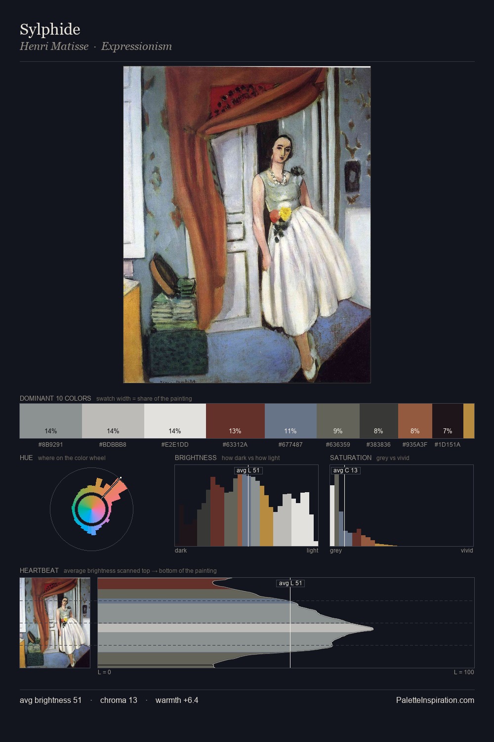
Palette Analysis
Values in Antonio Jacobsen tilt decisively toward white, giving the palette its luminous character. Cool tones set the register here - the blues and greens easily outweigh any warm accents. Muted throughout, the palette achieves its effects through value and temperature rather than chromatic force. Antonio Jacobsen gives 42.0% of the composition to a single #E8E7DD - a decisive chromatic anchor. The most saturated colour, #BA634E, is reserved to 0.6% of the surface, where it acts as a focal punctuation. 77 units of value range underpin the palette's structural clarity: the eye always knows where light falls. The palette has the character of outdoor light: cool, mid-bright, with colour rendered faithfully rather than expressively. Palette 8 sits within the larger chromatic argument that Antonio Jacobsen's complete body of work advances.
Example use cases
- print magazines
- beauty brands
- real estate
- high-end packaging
- editorial design
I Love This!
Copy, export, or download for your project