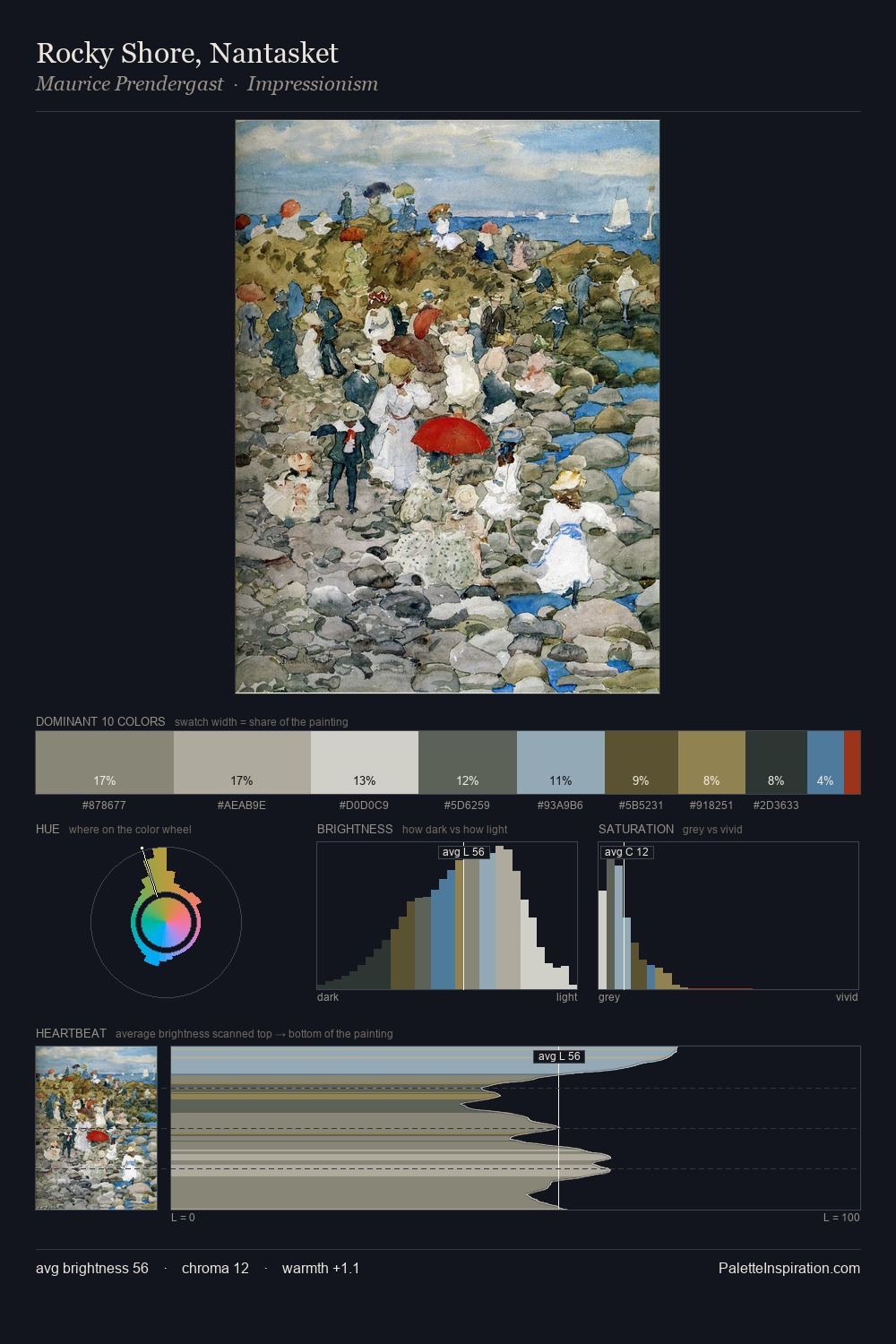
Antonio Jacobsen Palette 4

Palette Analysis
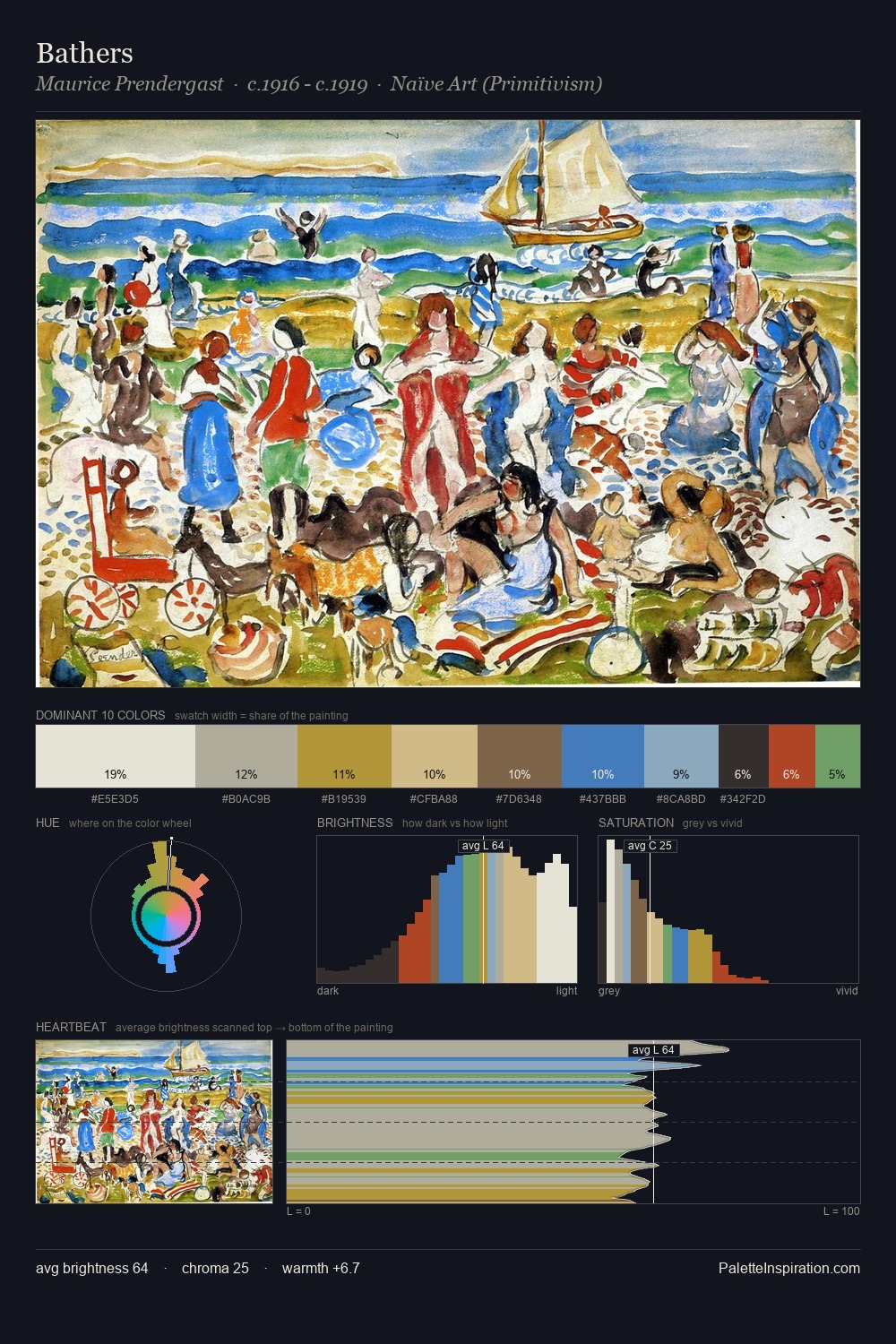
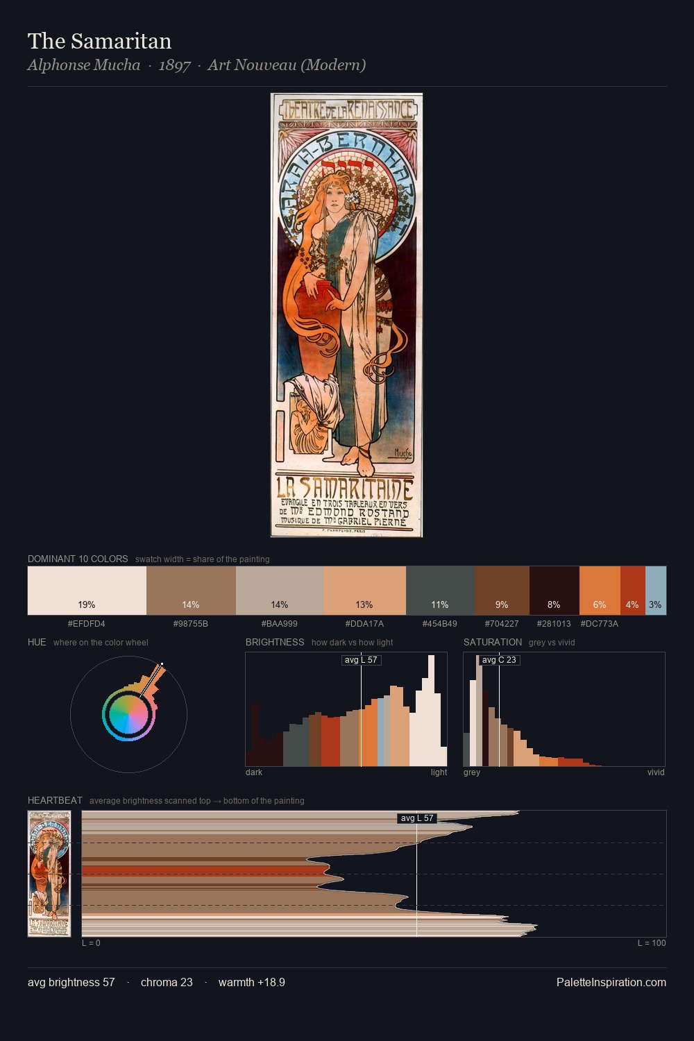
Light floods Antonio Jacobsen; the palette keeps values pale and airy across its range. A distinctly cool atmosphere runs through this palette: sky, water, and mist given colour form. Saturation is deliberately withheld - the beauty here lies in the near-monochromatic gradations rather than colour difference. The dominant colour, #F2F0EC, takes 30.8% of the total area, establishing the overall mood before any other hue is introduced. At 7.5%, #A7CBD6 carries the palette's sharpest chromatic charge: an accent that earns its place precisely because it is withheld. The value range spans 70 units across the palette, providing the full gamut from deep shadow to near-white and ensuring clear tonal hierarchy. The palette has the character of outdoor light: cool, mid-bright, with colour rendered faithfully rather than expressively. Palette 4 sits within the larger chromatic argument that Antonio Jacobsen's complete body of work advances.
Example use cases
- florist branding
- event design
- real estate
- jewelry retail
- hospitality branding
I Love This!
Copy, export, or download for your project