António de Carvalho da Silva Porto Palette 2
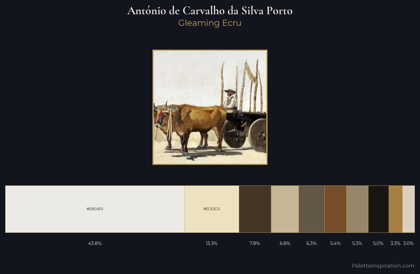
Palette Analysis
António de Carvalho da Silva Porto works in the upper reaches of the value scale, creating an atmosphere of brightness and expansiveness. Cool tones set the register here - the blues and greens easily outweigh any warm accents. All colours lean toward grey, building depth through value rather than colour punch. António de Carvalho da Silva Porto gives 43.8% of the composition to a single #EBEAE5 - a decisive chromatic anchor. #C6B794 delivers the chromatic peak at only 6.8% - a small shot of colour with outsized visual impact. The full value range is 74 units: broad enough to build convincing three-dimensional form. The mid-to-high key, cool bias, and moderate chroma point to outdoor observation - sky and diffused daylight as the dominant light source. This is palette 2 of António de Carvalho da Silva Porto's sequence - a single chapter in a chromatic story told across many works.
Example use cases
- ceramics & pottery
- boutique hospitality
- menswear
- heritage food brands
- craft & artisan brands
I Love This!
Copy, export, or download for your project
Related Palettes
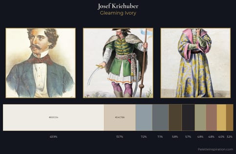
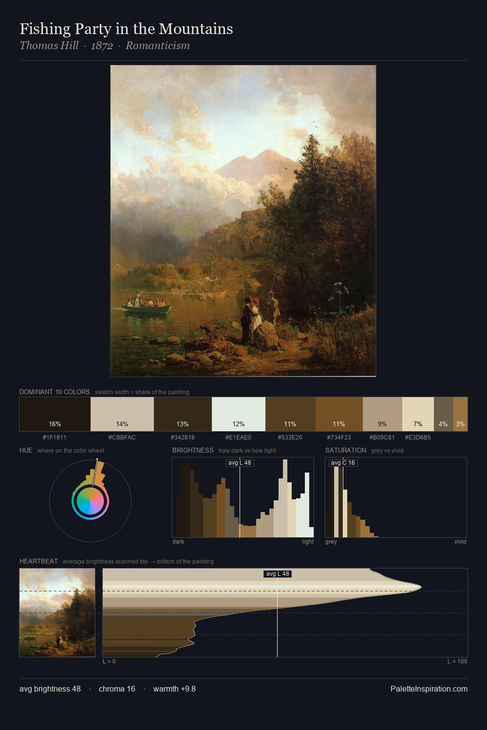
Josef Kriehuber Palette 4
Gleaming Ivory
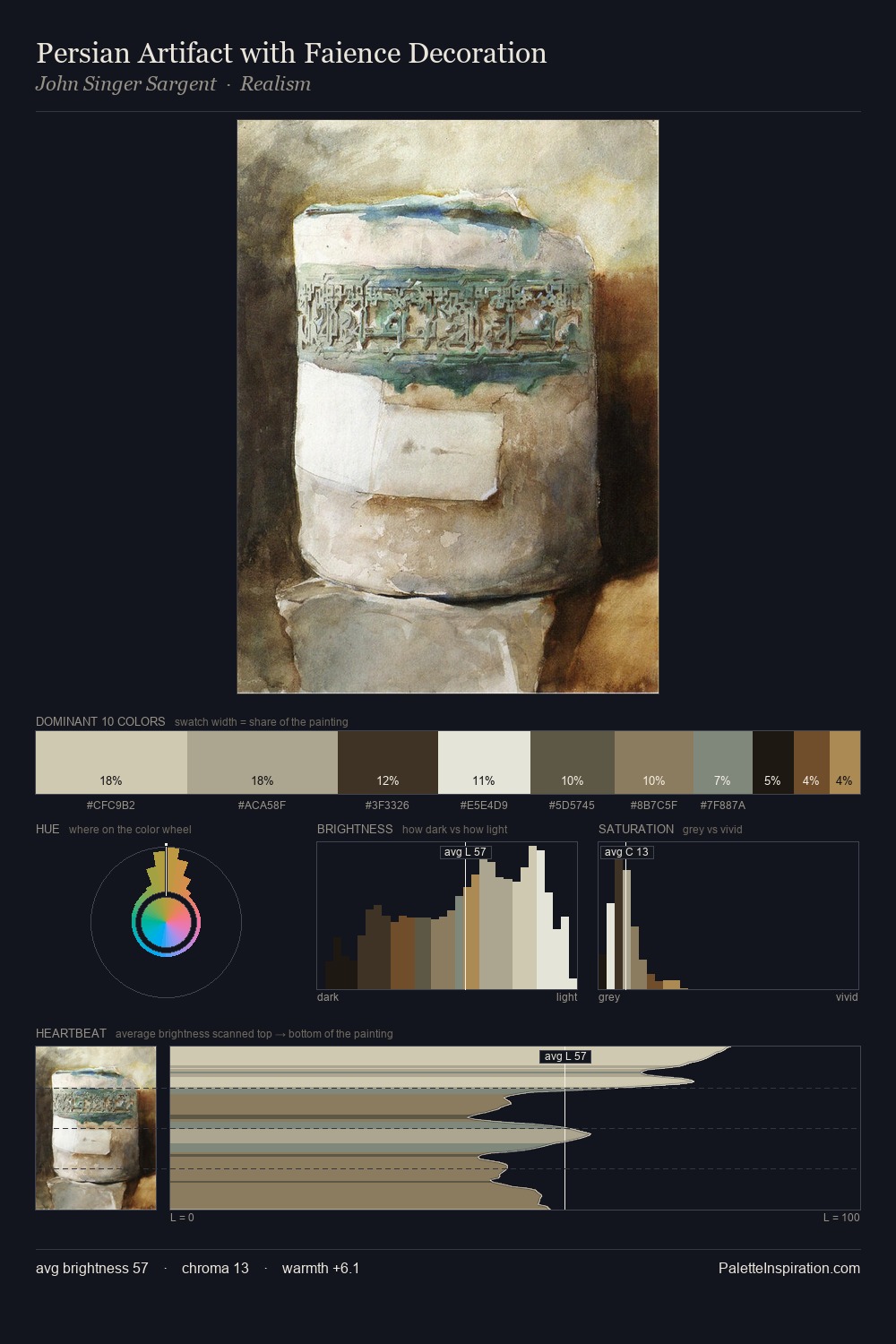
Julian Alden Weir Palette 8
Soft Alabaster
António de Carvalho da Silva Porto Palette 1
Pale Topaz
António de Carvalho da Silva Porto Palette 3
Pale Topaz
António de Carvalho da Silva Porto Palette 4
Veiled Tawny
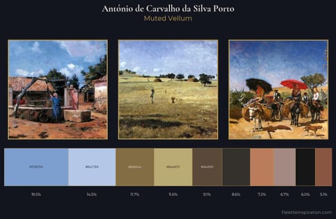
António de Carvalho da Silva Porto Palette 5
Muted Vellum