Antonio Alice Palette 2

Palette Analysis
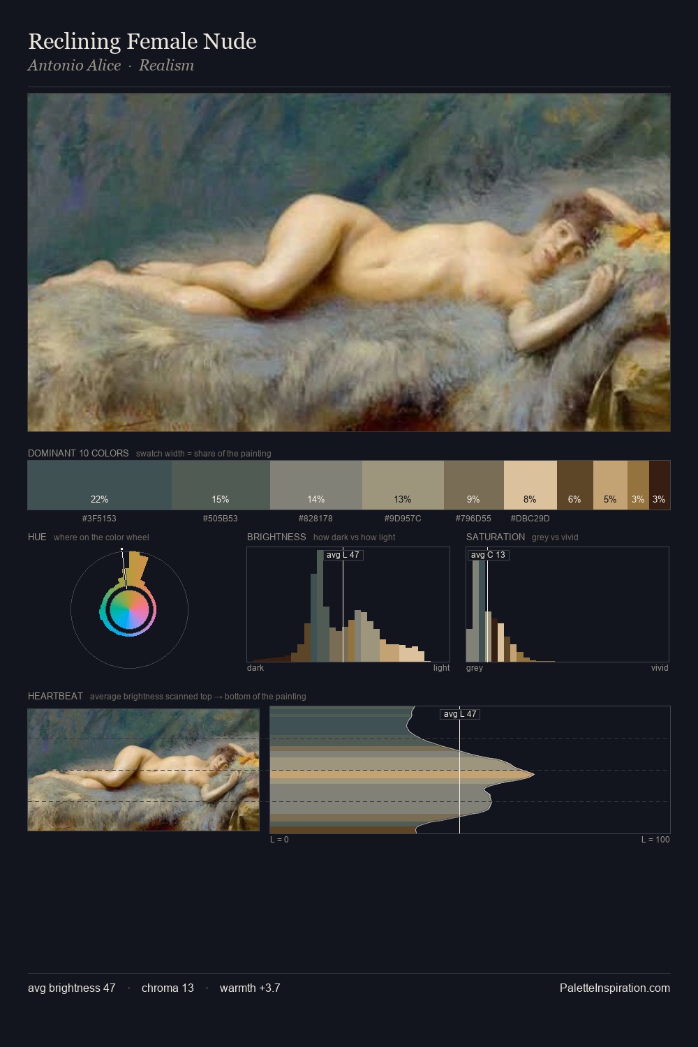
Antonio Alice occupies the comfortable middle of the value scale, avoiding both extremes to hold the eye in a sustained middle grey. Antonio Alice tilts toward cool - blues and silver-greys carry the structural weight. Saturation is deliberately withheld - the beauty here lies in the near-monochromatic gradations rather than colour difference. At 28.7%, #425353 functions less as a colour accent and more as a complete atmospheric environment. At 2.8%, #3D291B carries the palette's sharpest chromatic charge: an accent that earns its place precisely because it is withheld. A value spread of 55 units gives the palette both depth and air - shadows are genuinely dark, lights genuinely light. High luminosity and cool temperature suggest the plein-air condition: unfiltered daylight and open sky. This is palette 2 of Antonio Alice's sequence - a single chapter in a chromatic story told across many works.
Example use cases
- exhibition design
- foundation branding
- estate management
- art education
- museums & galleries
I Love This!
Copy, export, or download for your project