Antonietta Brandeis Palette 4

Palette Analysis
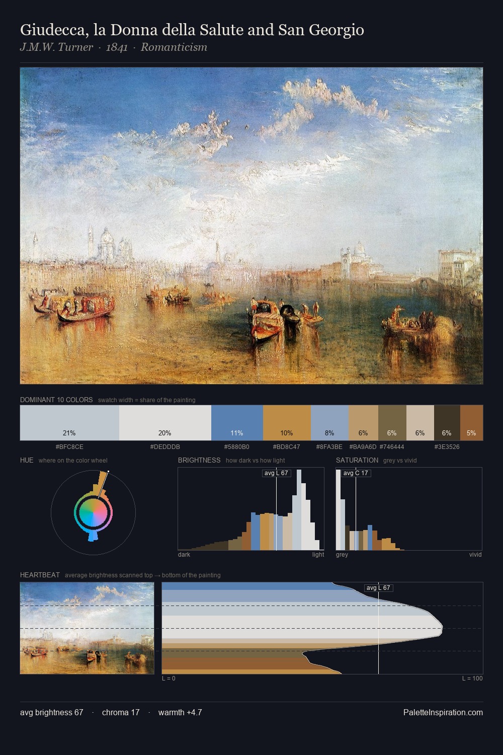
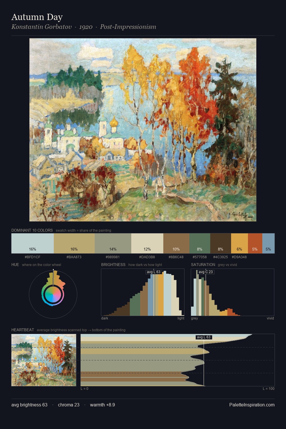
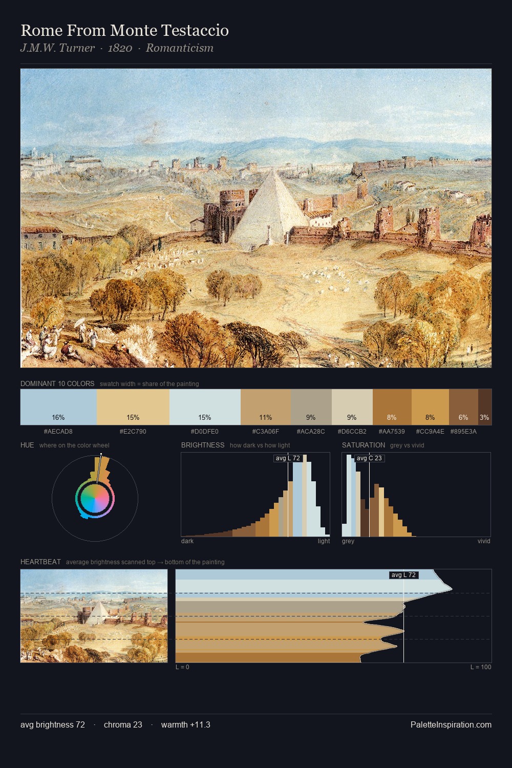
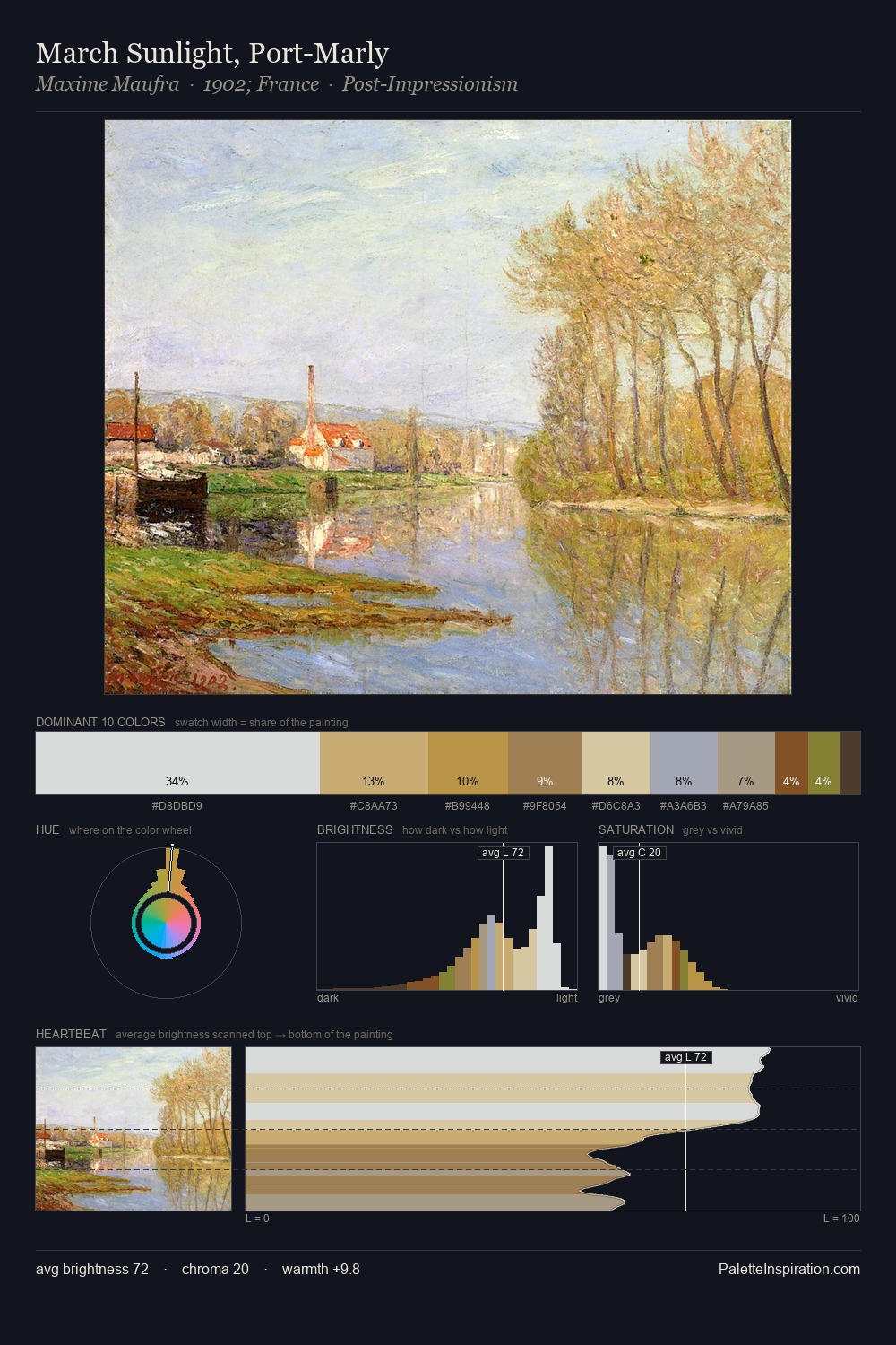
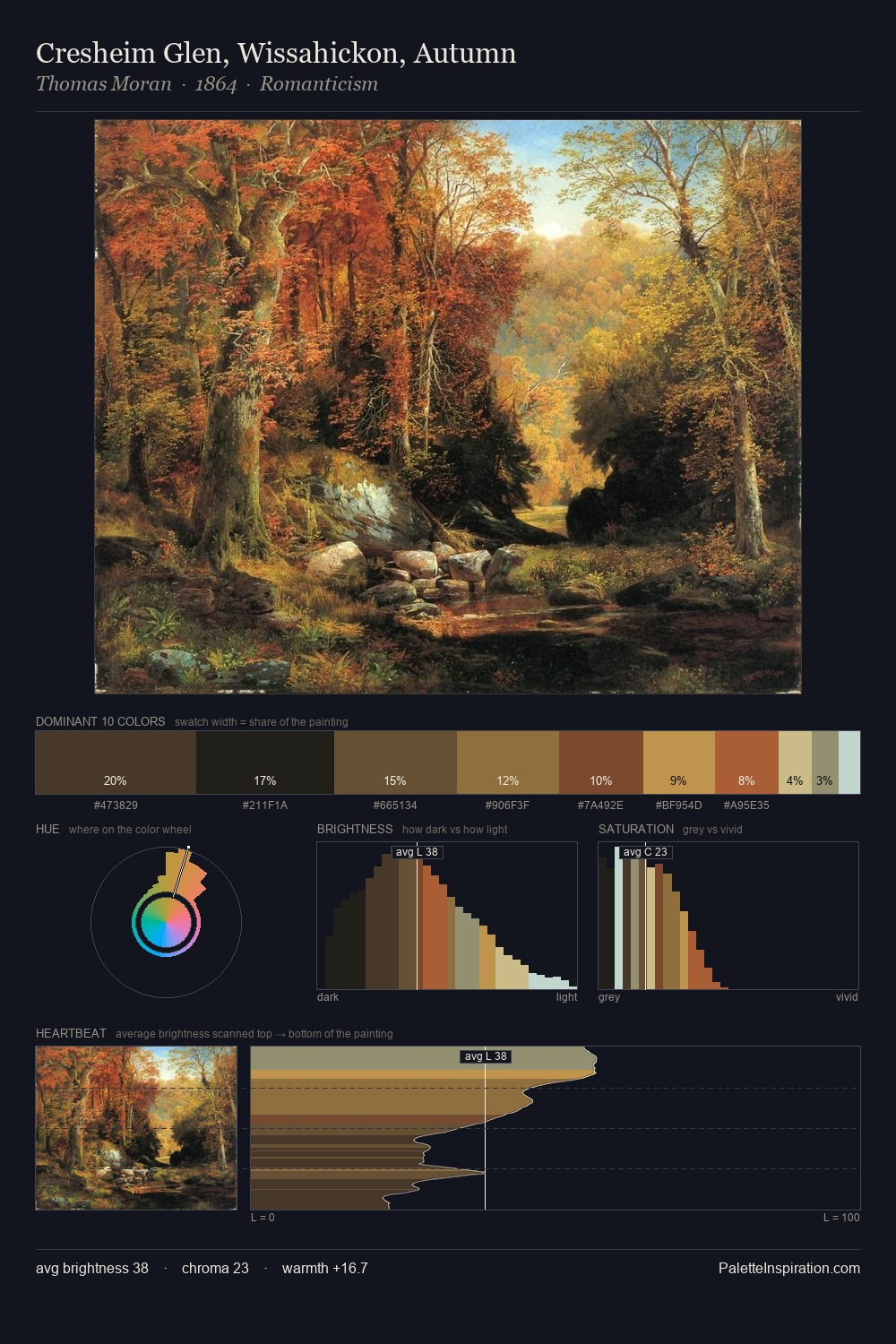
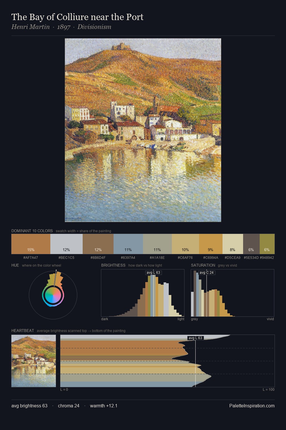
Light floods Antonietta Brandeis; the palette keeps values pale and airy across its range. Cool hues prevail: blues, greens, and greys anchor the palette's emotional temperature. Saturation is deliberately withheld - the beauty here lies in the near-monochromatic gradations rather than colour difference. #B4D1CC at 29.8% of the palette: an overwhelming presence that pulls all other colours into its gravitational field. Only 3.0% is devoted to #A46639, yet that small allocation delivers the palette's entire chromatic tension. The full value range is 55 units: broad enough to build convincing three-dimensional form. The palette has the character of outdoor light: cool, mid-bright, with colour rendered faithfully rather than expressively. Antonietta Brandeis's palette 4 carries its own internal logic while remaining in conversation with the artist's broader colour intelligence.
Example use cases
- design agencies
- product brands
- e-commerce
- editorial sites
- publishing
I Love This!
Copy, export, or download for your project