Anton von Werner Palette 4

Palette Analysis
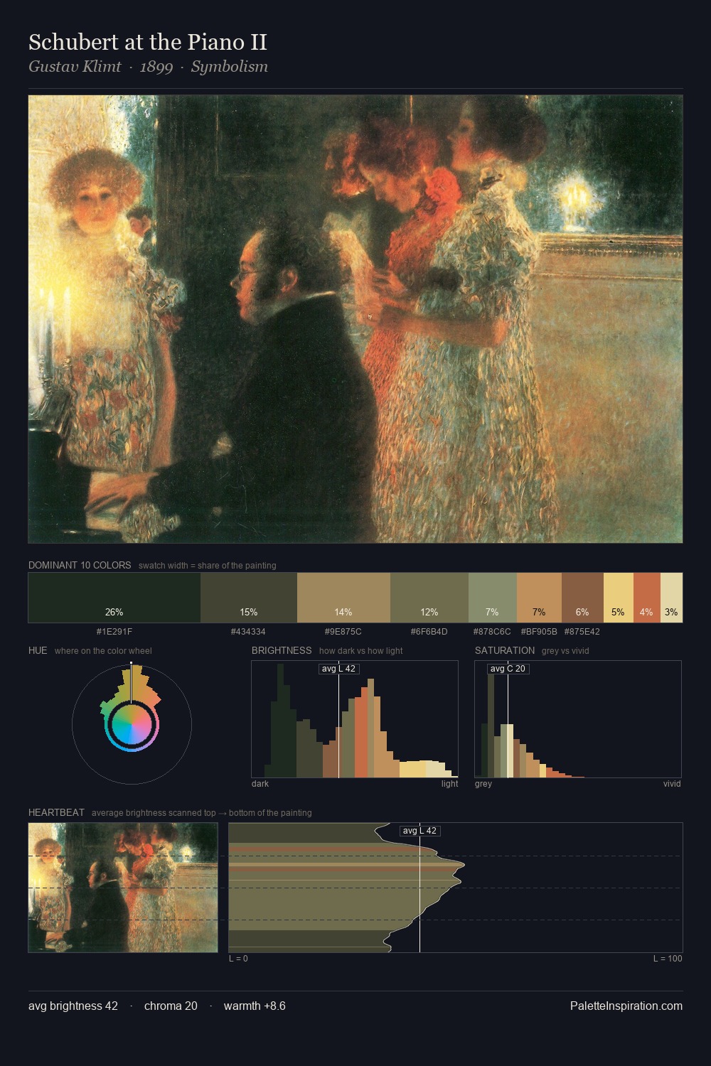
Anton von Werner keeps values measured and balanced, a hallmark of tonal restraint. Cool tones set the register here - the blues and greens easily outweigh any warm accents. Every colour is desaturated; the palette proceeds through near-neutrals and gently-coloured greys. #132219 claims 34.3% of the surface, functioning as the work's tonal foundation. The saturated accent, #C45944, registers at 2.6% - sparse enough to feel like a deliberate surprise. The full value range is 59 units: broad enough to build convincing three-dimensional form. High luminosity and cool temperature suggest the plein-air condition: unfiltered daylight and open sky. This is palette 4 of Anton von Werner's sequence - a single chapter in a chromatic story told across many works.
Example use cases
- theater design
- jewelry brands
- tobacco-adjacent retail
- event branding
- film & entertainment
I Love This!
Copy, export, or download for your project