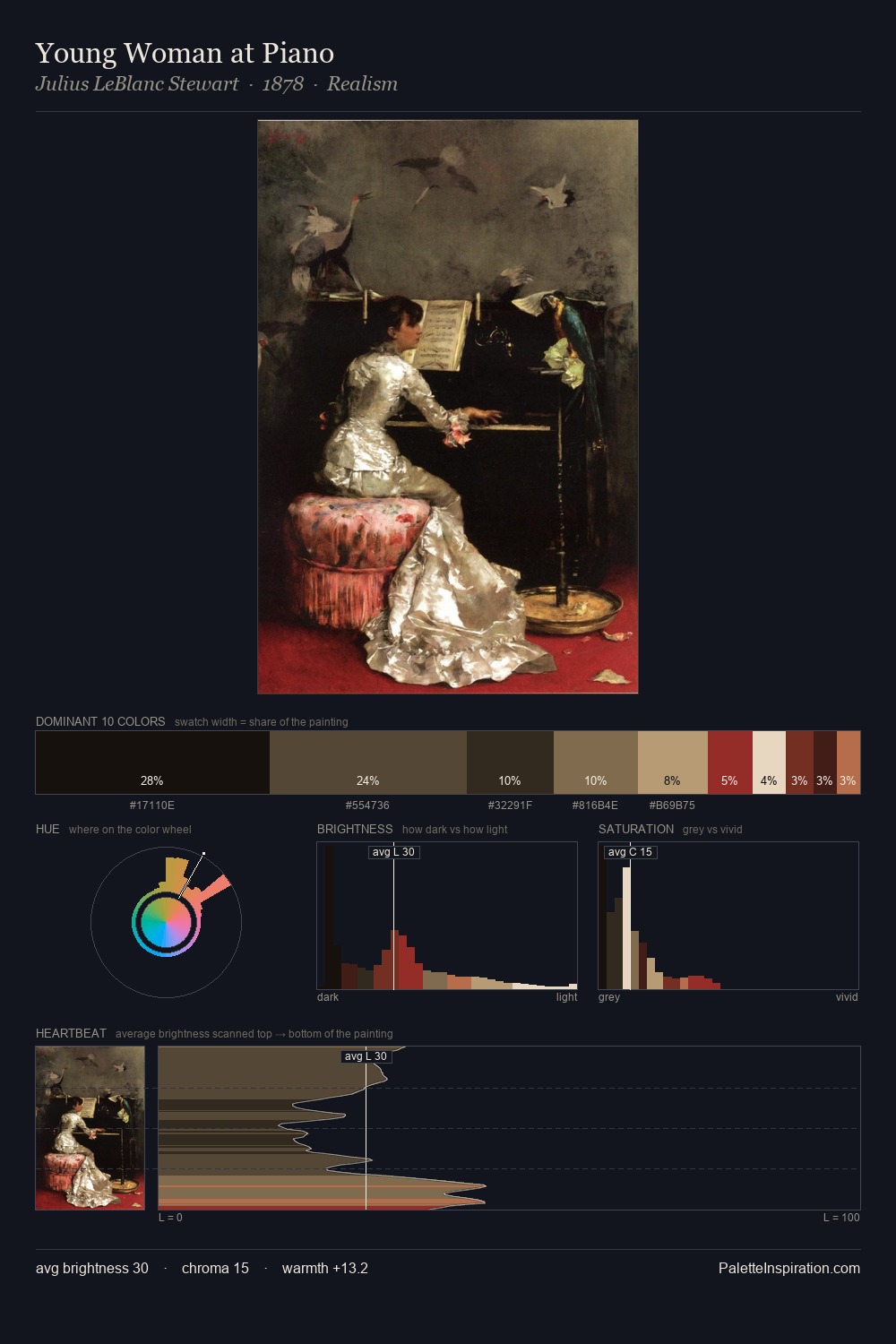
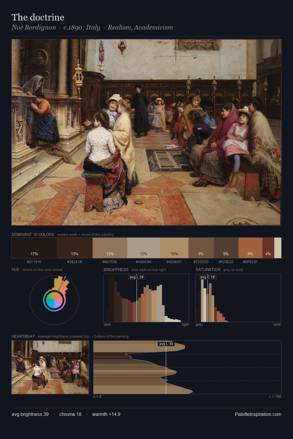
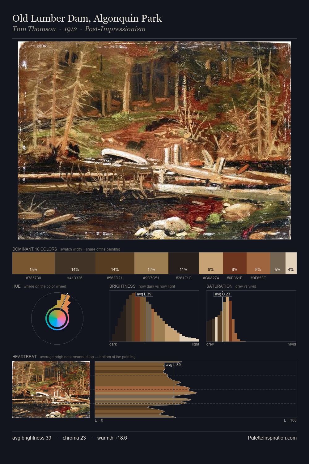
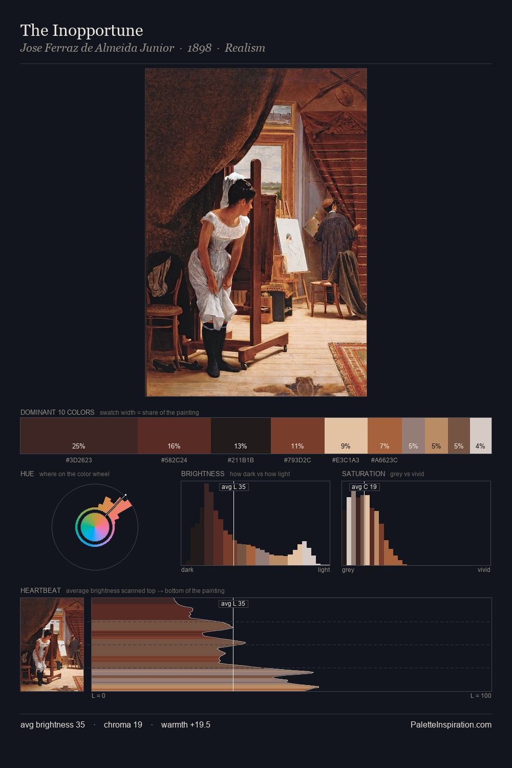
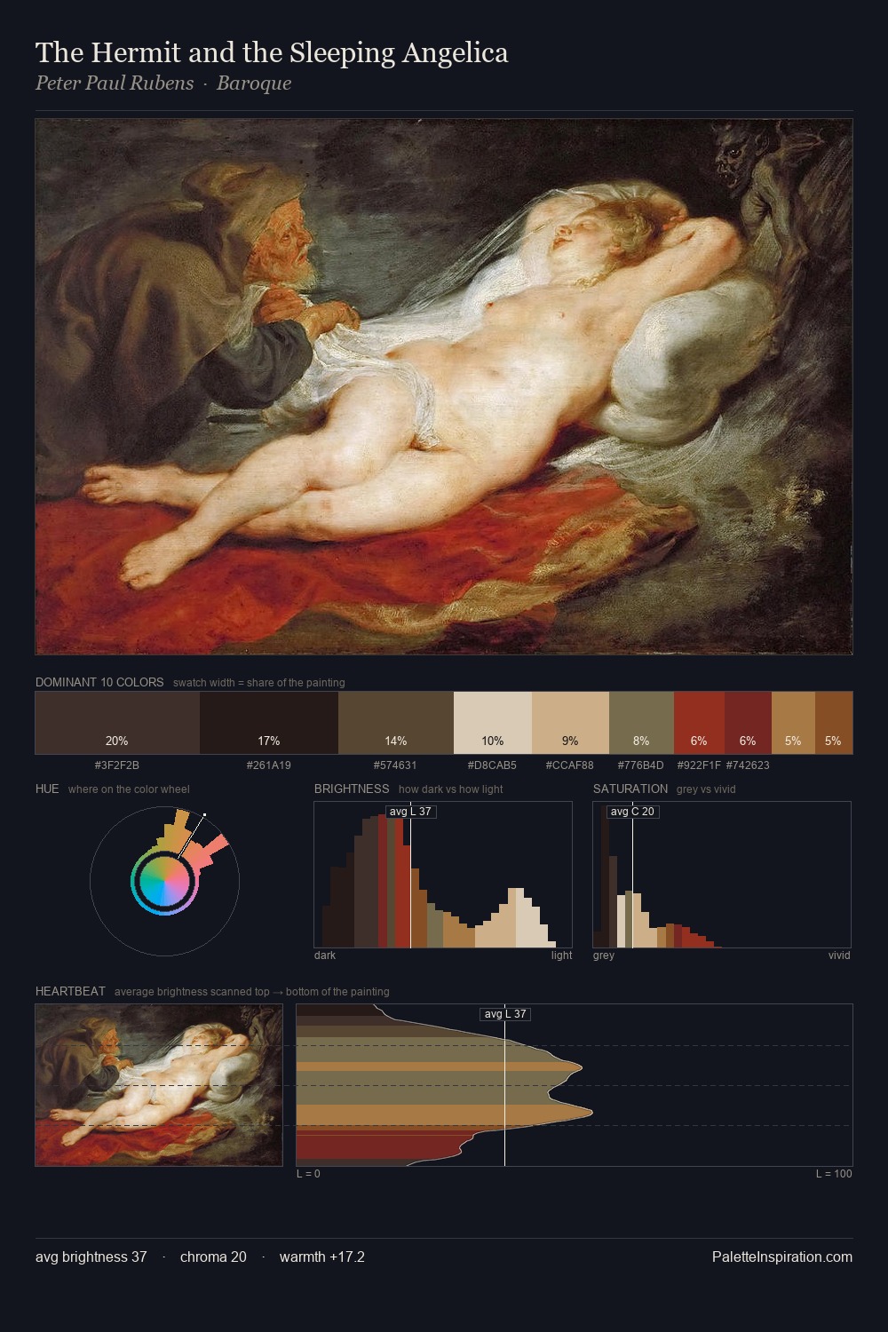
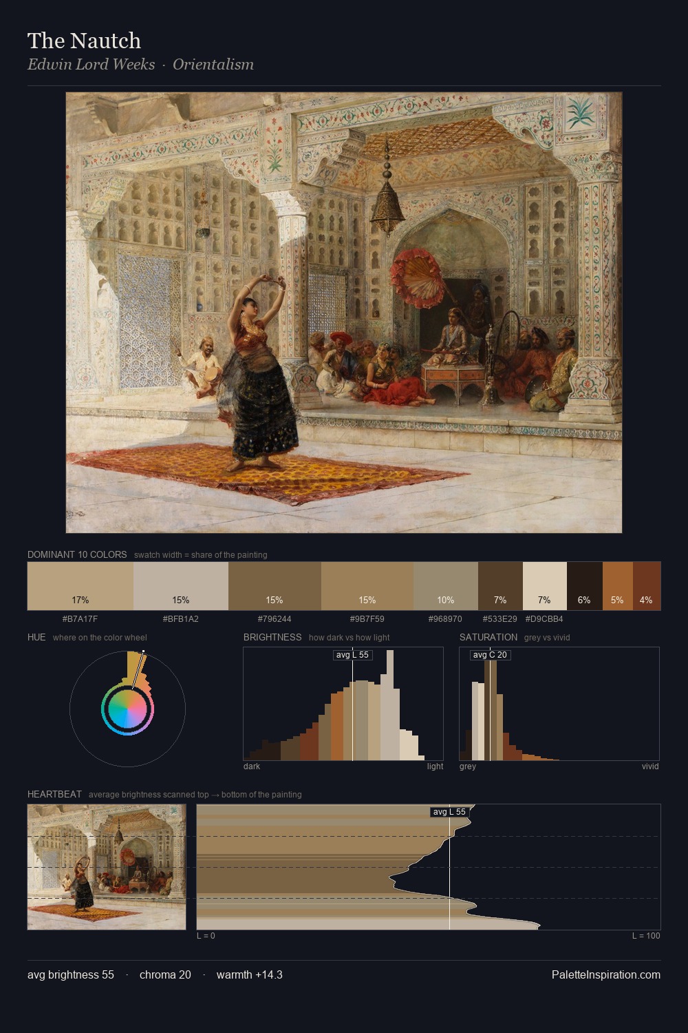
Anton von Werner Palette 1
Muted Caramel
Muted Deliberately desaturated - chroma pulled toward gray, the restraint of tonal painting.
Caramel Warm mid-brown - the color of cooked sugar, smooth and amber-toned.

Palette Analysis
Anton von Werner occupies the comfortable middle of the value scale, avoiding both extremes to hold the eye in a sustained middle grey. Warmth dominates - the palette of Anton von Werner leans heavily on the yellow-orange-red arc of the colour wheel. Chroma is kept low across all colours, producing the soft, enveloping quality that characterises tonal painting. Only 5.8% is devoted to #A1623E, yet that small allocation delivers the palette's entire chromatic tension. A value spread of 68 units gives the palette both depth and air - shadows are genuinely dark, lights genuinely light. In the context of Anton von Werner's full range of palettes, group 1 represents one movement in an ongoing chromatic dialogue.
Example use cases
- ceramics & pottery
- boutique hospitality
- menswear
- heritage food brands
- craft & artisan brands
I Love This!
Use This Palette
Copy, export, or download for your project
Copy, export, or download for your project
Copy:
Download:
Share: