Anna Katarina Boberg Palette 1

Palette Analysis
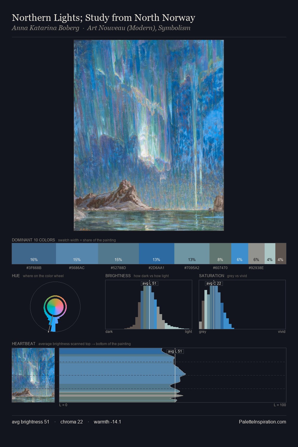
Anna Katarina Boberg occupies the comfortable middle of the value scale, avoiding both extremes to hold the eye in a sustained middle grey. Temperature is cool-dominant, with blue and green families claiming the largest areas. Chroma is moderate: colours carry enough saturation to be read as colour, but the palette stops well short of garish intensity. #4889BC functions as the palette's exclamation mark: highest chroma, lowest percentage (10.5%). 38 units of value spread create a palette that is varied but unified - contrast in the service of harmony. The mid-to-high key, cool bias, and moderate chroma point to outdoor observation - sky and diffused daylight as the dominant light source. This is palette 1 of Anna Katarina Boberg's sequence - a single chapter in a chromatic story told across many works.
Example use cases
- art galleries
- creative studios
- consumer goods
- lifestyle media
- professional services
I Love This!
Copy, export, or download for your project