Anna Dorothea Therbusch Palette 4

Palette Analysis
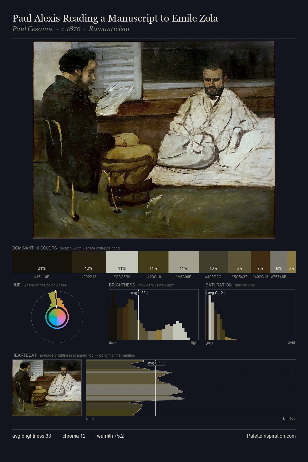
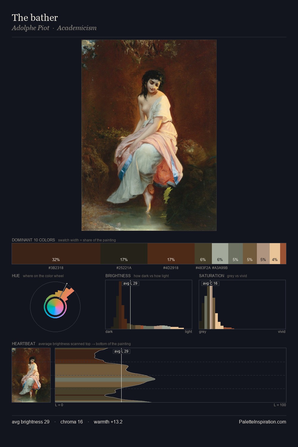
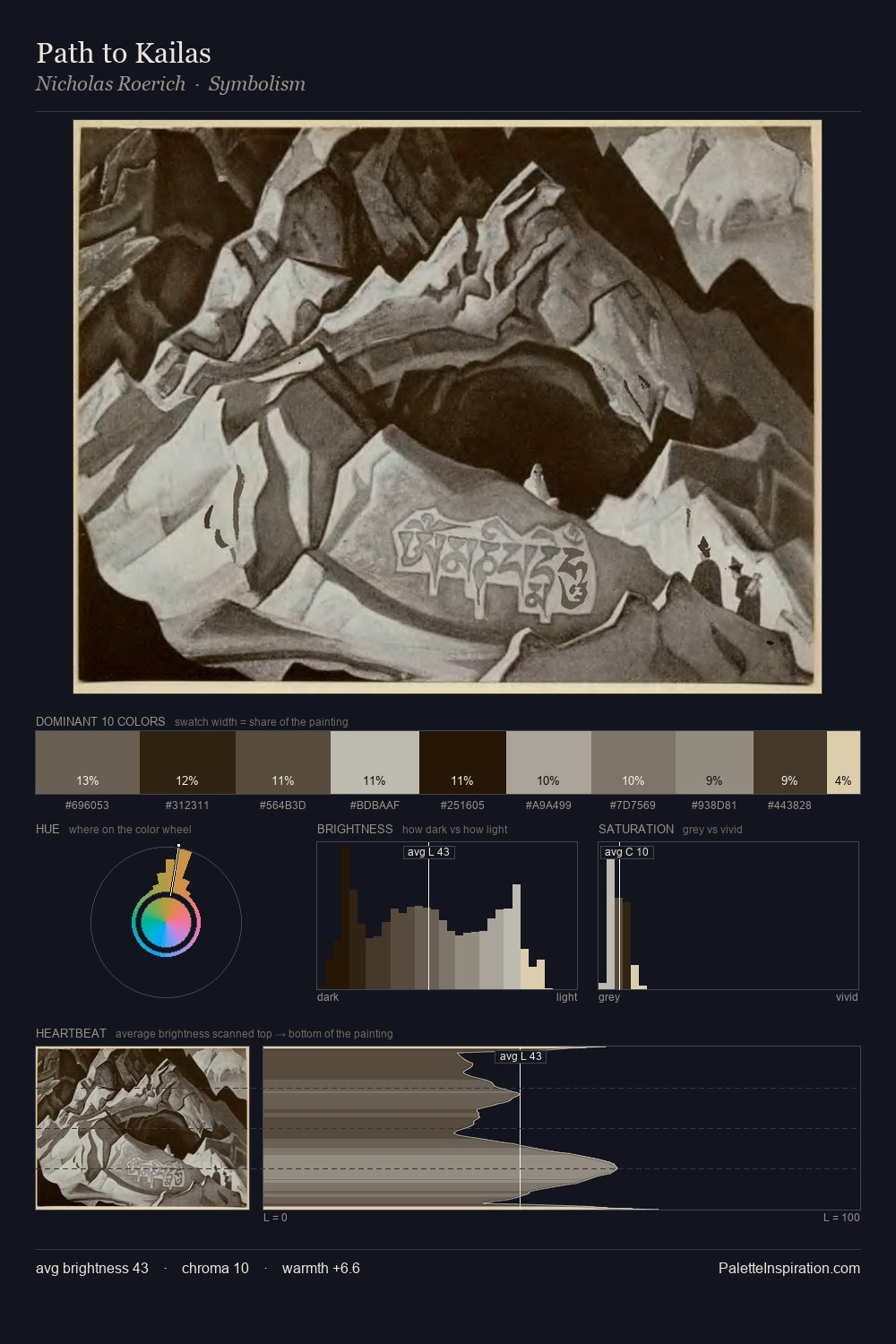
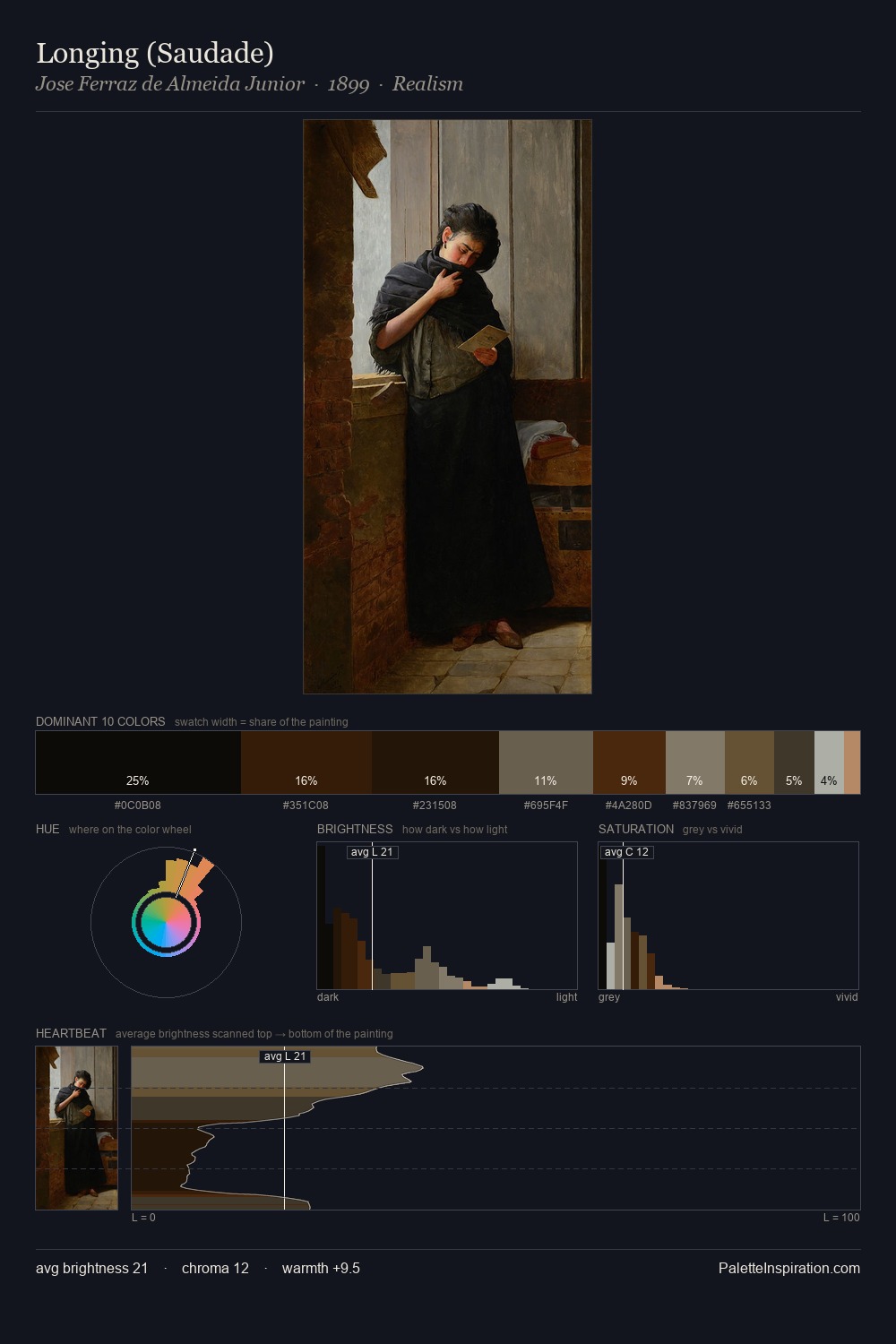
Anna Dorothea Therbusch occupies the comfortable middle of the value scale, avoiding both extremes to hold the eye in a sustained middle grey. Neither warm nor cool has the upper hand here; the equilibrium between the two generates the palette's visual energy. Saturation is deliberately withheld - the beauty here lies in the near-monochromatic gradations rather than colour difference. A single dominant - #2D1604 at 25.5% - sets the character of the whole composition. The most saturated colour, #6C513F, is reserved to 5.1% of the surface, where it acts as a focal punctuation. The value range of 51 units sits in the comfortable middle: enough depth, enough light, neither extreme. Anna Dorothea Therbusch's palette 4 carries its own internal logic while remaining in conversation with the artist's broader colour intelligence.
Example use cases
- music labels
- luxury hospitality
- editorial photography
- leather goods
- premium streaming
I Love This!
Copy, export, or download for your project
Related Palettes

Jacob Fransz. van der Merck Palette 3
Nocturnal Bister

Jacob Jansz. Coeman Palette 1
Tenebrous Sienna

Jacob Jansz. Coeman Master Palette
Tenebrous Sienna

Johann Justin Preissler Palette 1
Tenebrous Bister

Anna Dorothea Therbusch Palette 1
Shadowed Gamboge

Anna Dorothea Therbusch Palette 2
Tenebrous Bister