Anna Claypoole Peale Palette 1

Palette Analysis
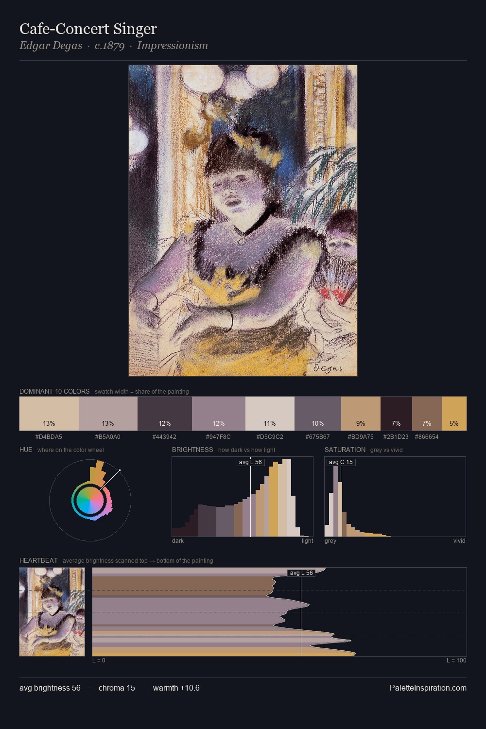
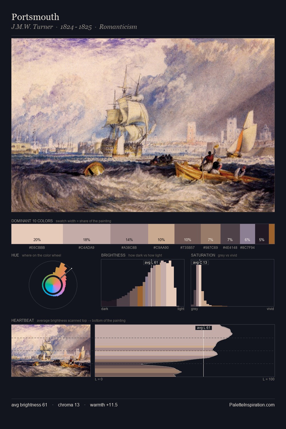
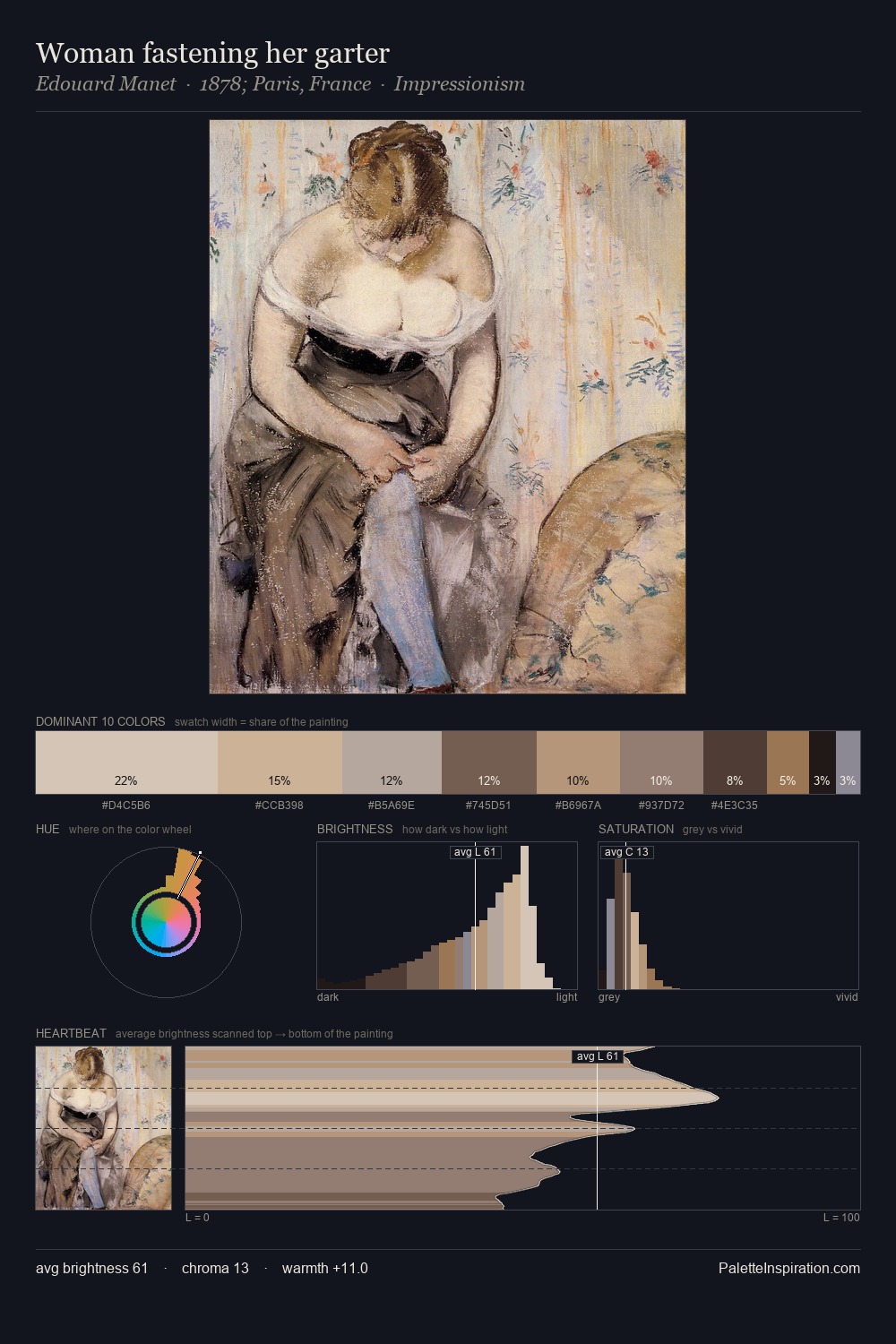
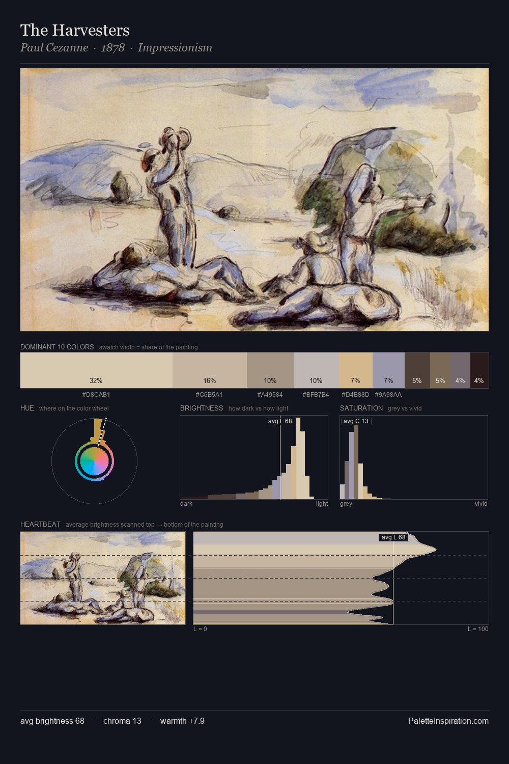
Anna Claypoole Peale sits in the centre of the value range, lending the palette a sense of even, sustained light. Warm hues command this palette; Anna Claypoole Peale favours the reds, oranges, and yellows of firelight and earth. Saturation is deliberately withheld - the beauty here lies in the near-monochromatic gradations rather than colour difference. #43423D claims 32.2% of the surface, functioning as the work's tonal foundation. At 5.6%, #B79A7A carries the palette's sharpest chromatic charge: an accent that earns its place precisely because it is withheld. 52 units of value spread create a palette that is varied but unified - contrast in the service of harmony. In the context of Anna Claypoole Peale's full range of palettes, group 1 represents one movement in an ongoing chromatic dialogue.
Example use cases
- exhibition design
- foundation branding
- estate management
- art education
- museums & galleries
I Love This!
Copy, export, or download for your project