Anna Bilińska Palette 5
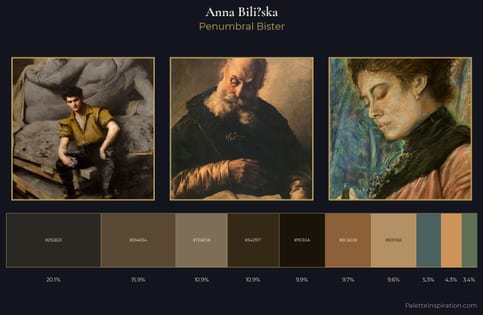
Penumbral Bister
Penumbral Partial shadow - the transitional zone between light and full dark, soft-edged.
Bister Dark warm brown - a traditional ink and wash pigment made from wood soot.
Palette Analysis
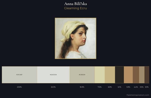
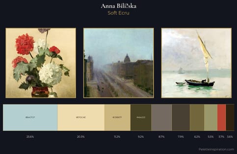
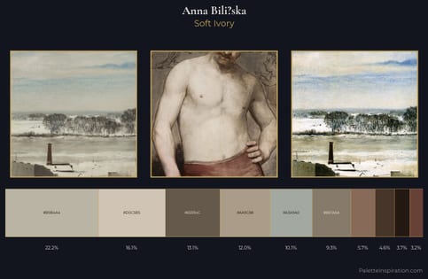
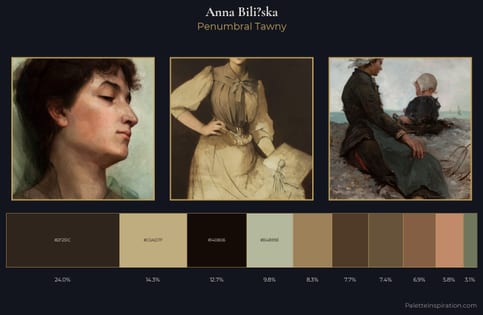
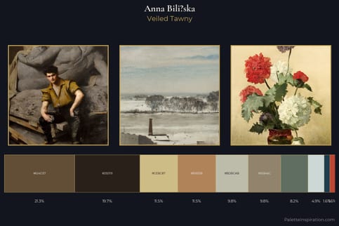
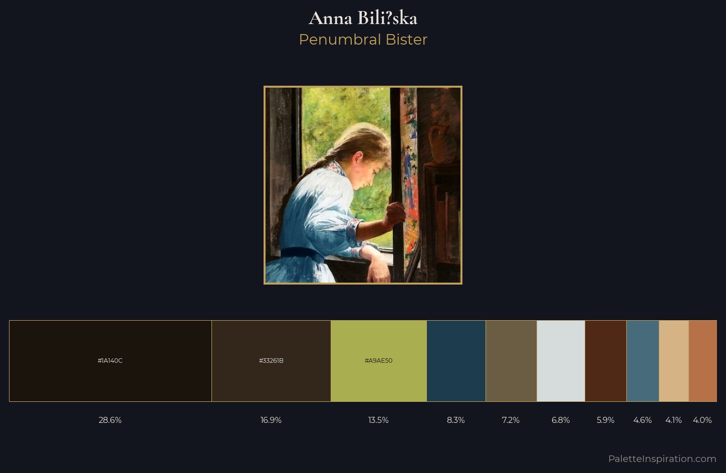
Values in Anna Bili?ska rest in the mid-range - neither dramatically lit nor steeped in shadow. Anna Bili?ska orchestrates warmth above all else - reds, ambers, and siennas take the lead. All colours lean toward grey, building depth through value rather than colour punch. At 28.6%, #1A140C functions less as a colour accent and more as a complete atmospheric environment. #D6B385 functions as the palette's exclamation mark: highest chroma, lowest percentage (4.1%). A value spread of 69 units gives the palette both depth and air - shadows are genuinely dark, lights genuinely light. This is palette 5 of Anna Bili?ska's sequence - a single chapter in a chromatic story told across many works.
Example use cases
- theater design
- jewelry brands
- tobacco-adjacent retail
- event branding
- film & entertainment
I Love This!
Use This Palette
Copy, export, or download for your project
Copy, export, or download for your project
Copy:
Download:
Share: