Andrea Pozzo Master Palette
Muted Tawny
Muted Deliberately desaturated - chroma pulled toward gray, the restraint of tonal painting.
Tawny Warm orange-brown - a traditional term for the color of tanned leather or lion fur.

Palette Analysis
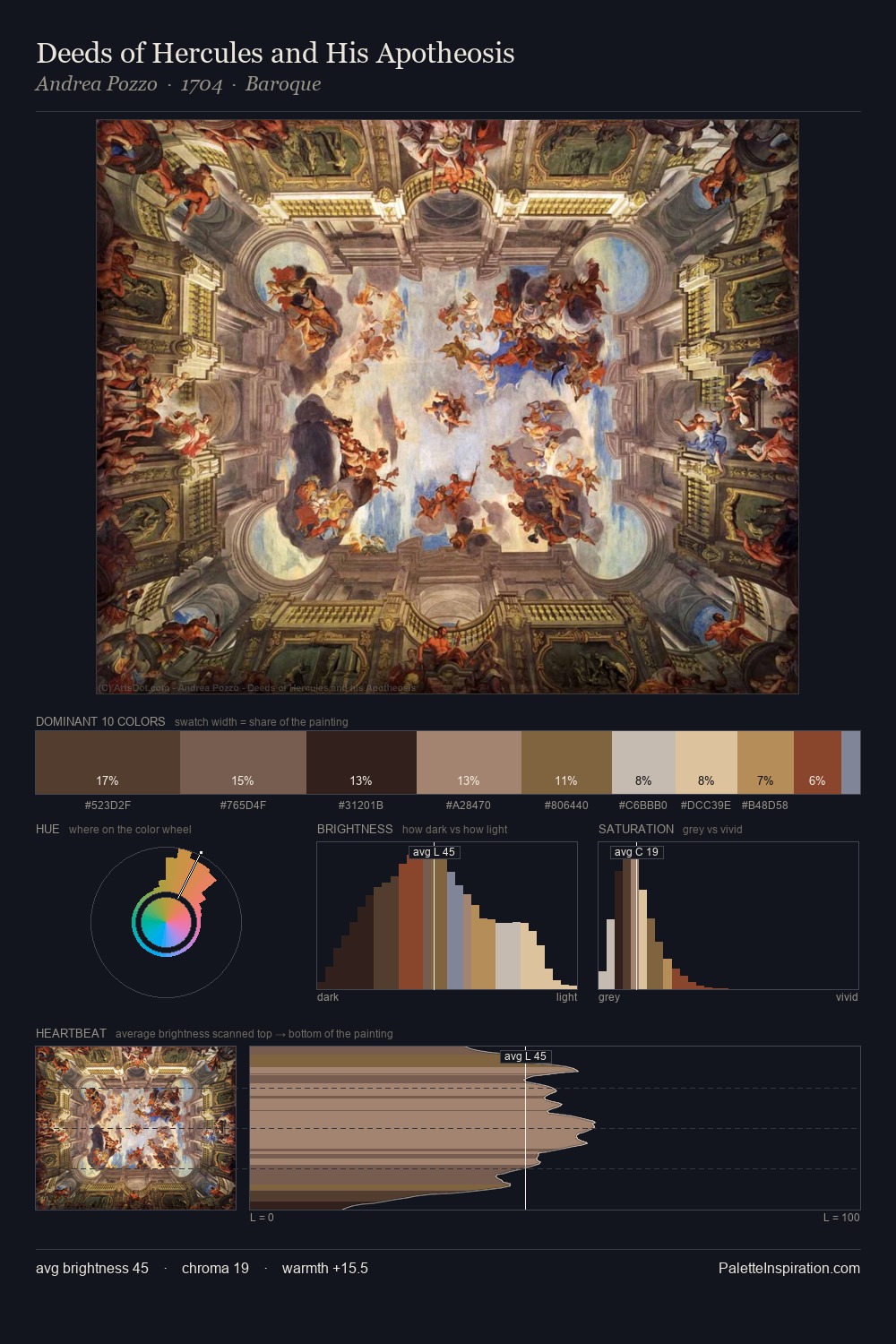
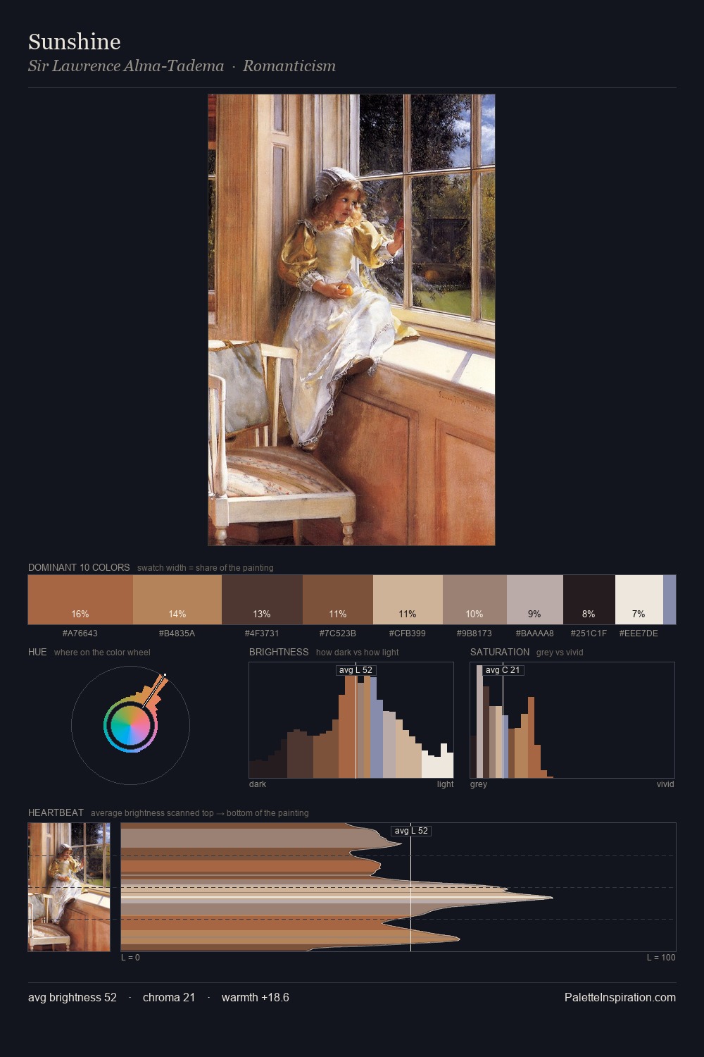
Andrea Pozzo sits in the centre of the value range, lending the palette a sense of even, sustained light. Andrea Pozzo orchestrates warmth above all else - reds, ambers, and siennas take the lead. All colours lean toward grey, building depth through value rather than colour punch. Only 6.7% is devoted to #7B5B3D, yet that small allocation delivers the palette's entire chromatic tension. At 57 units of value range, the palette has the tonal breadth to sustain complex spatial readings. Andrea Pozzo arrived at this balance through long practice; the palette carries the weight of that experience.
Example use cases
- exhibition design
- foundation branding
- estate management
- art education
- museums & galleries
I Love This!
Use This Palette
Copy, export, or download for your project
Copy, export, or download for your project
Copy:
Download:
Share: