Andrea Pozzo Palette 2
Muted Parchment
Muted Deliberately desaturated - chroma pulled toward gray, the restraint of tonal painting.
Parchment Aged warm neutral - the color of old manuscript parchment, tan and slightly yellowed.

Palette Analysis
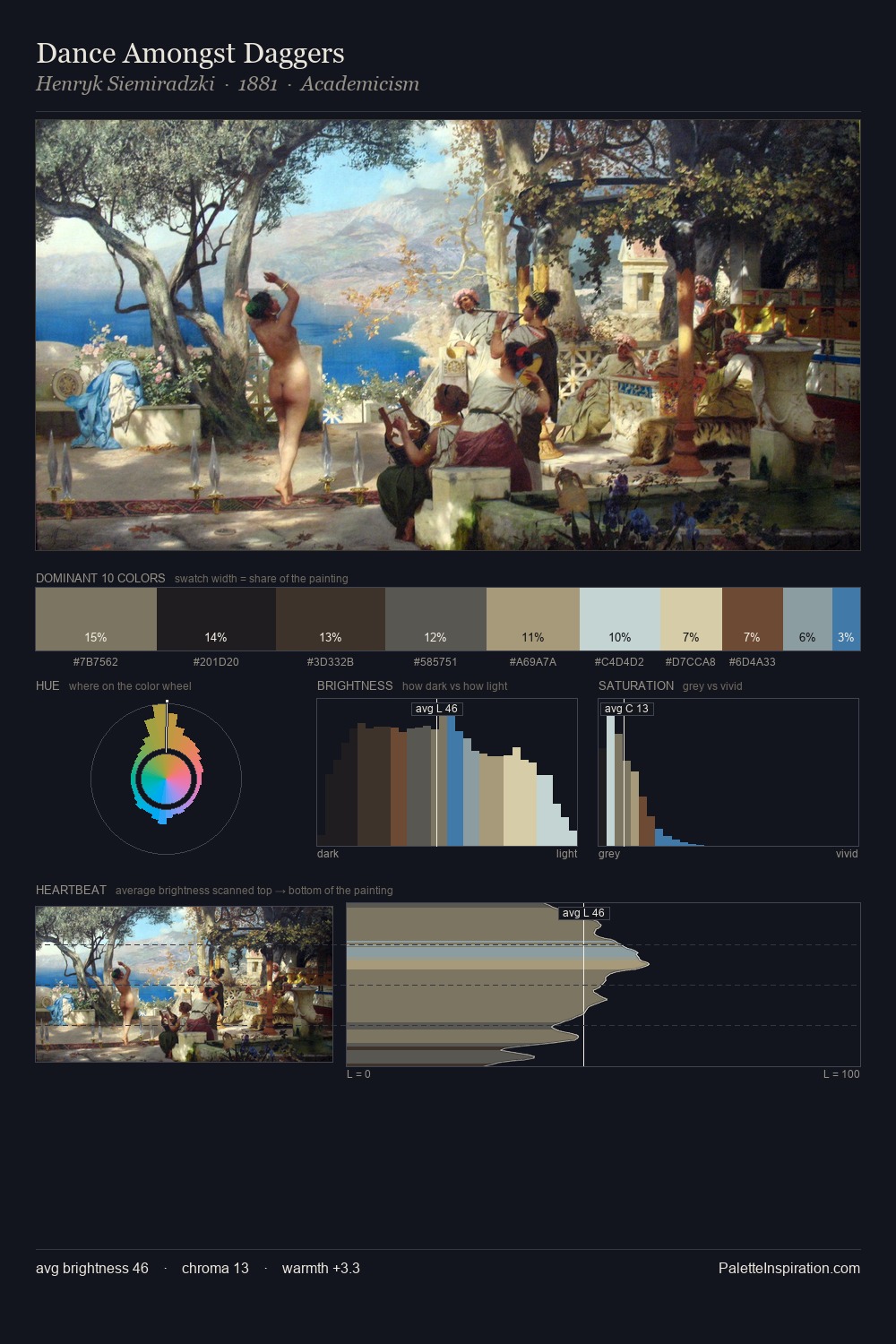
Mid-key values give Andrea Pozzo its characteristic quietness - nothing blazes, nothing disappears. Warm and cool are kept in productive tension, creating the kind of chromatic harmony that sustains the eye. Saturation is deliberately withheld - the beauty here lies in the near-monochromatic gradations rather than colour difference. At 2.2%, #58769C carries the palette's sharpest chromatic charge: an accent that earns its place precisely because it is withheld. 65 units of value range underpin the palette's structural clarity: the eye always knows where light falls. Andrea Pozzo's palette 2 carries its own internal logic while remaining in conversation with the artist's broader colour intelligence.
Example use cases
- exhibition design
- foundation branding
- estate management
- art education
- museums & galleries
I Love This!
Use This Palette
Copy, export, or download for your project
Copy, export, or download for your project
Copy:
Download:
Share: