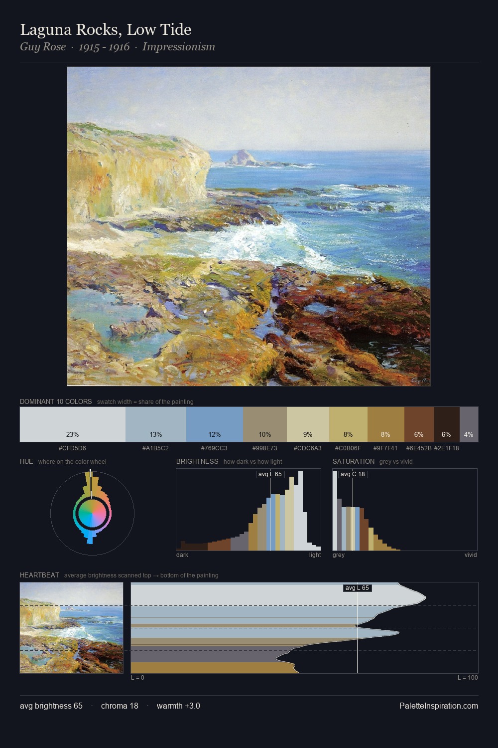
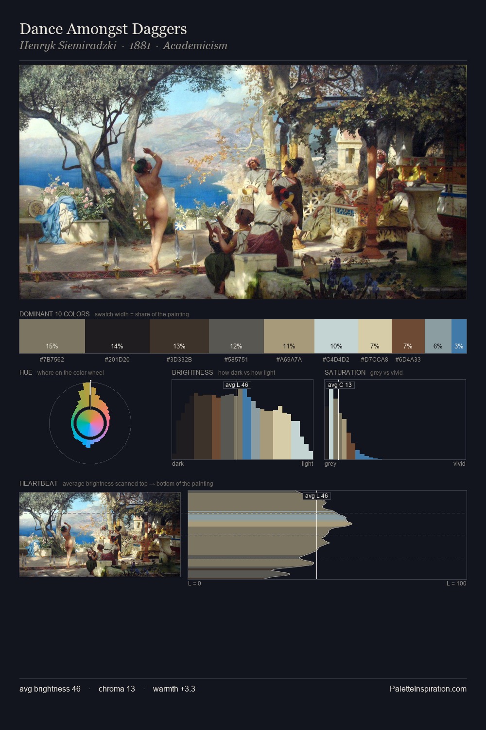
American Realism Palette 2
Lustrous Alabaster
Lustrous Sheen without harshness - mid-to-high key, silky, with a pearl-like quality.
Alabaster Warm off-white - creamy stone white, luminous and slightly translucent.
Palette Analysis
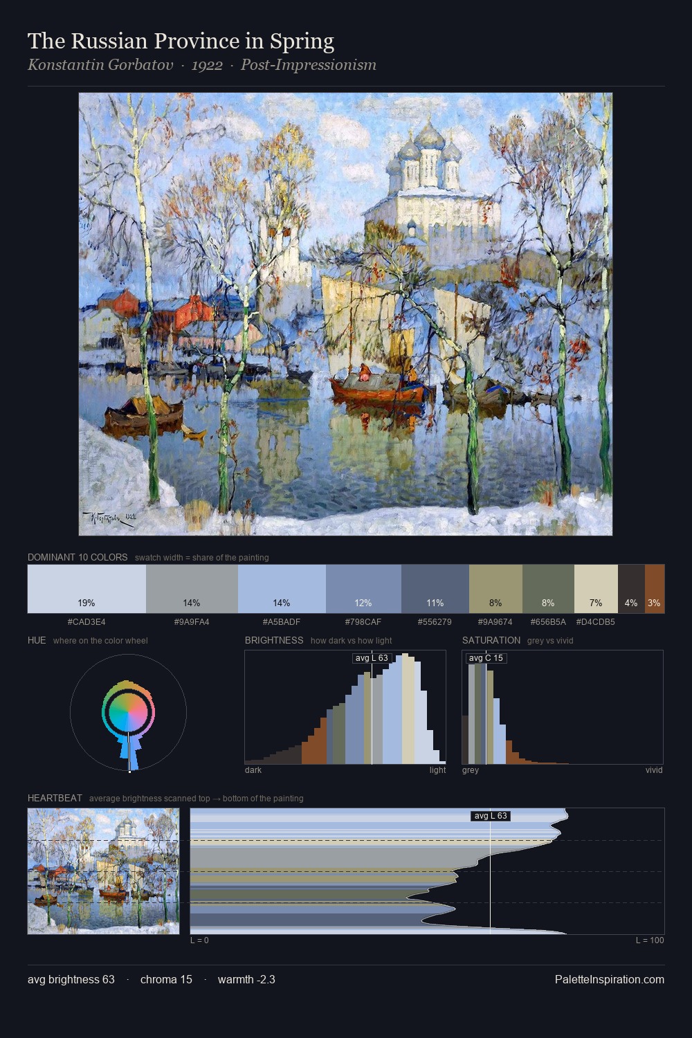
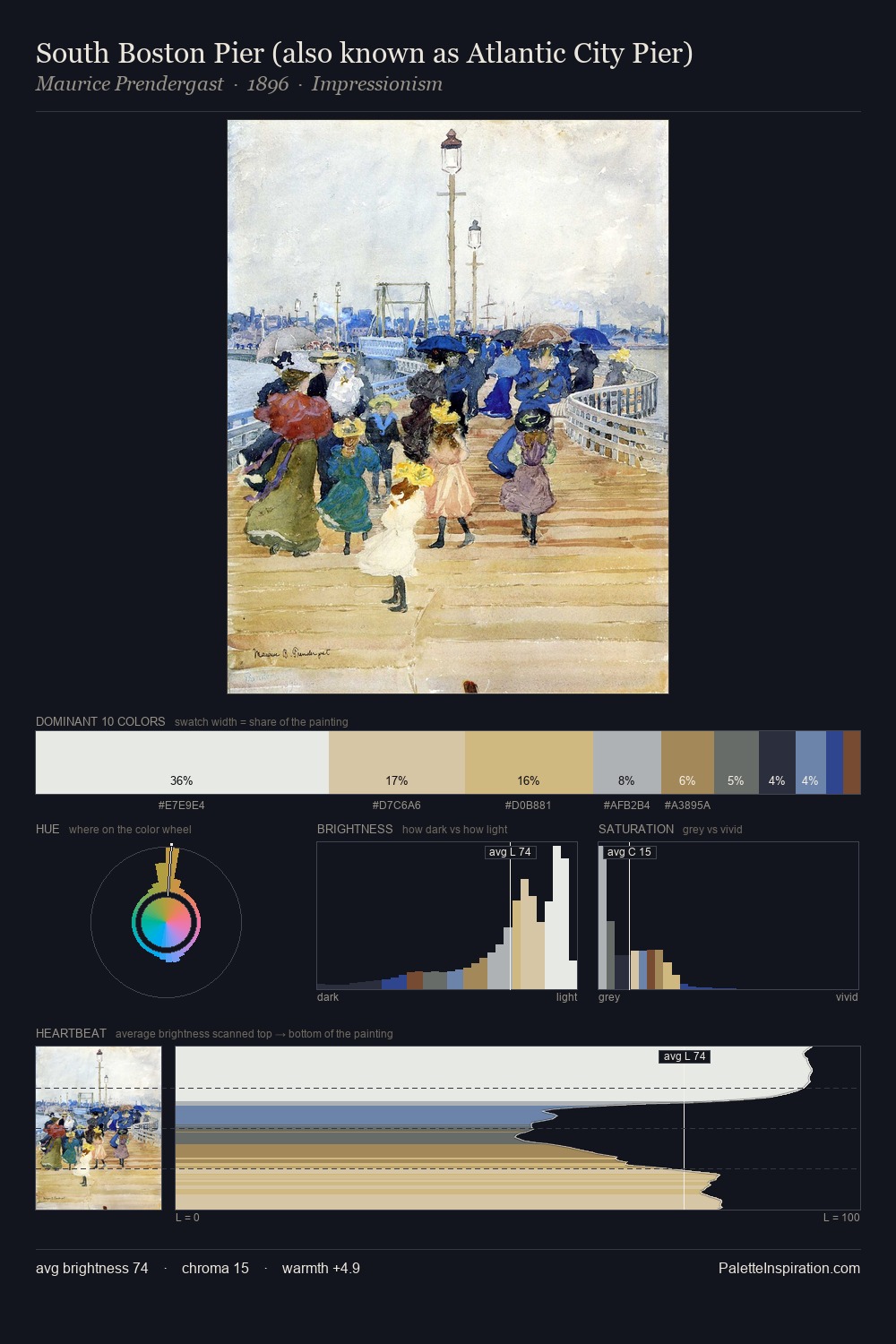
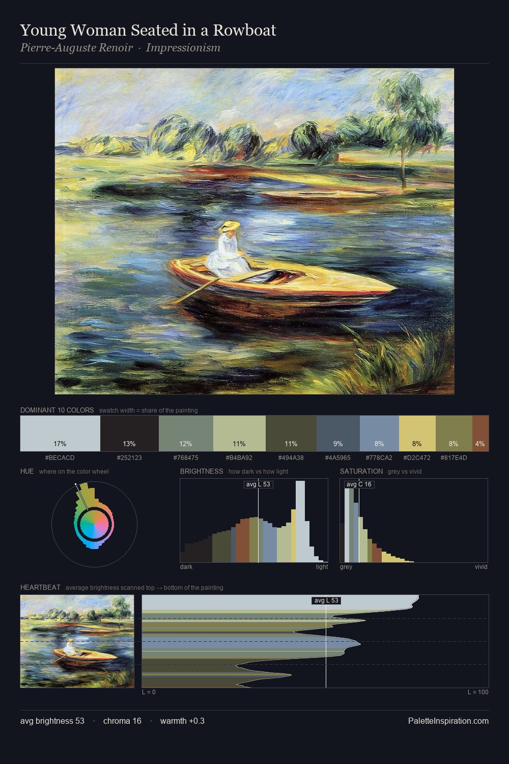
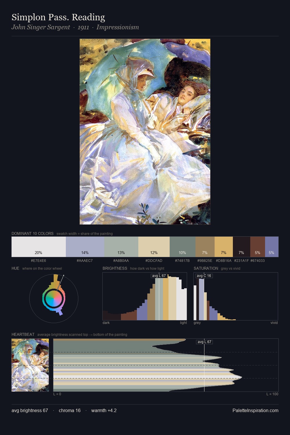
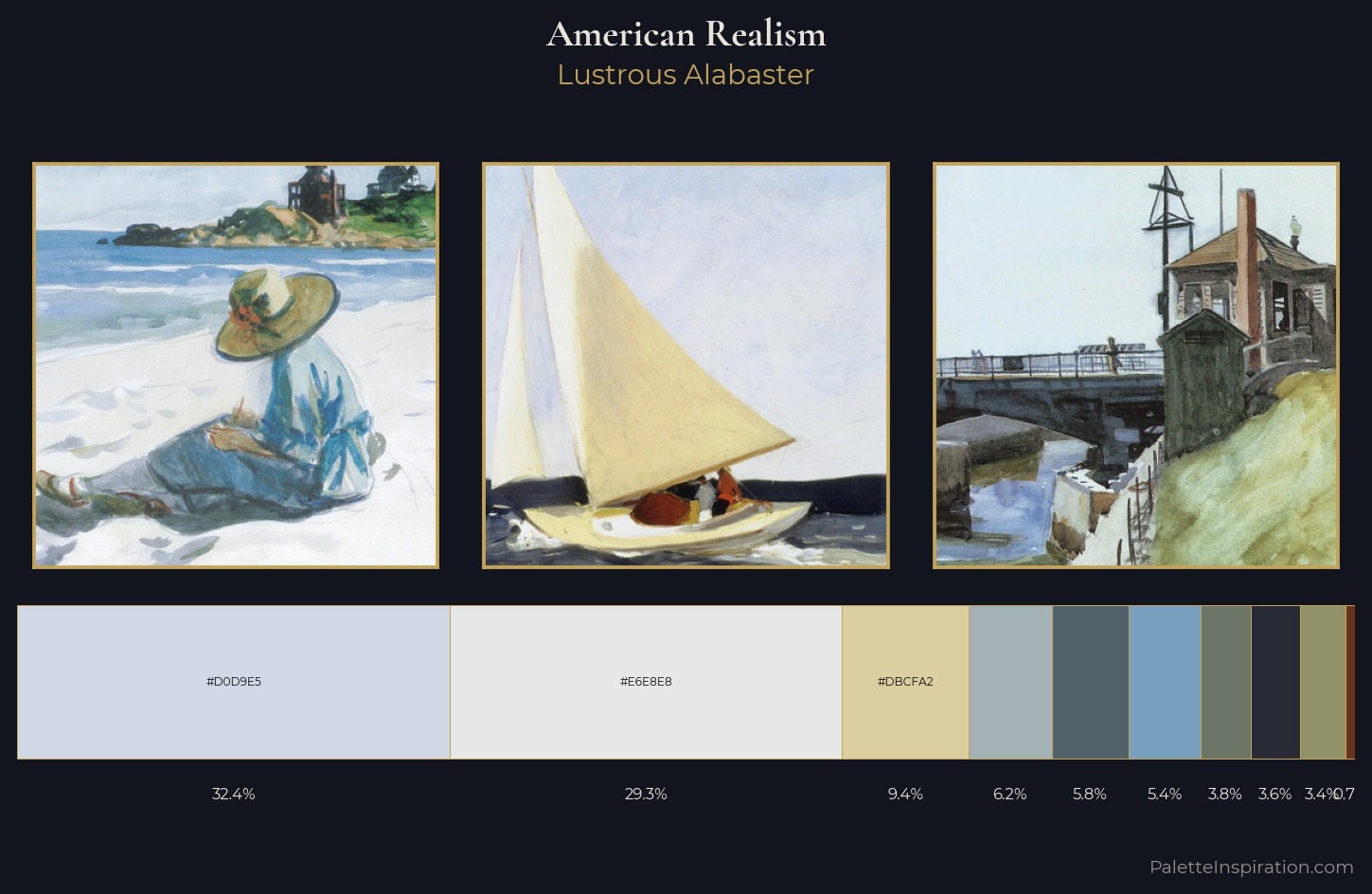
American Realism is strongly light-biased - shadow is suggested rather than declared. Cool hues prevail: blues, greens, and greys anchor the palette's emotional temperature. Saturation is deliberately withheld - the beauty here lies in the near-monochromatic gradations rather than colour difference. A single dominant - #D0D9E5 at 32.4% - sets the character of the whole composition. The saturated accent, #67331F, registers at 0.7% - sparse enough to feel like a deliberate surprise. The full value range is 64 units: broad enough to build convincing three-dimensional form. High luminosity and cool temperature suggest the plein-air condition: unfiltered daylight and open sky.
Example use cases
- museum collateral
- fashion lookbooks
- minimalist e-commerce
- interior design
- publishing
I Love This!
Use This Palette
Copy, export, or download for your project
Copy, export, or download for your project
Copy:
Download:
Share: