Alfredo Andersen Palette 2
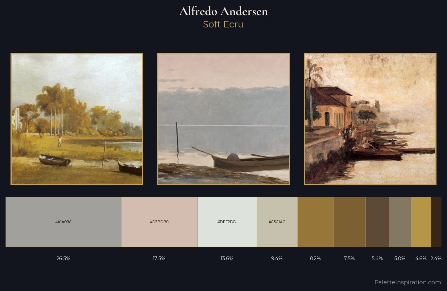
Palette Analysis
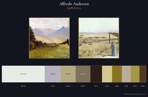
Alfredo Andersen works in the upper reaches of the value scale, creating an atmosphere of brightness and expansiveness. A distinctly cool atmosphere runs through this palette: sky, water, and mist given colour form. Saturation is deliberately withheld - the beauty here lies in the near-monochromatic gradations rather than colour difference. At 26.5%, #A1A09C functions less as a colour accent and more as a complete atmospheric environment. The saturated accent, #B59546, registers at 4.6% - sparse enough to feel like a deliberate surprise. A value spread of 62 units gives the palette both depth and air - shadows are genuinely dark, lights genuinely light. The mid-to-high key, cool bias, and moderate chroma point to outdoor observation - sky and diffused daylight as the dominant light source. Alfredo Andersen's palette 2 carries its own internal logic while remaining in conversation with the artist's broader colour intelligence.
Example use cases
- exhibition design
- foundation branding
- estate management
- art education
- museums & galleries
I Love This!
Copy, export, or download for your project