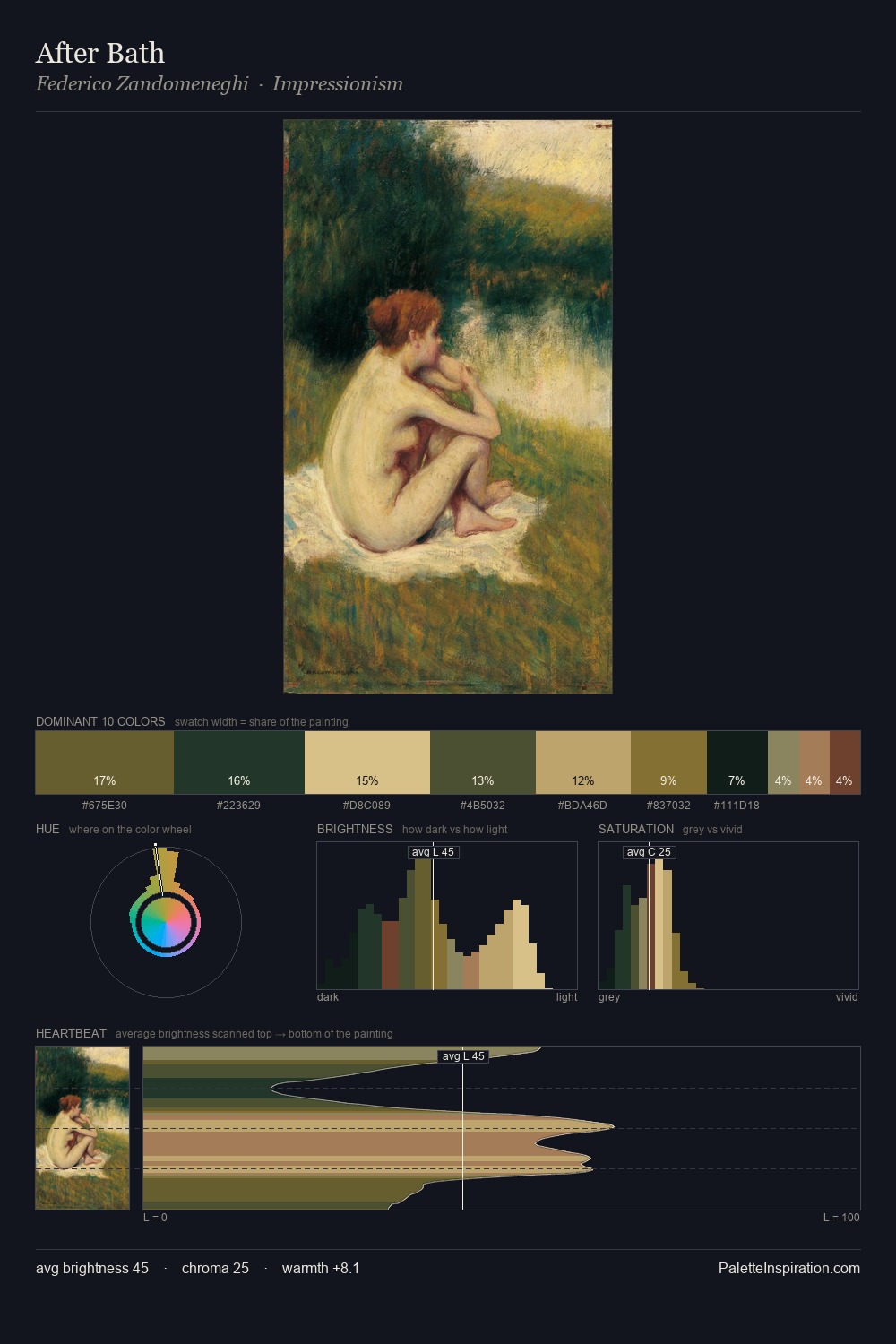
Alfred Parsons Palette 3

Palette Analysis
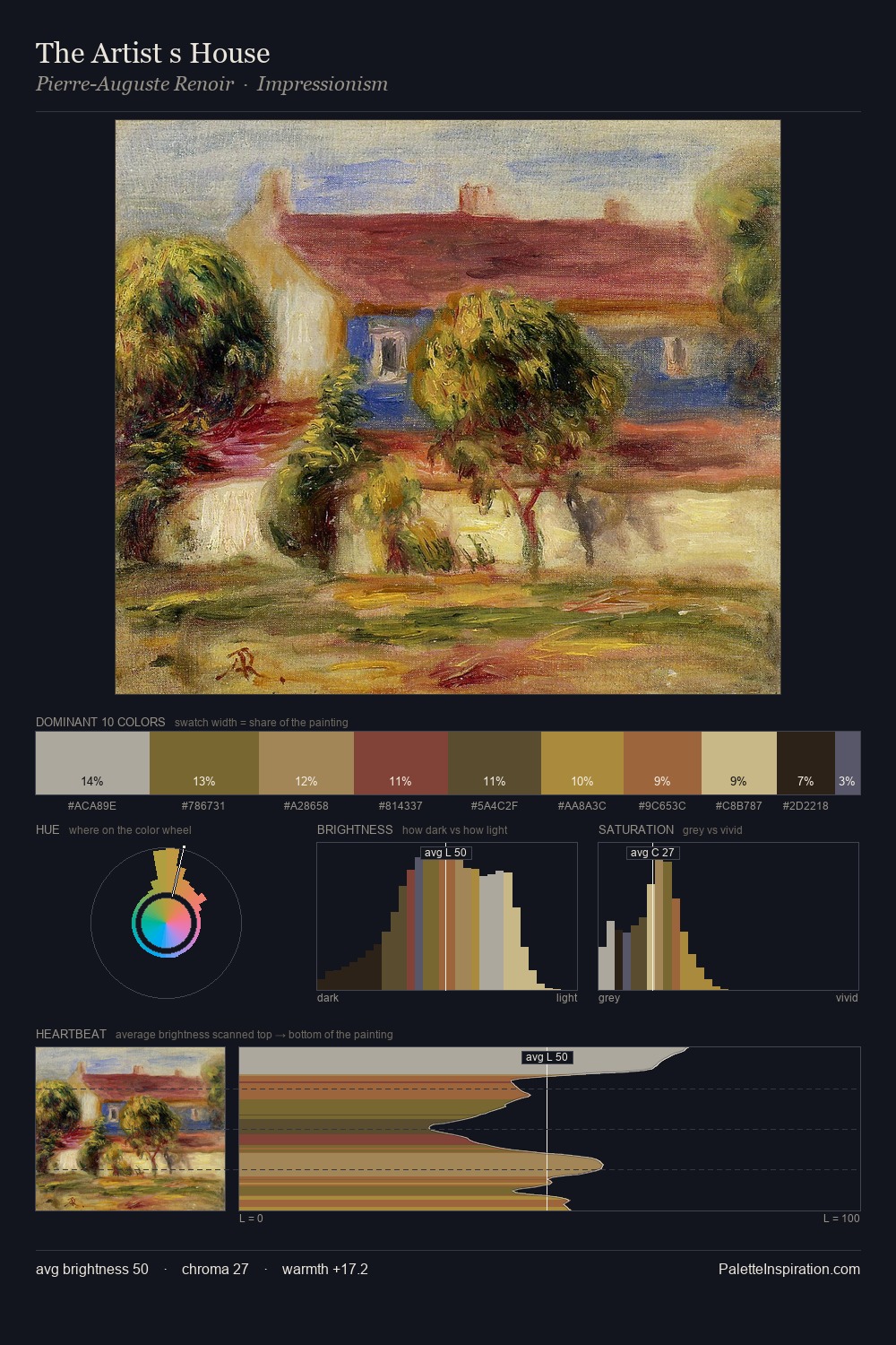
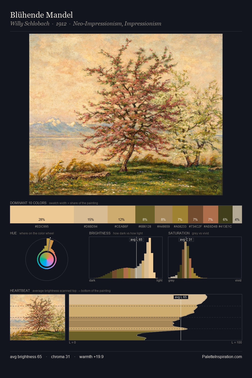
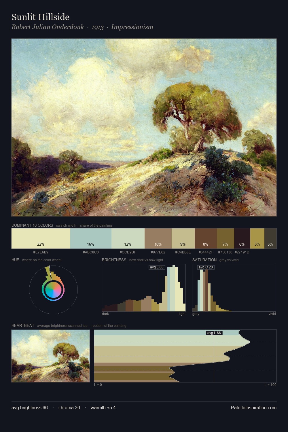
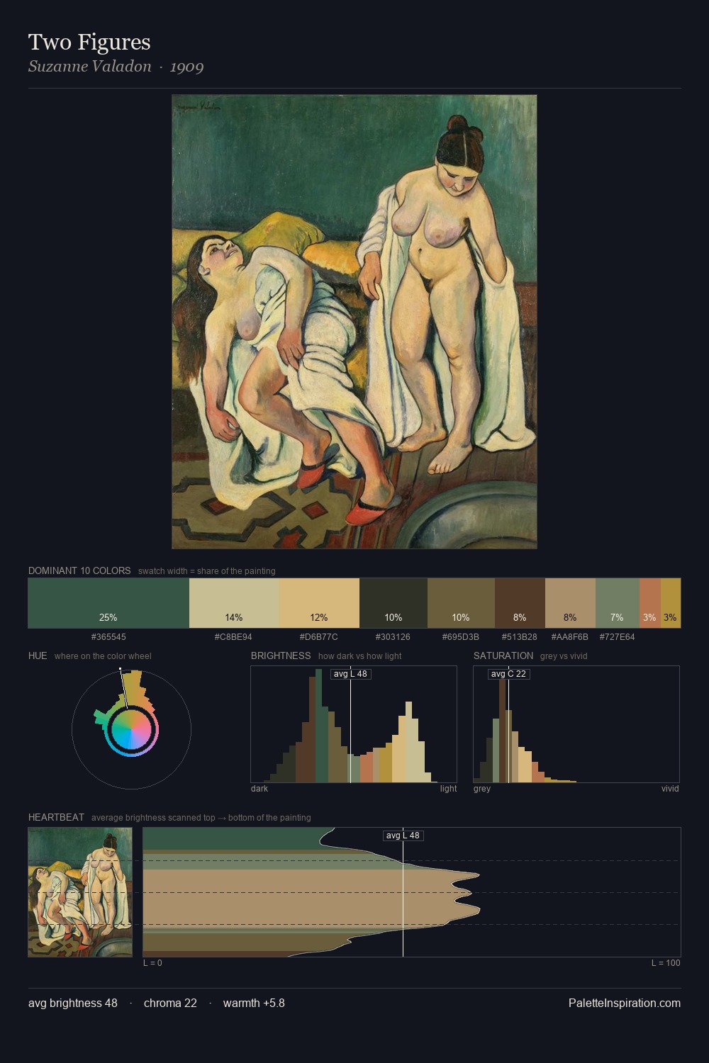
Values in Alfred Parsons tilt decisively toward white, giving the palette its luminous character. Cool tones set the register here - the blues and greens easily outweigh any warm accents. Chroma is moderate: colours carry enough saturation to be read as colour, but the palette stops well short of garish intensity. The dominant colour, #CCC592, takes 25.6% of the total area, establishing the overall mood before any other hue is introduced. At 6.0%, #6F6428 carries the palette's sharpest chromatic charge: an accent that earns its place precisely because it is withheld. The value range of 48 units sits in the comfortable middle: enough depth, enough light, neither extreme. High luminosity and cool temperature suggest the plein-air condition: unfiltered daylight and open sky. In the context of Alfred Parsons's full range of palettes, group 3 represents one movement in an ongoing chromatic dialogue.
Example use cases
- design agencies
- product brands
- e-commerce
- editorial sites
- publishing
I Love This!
Copy, export, or download for your project