Alfred Freddy Krupa Master Palette

Palette Analysis
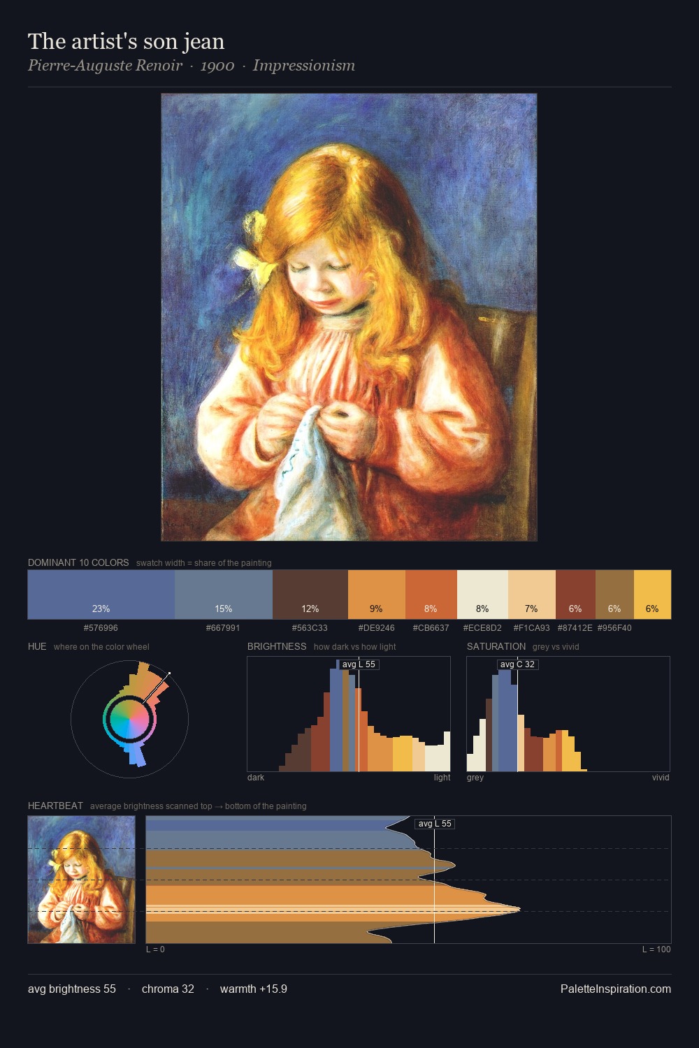
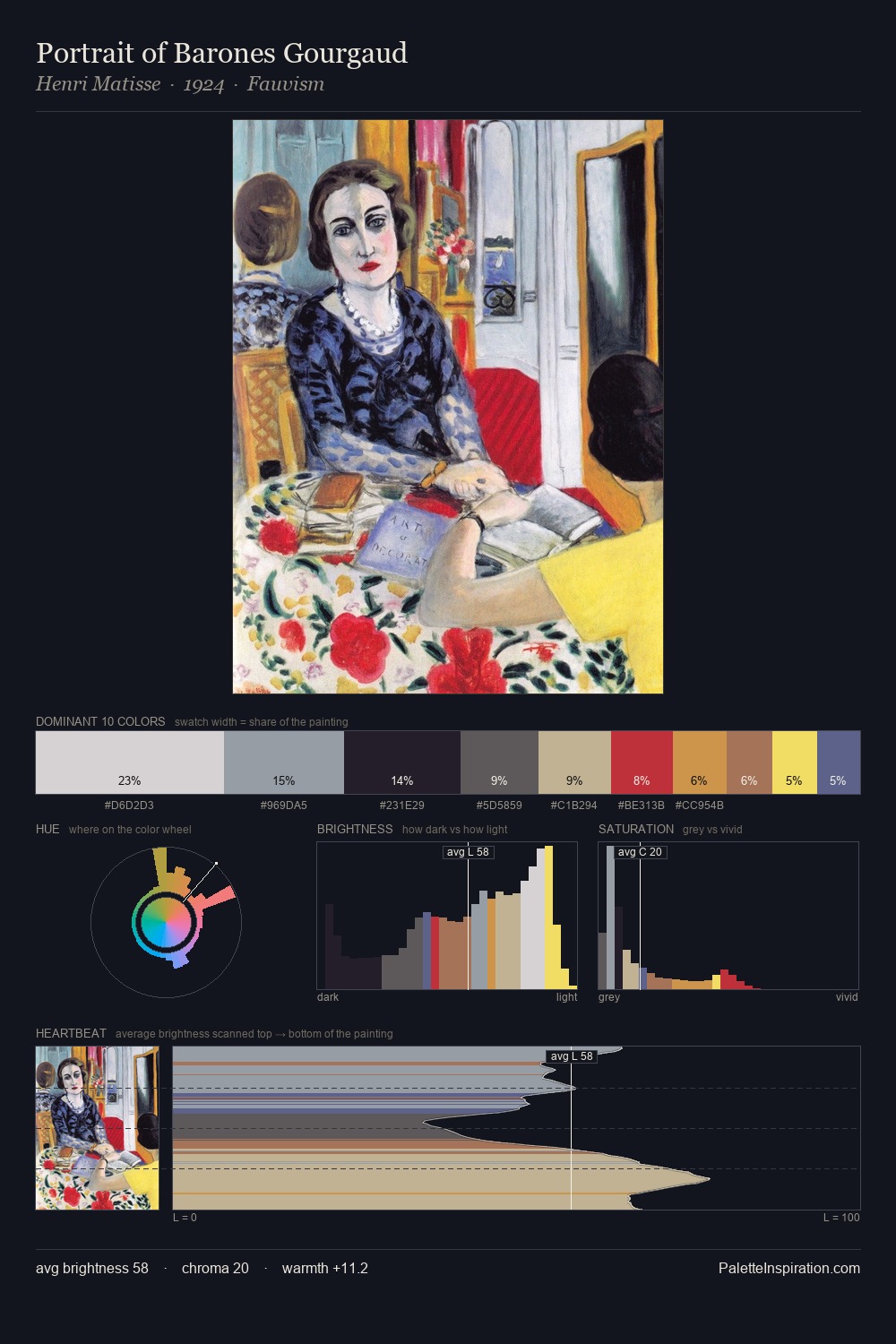
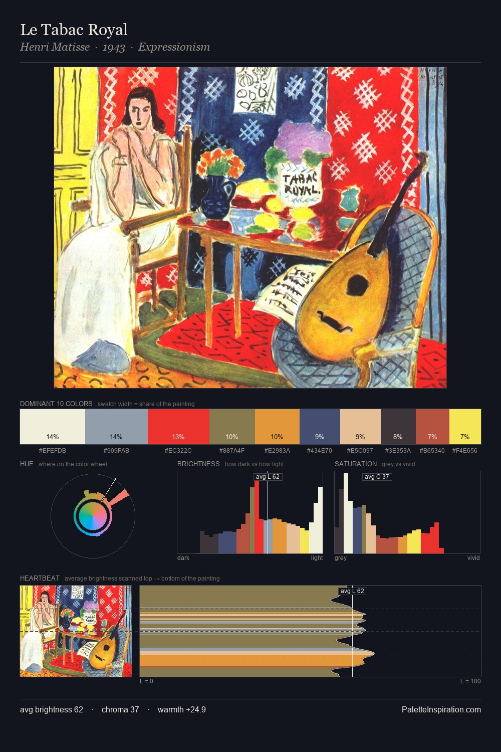
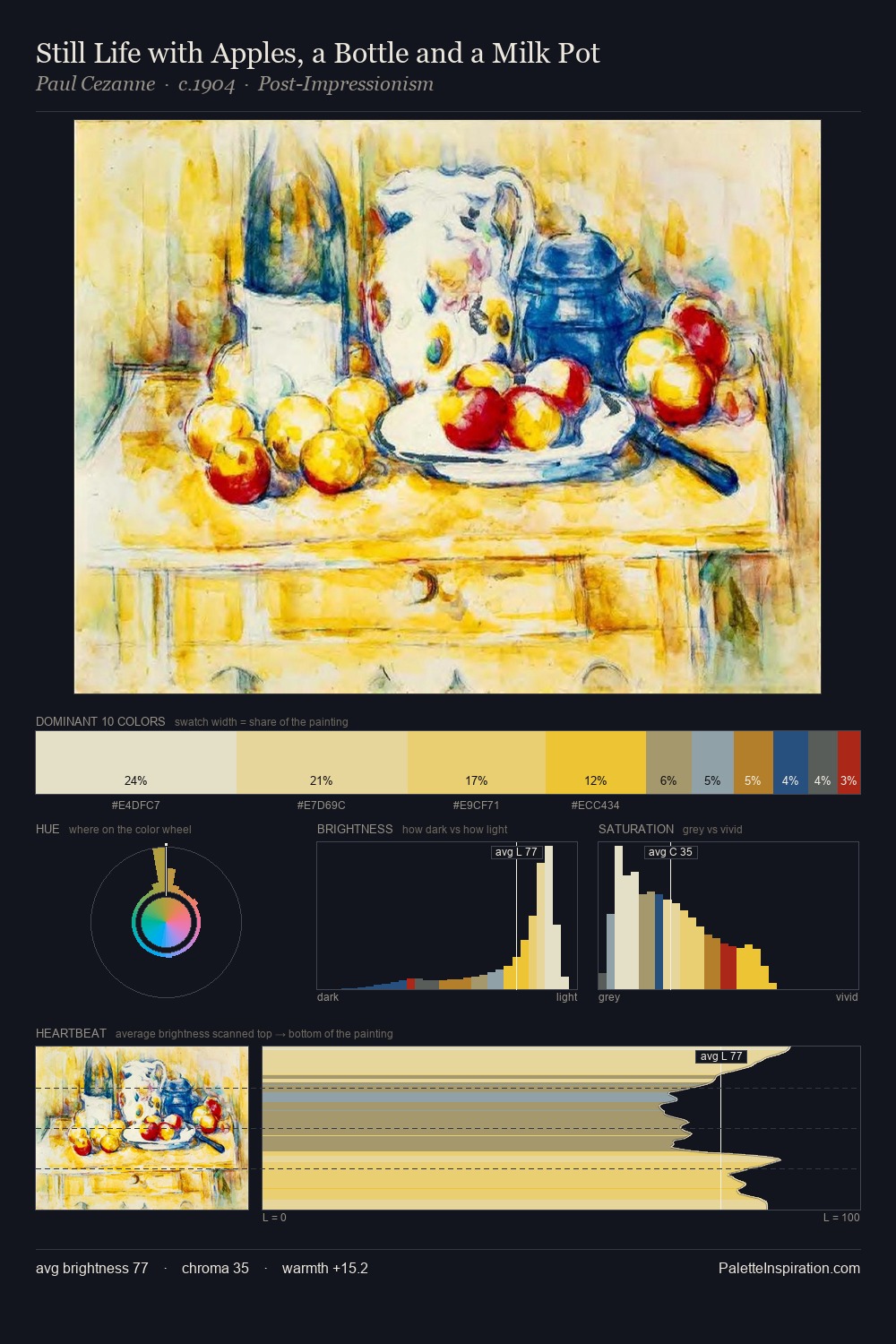
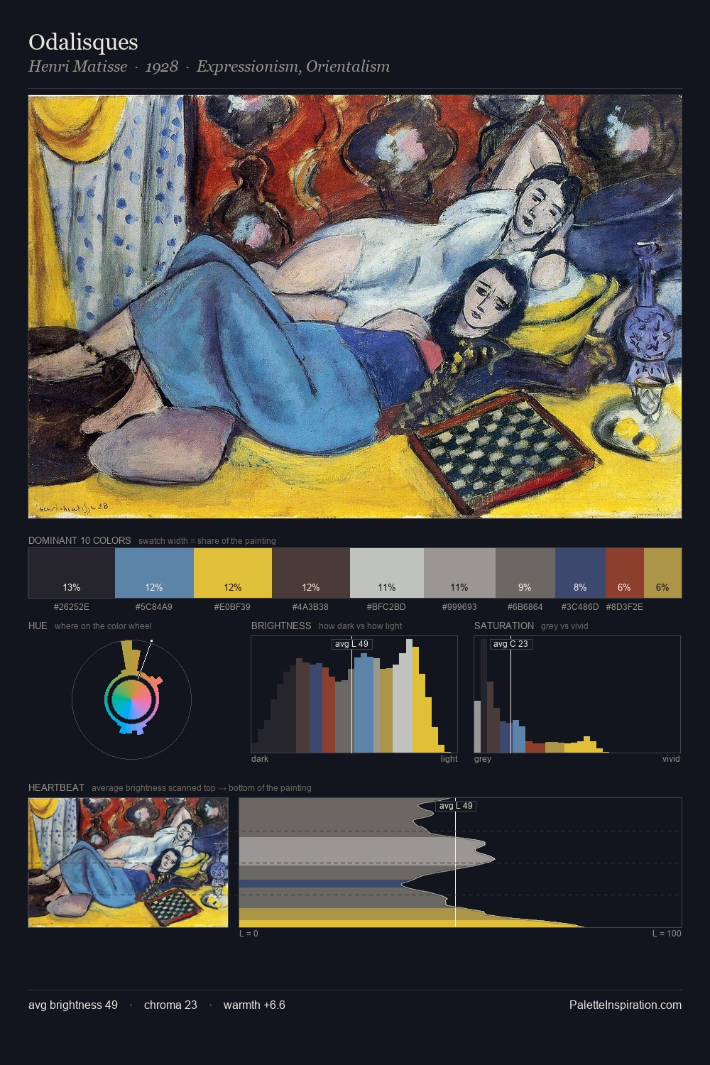
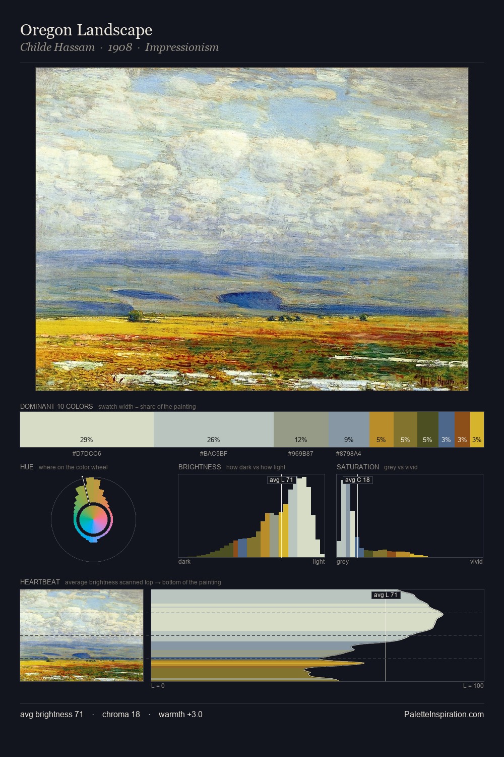
Alfred Freddy Krupa sits in the centre of the value range, lending the palette a sense of even, sustained light. Blues and teal-greys govern the palette, lending it an aquatic or atmospheric quality. Colours are neither washed out nor blazing; they occupy the productive middle ground of the chroma scale. #8296A9 at 27.5% of the palette: an overwhelming presence that pulls all other colours into its gravitational field. #7B2216 delivers the chromatic peak at only 5.0% - a small shot of colour with outsized visual impact. Spanning 46 units on the value axis, the palette achieves the balance between tonal flatness and fragmentation. The mid-to-high key, cool bias, and moderate chroma point to outdoor observation - sky and diffused daylight as the dominant light source. These proportions encode Alfred Freddy Krupa's instinctive sense of how much of each quality the eye can hold.
Example use cases
- publishing
- corporate identity
- consumer apps
- hospitality
- design agencies
I Love This!
Copy, export, or download for your project