Alfred Freddy Krupa Palette 1

Palette Analysis
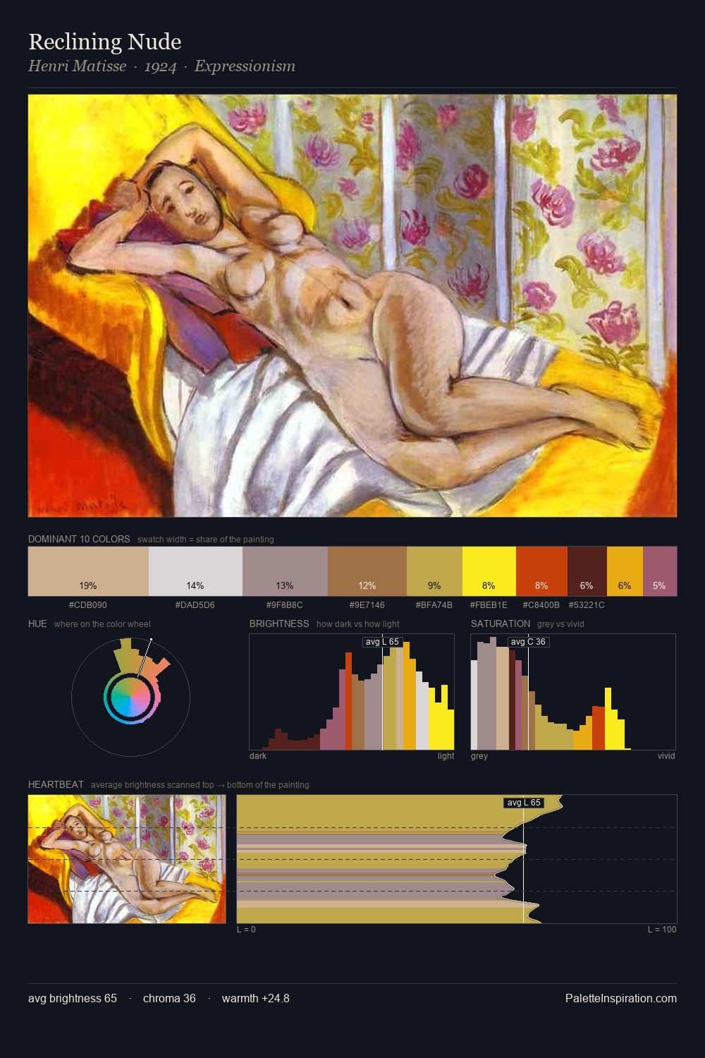
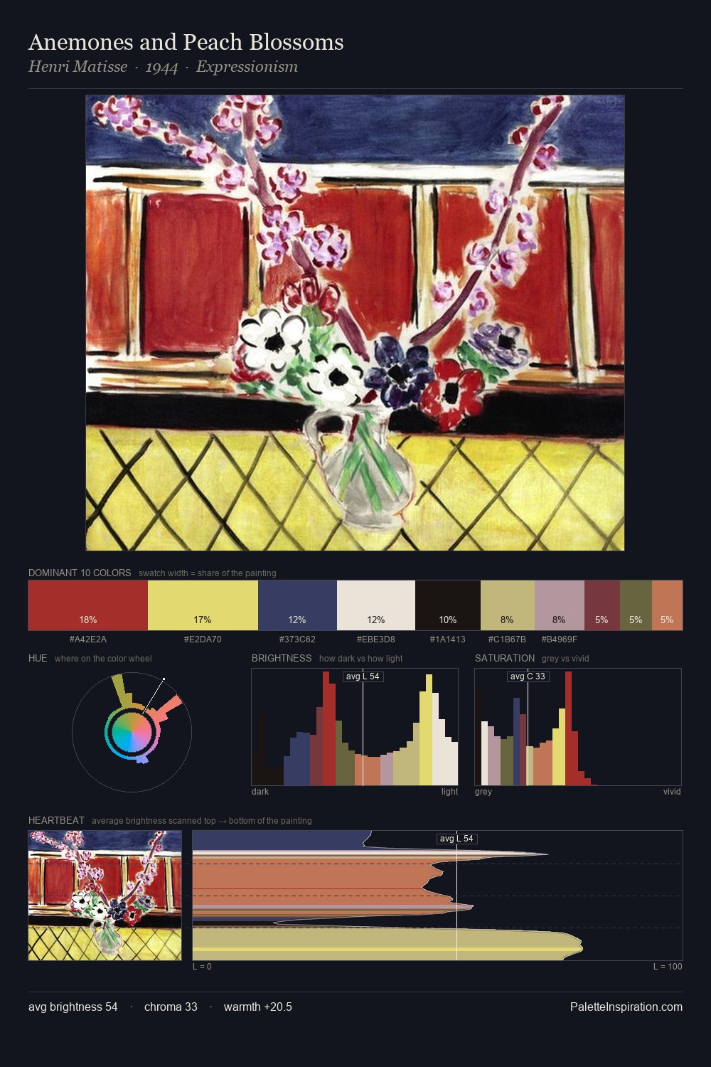
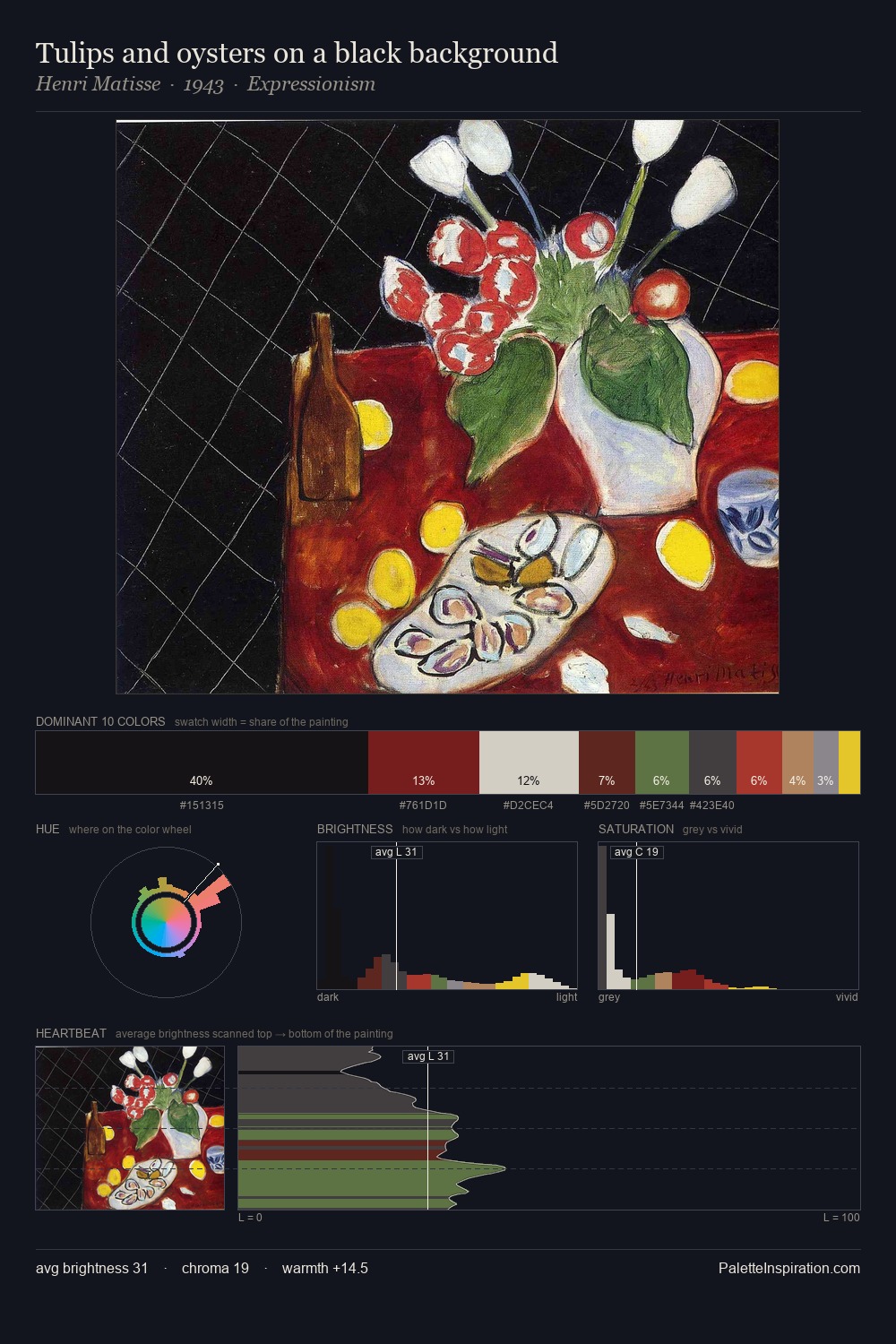
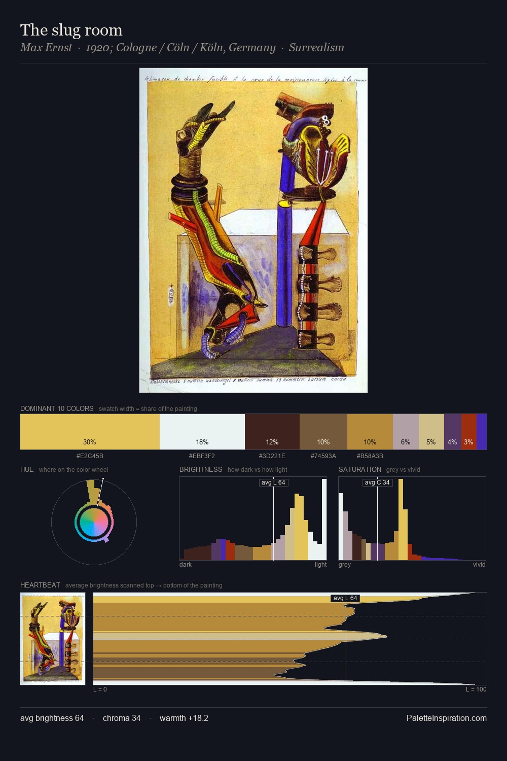
The high-key values of Alfred Freddy Krupa give it an effulgent, almost bleached quality. Blues and teal-greys govern the palette, lending it an aquatic or atmospheric quality. Mid-saturation across the board: the palette has colour character without chromatic excess. #DAE0E2 claims 25.5% of the surface, functioning as the work's tonal foundation. Rather than a studied accent, #D6C351 takes 8.2% - a bold allocation that saturates the composition's atmosphere. The full value range is 63 units: broad enough to build convincing three-dimensional form. The mid-to-high key, cool bias, and moderate chroma point to outdoor observation - sky and diffused daylight as the dominant light source. Palette 1 sits within the larger chromatic argument that Alfred Freddy Krupa's complete body of work advances.
Example use cases
- publishing
- corporate identity
- consumer apps
- hospitality
- design agencies
I Love This!
Copy, export, or download for your project