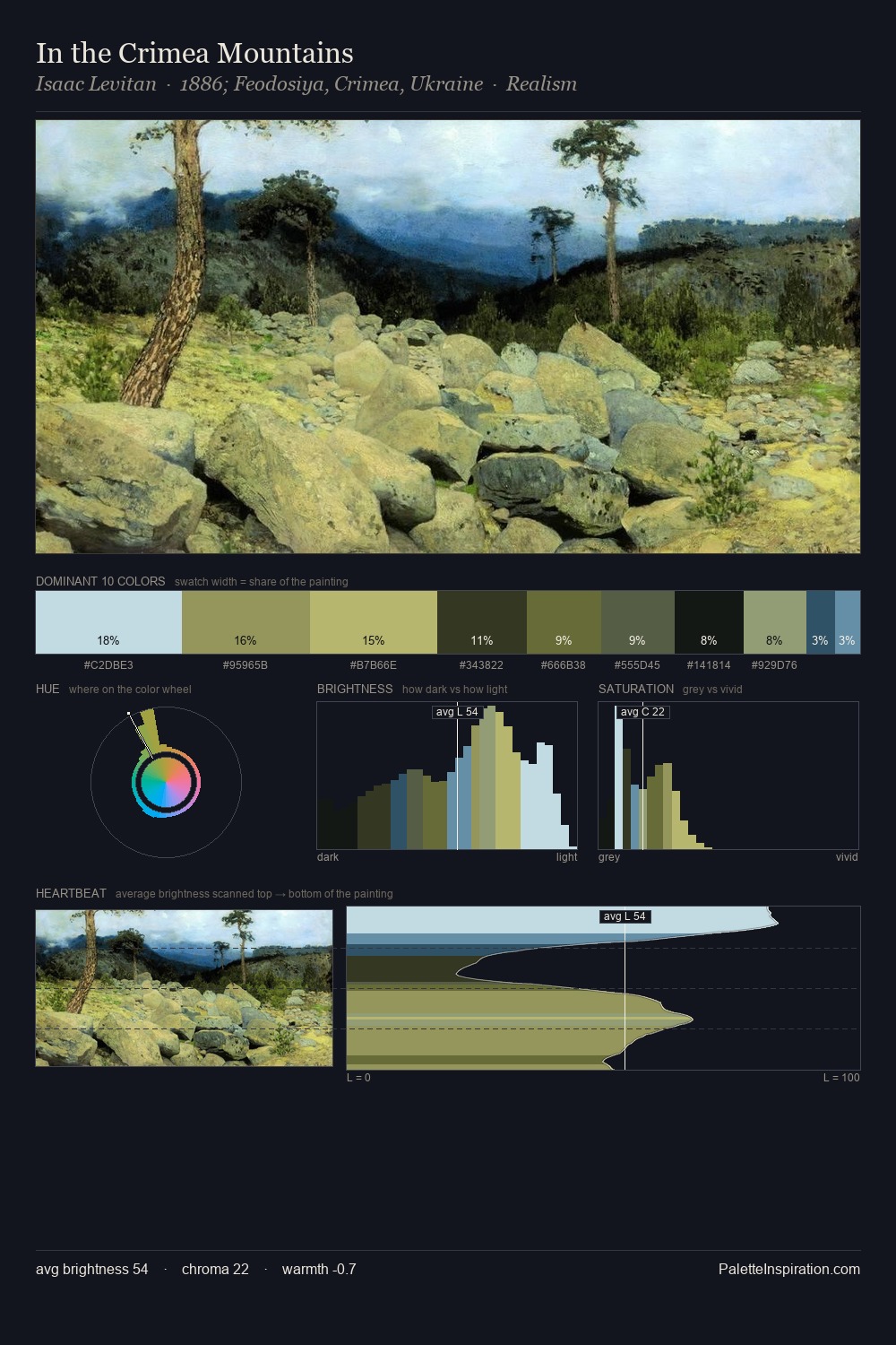
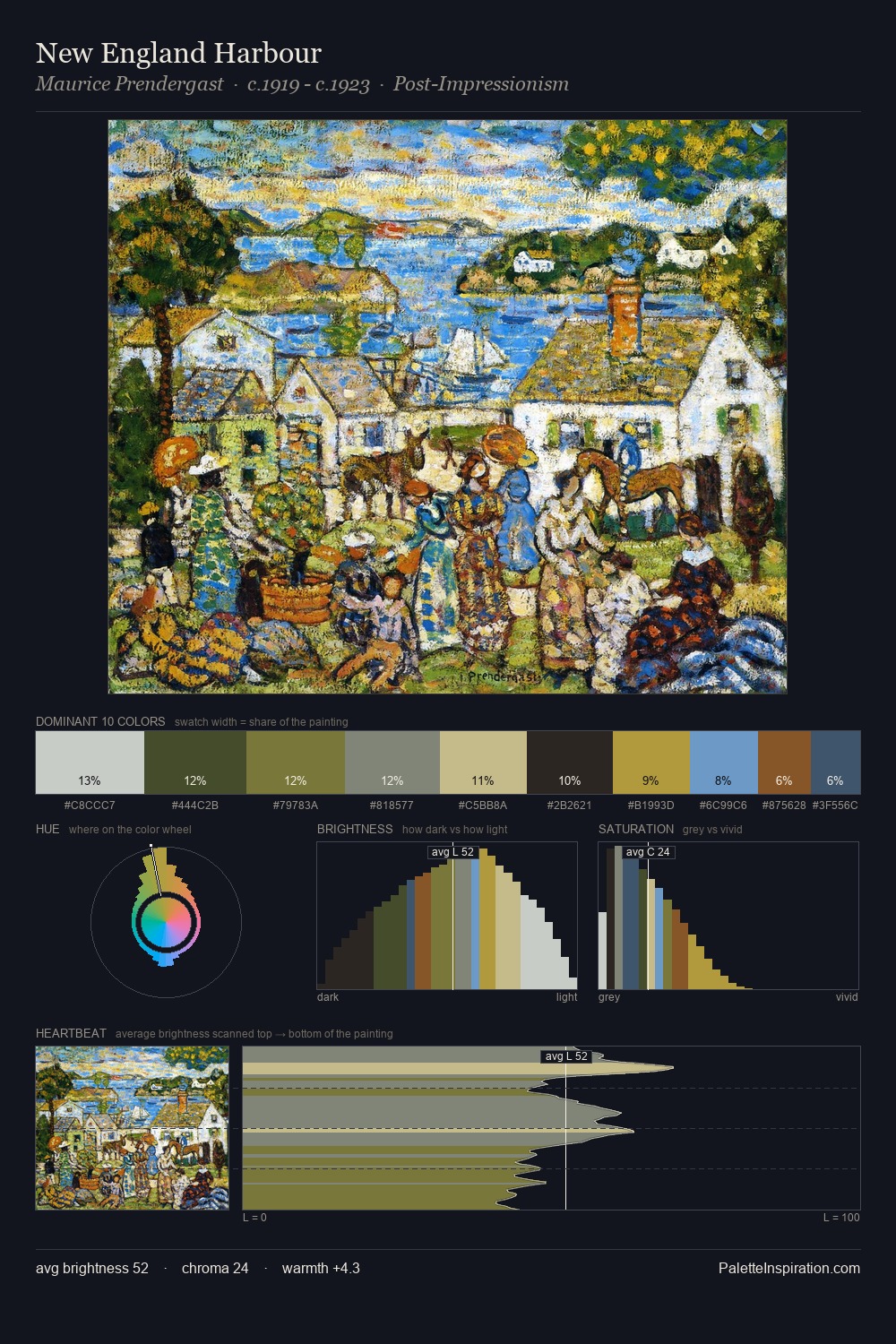
Alexey Bogolyubov Palette 5

Palette Analysis
Values in Alexey Bogolyubov tilt decisively toward white, giving the palette its luminous character. Cool hues prevail: blues, greens, and greys anchor the palette's emotional temperature. The absence of saturated colour is itself an expressive choice: this is a palette of restraint and atmosphere. #C9E2D9 at 34.8% of the palette: an overwhelming presence that pulls all other colours into its gravitational field. At 5.2%, #BCC494 carries the palette's sharpest chromatic charge: an accent that earns its place precisely because it is withheld. At 62 units of value range, the palette has the tonal breadth to sustain complex spatial readings. The mid-to-high key, cool bias, and moderate chroma point to outdoor observation - sky and diffused daylight as the dominant light source. Palette 5 sits within the larger chromatic argument that Alexey Bogolyubov's complete body of work advances.
Example use cases
- garden centers
- natural beauty
- park & rec design
- sustainable fashion
- sustainability
I Love This!
Copy, export, or download for your project