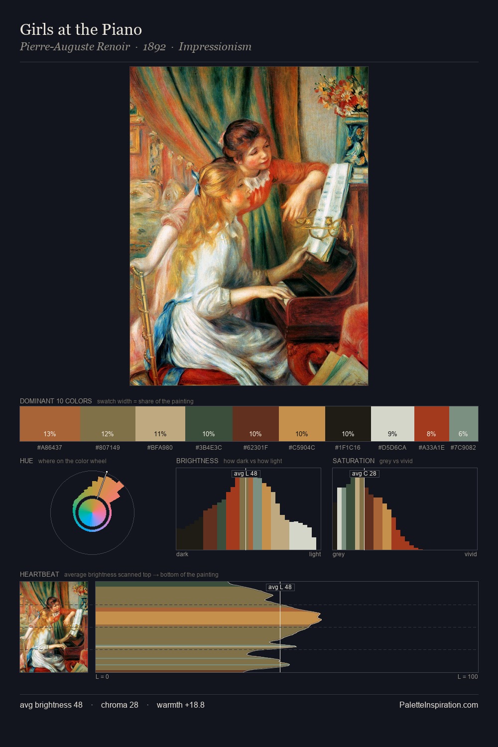
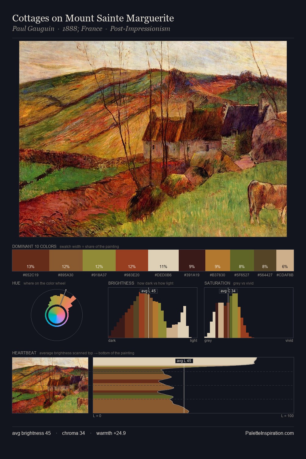
Alexei Harlamoff Palette 7

Palette Analysis
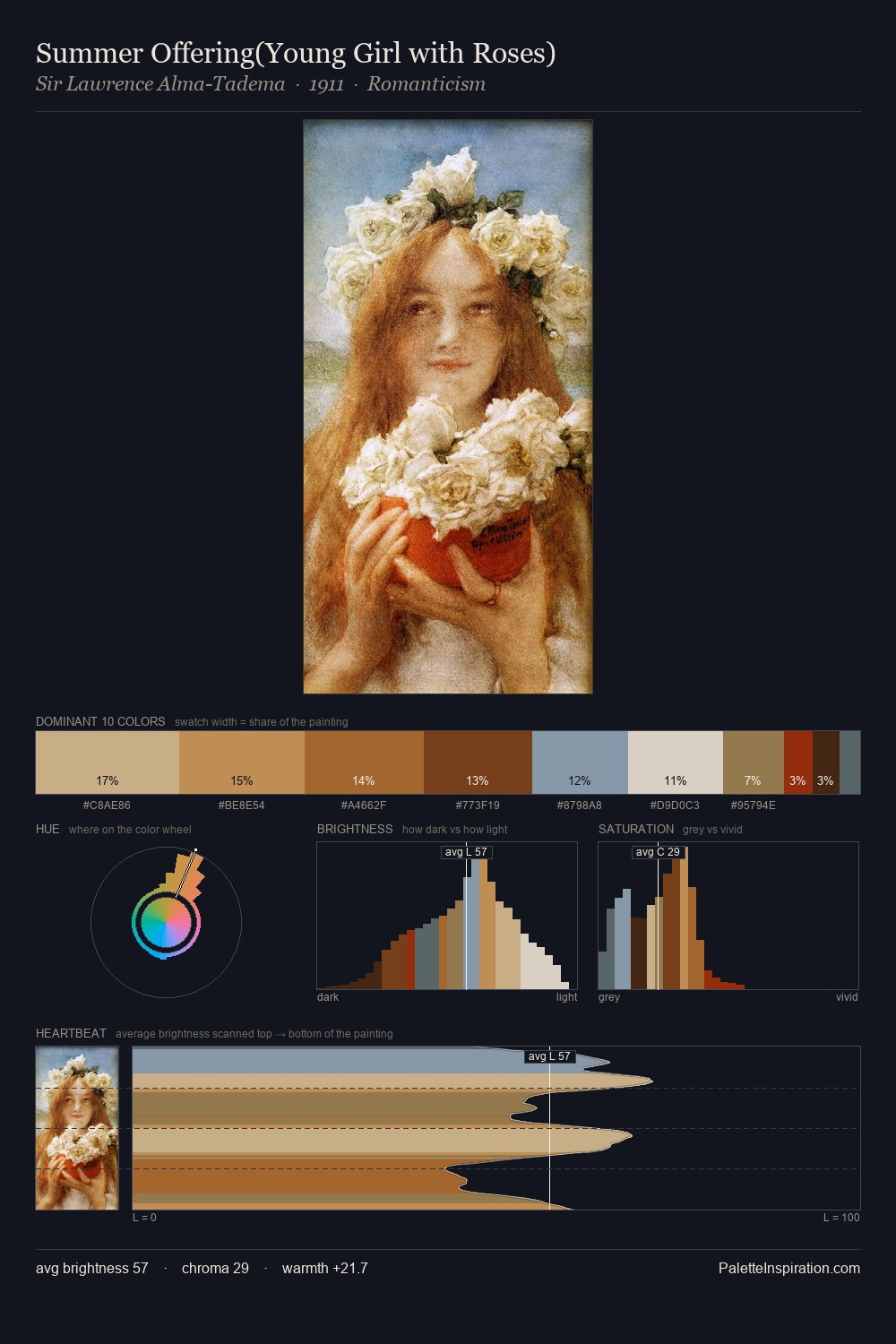
Mid-key values give Alexei Harlamoff its characteristic quietness - nothing blazes, nothing disappears. Warm and cool are kept in productive tension, creating the kind of chromatic harmony that sustains the eye. Saturation is deliberately withheld - the beauty here lies in the near-monochromatic gradations rather than colour difference. A single dominant - #D4D5C3 at 38.6% - sets the character of the whole composition. The most saturated colour, #2A1406, is reserved to 8.4% of the surface, where it acts as a focal punctuation. A value spread of 65 units gives the palette both depth and air - shadows are genuinely dark, lights genuinely light. In the context of Alexei Harlamoff's full range of palettes, group 7 represents one movement in an ongoing chromatic dialogue.
Example use cases
- ceramics & pottery
- boutique hospitality
- menswear
- heritage food brands
- craft & artisan brands
I Love This!
Copy, export, or download for your project