Alexander Pope Palette 3
Shadowed Bister
Shadowed Low-key - values weighted toward shadow, the palette of dim interiors and overcast skies.
Bister Dark warm brown - a traditional ink and wash pigment made from wood soot.

Palette Analysis
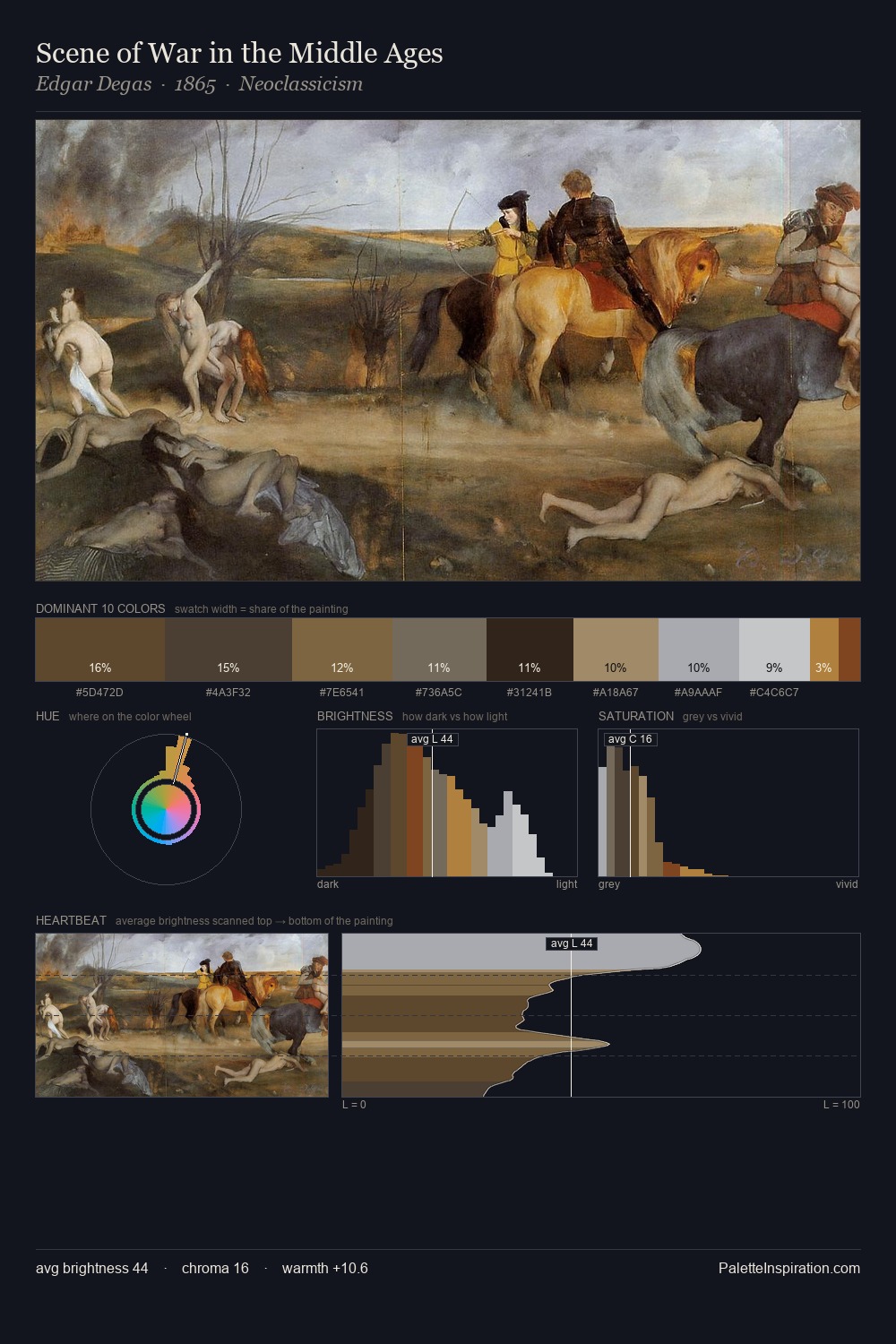
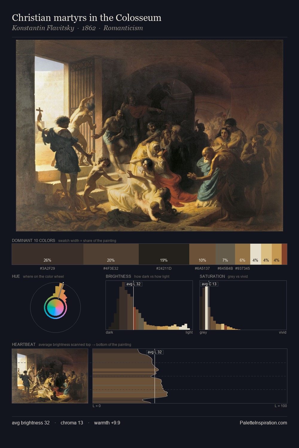
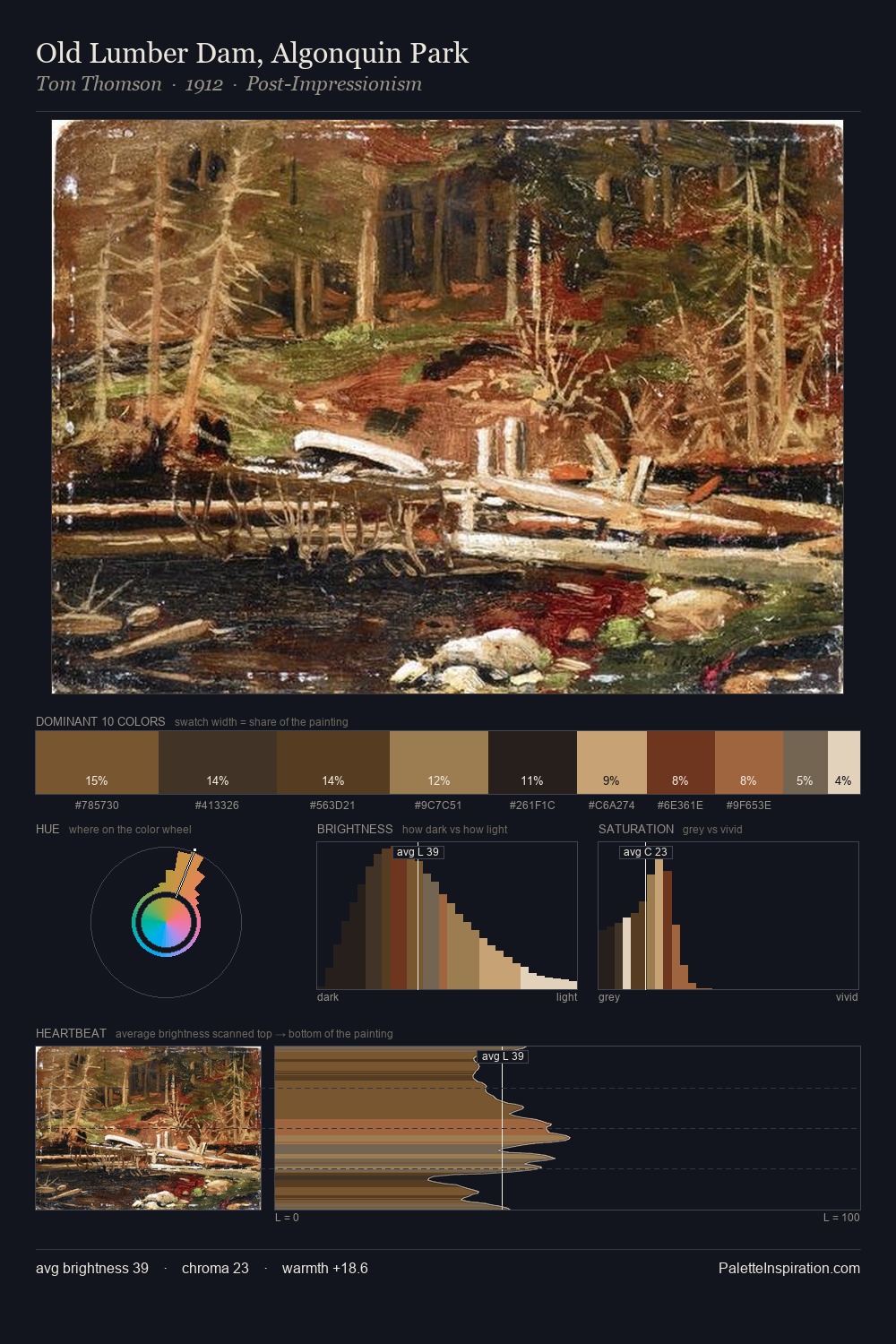
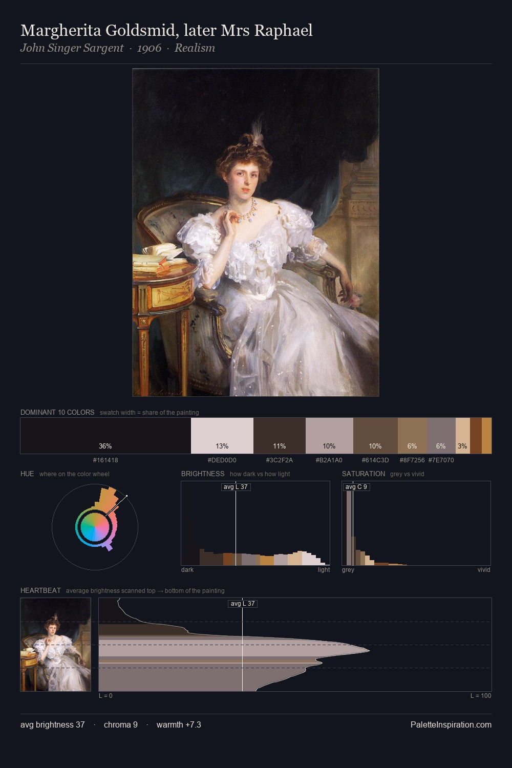
The value structure of Alexander Pope is mid-key: quiet, controlled, and cohesive. Warm hues command this palette; Alexander Pope favours the reds, oranges, and yellows of firelight and earth. All colours lean toward grey, building depth through value rather than colour punch. The most saturated colour, #B47D41, is reserved to 2.2% of the surface, where it acts as a focal punctuation. The value range spans 63 units across the palette, providing the full gamut from deep shadow to near-white and ensuring clear tonal hierarchy. In the context of Alexander Pope's full range of palettes, group 3 represents one movement in an ongoing chromatic dialogue.
Example use cases
- film & entertainment
- fine dining
- spirits branding
- menswear
- theater design
I Love This!
Use This Palette
Copy, export, or download for your project
Copy, export, or download for your project
Copy:
Download:
Share: