Alexander Pope Palette 2

Palette Analysis
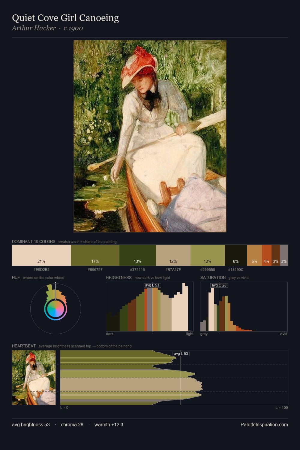
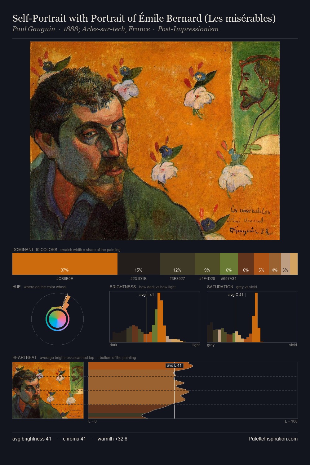
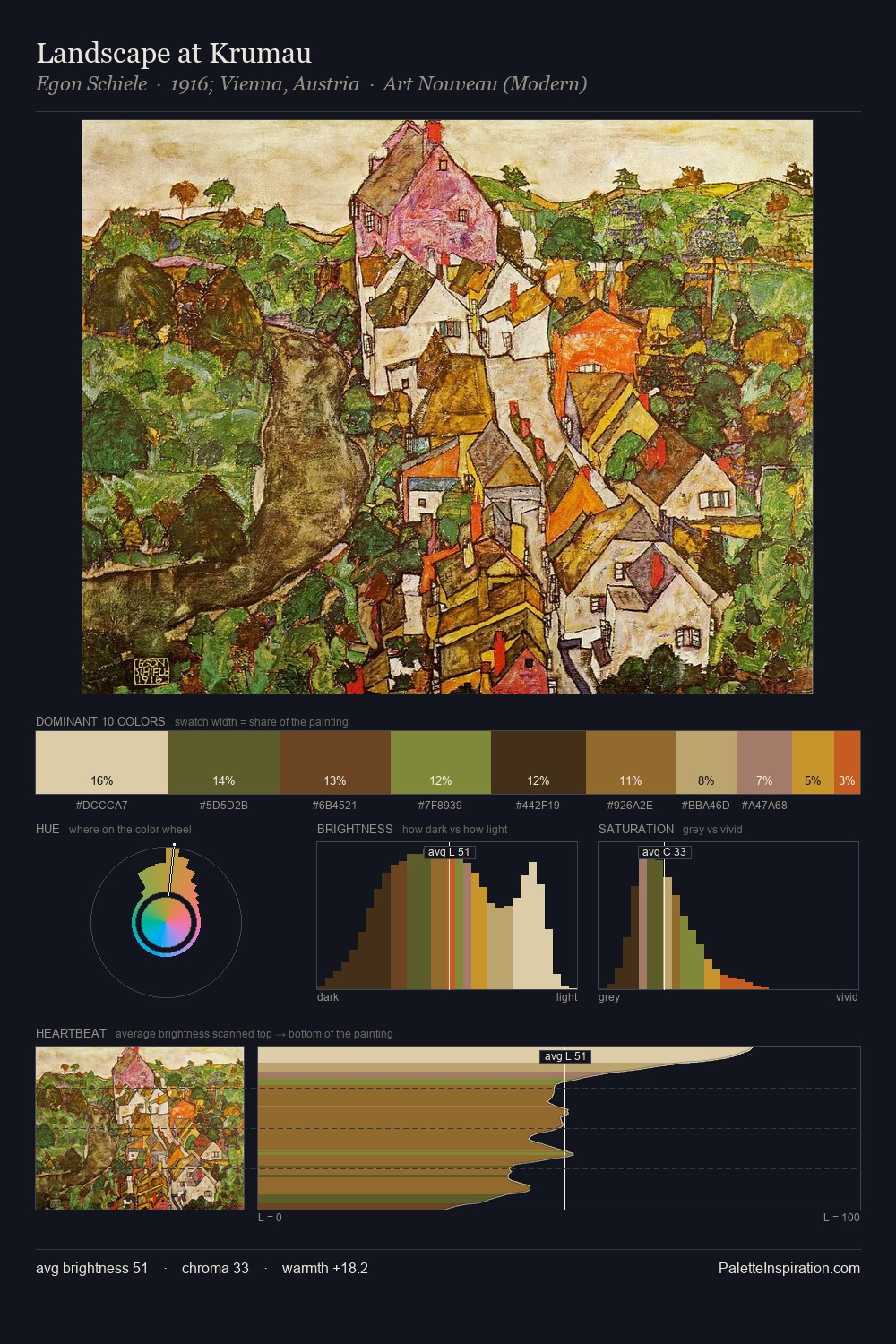
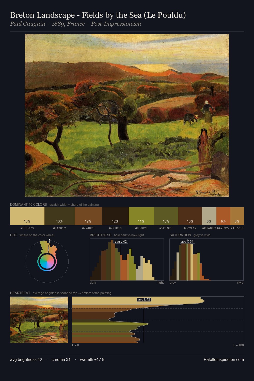
Alexander Pope distributes its values across the middle register, creating harmony without high contrast. Temperature is balanced: the palette pits warm earth against cool sky without declaring a winner. A restrained, mid-chroma palette: every hue is present and legible, but nothing shouts. The highest-chroma note - #57331B - appears at just 7.1%, deployed as a precision accent against the quieter ground. The full value range is 64 units: broad enough to build convincing three-dimensional form. The palette reads as an Impressionist one - light-biased, chromatically direct, and built on temperature contrast rather than value opposition. Alexander Pope's palette 2 carries its own internal logic while remaining in conversation with the artist's broader colour intelligence.
Example use cases
- theater design
- jewelry brands
- tobacco-adjacent retail
- event branding
- film & entertainment
I Love This!
Copy, export, or download for your project