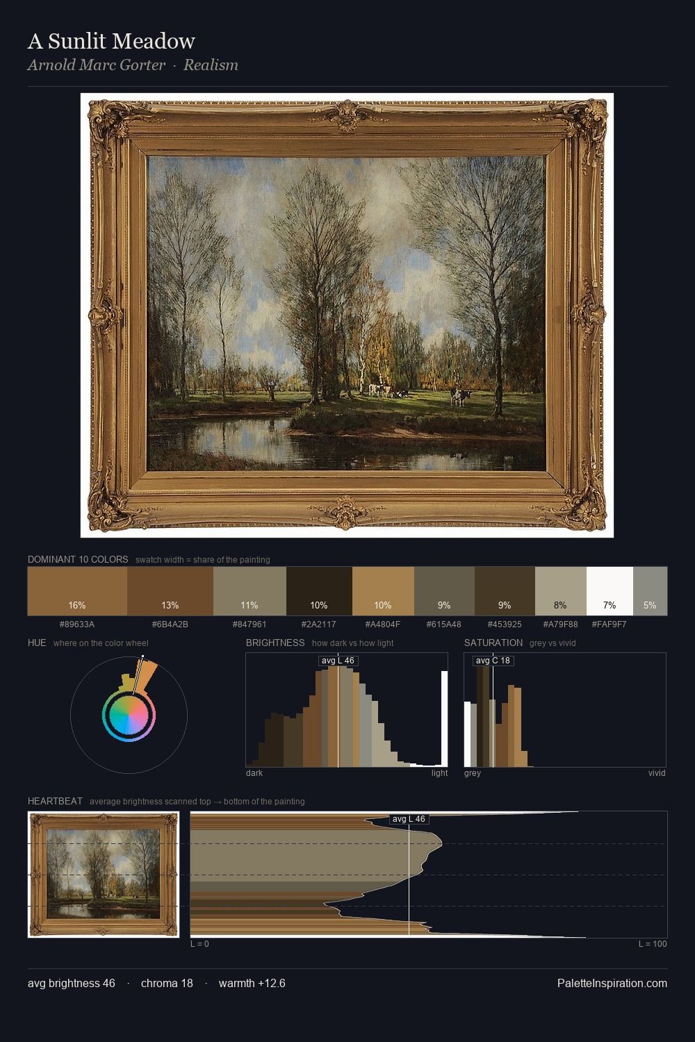
Alessandro Grevenbroeck Palette 3

Palette Analysis
Alessandro Grevenbroeck is high-key - luminous, open, and weighted toward light. A distinctly cool atmosphere runs through this palette: sky, water, and mist given colour form. Every colour is desaturated; the palette proceeds through near-neutrals and gently-coloured greys. 47.5% of the palette belongs to #FFFFFE, a concentration that makes it the unmistakable visual centre. The saturated accent, #735B36, registers at 4.9% - sparse enough to feel like a deliberate surprise. At 76 units of value range, the palette has the tonal breadth to sustain complex spatial readings. The palette has the character of outdoor light: cool, mid-bright, with colour rendered faithfully rather than expressively. This is palette 3 of Alessandro Grevenbroeck's sequence - a single chapter in a chromatic story told across many works.
Example use cases
- publishing
- corporate identity
- consumer apps
- hospitality
- design agencies
I Love This!
Copy, export, or download for your project